7 Things About Web Design Your Boss Needs To Know
Written at 06 July 2016 19:17 by Szymon Binek
An average Internet user needs only about 3 seconds to decide whether the website is worth staying on or not. But what can you really tell about the website after those 3 seconds? Whether you like it or not, most of the visitors tend to judge a book by its cover and you have only one chance to make a first impression. Don’t spoil it! Here are 7 pillars of remarkable web design that every business owner should be aware of.
1. Less is more
The first commandment of website redesign says: ‘You shall keep the sense of proportion’. Although it may seem that flashy design elements like pop-ups or animations are eye-catching, in fact, they only disorient prospects. After all, visitors came to your website with a certain purpose (different than to admire your coding skills). Every time before you add a graphic, think what purpose it serves. Does it help visitors to download an offer, fill out a form, contact your company, or maybe it has other function?
For much the same reasons, a good website design should include a balanced portion of white space. Not only will it look more comprehensive, elegant and up-to-date, but also this simple trick will draw visitors’ attention to whatever you want: a key piece of information, a call-to-action button, an image, etc.

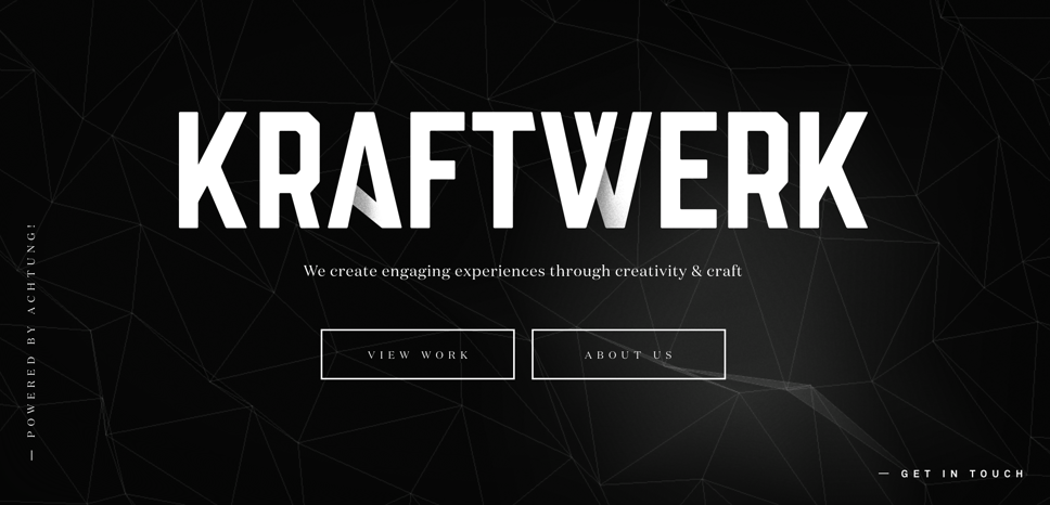
The best example of simplicity in web design is the site of Studio Kraftwerk, the Netherlands based design company. It is minimalistic and yet very compelling and esthetic.
2. Consistency is a top priority
The website design and its general feel should give visitors an immediate idea of what the company does and what its core values are. All the visual elements, CTAs, color palette or font should reflect the spirit of the company.
Nevertheless, no matter what your company’s vision is, you want the website to be consistent and well-organized. This means that each type of page: landing page, thank you page, informational page, etc., should have its unique layout. This will make the website easy to navigate. Too many colors, typefaces (up to 3) or different backgrounds, will look tacky and messy. So if you want to go crazy and give free rein to your imagination, think of better place than your company’s website.
3. Deliver a top-notch user experience
While there are many things that can spoil user experience (UX), slow website performance definitely is one of the most annoying. If the website is unable to load within just 2 seconds, 87% of visitors will leave and probably never go back again!1 Conclusion? What makes a good web design is a great user experience. It means that not only should the site load quickly, but also it must have an intuitive navigation. The navigation structure should be as simple as possible: no more than 3 levels deep and a visible search box, preferably near the top of the page. This way users will easily find what they need without wasting too much time.

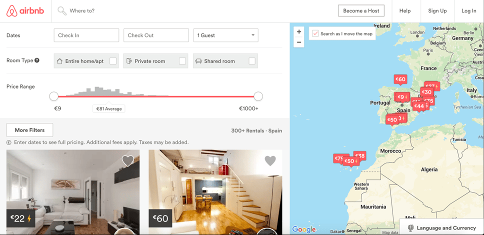
Airbnb website is transparent, functional and easy to navigate, and thus provides a top user experience.
4. Go mobile or die
Nowadays mobile devices permit people to browse the web on the way to work, while doing shopping or having their favorite coffee in Starbucks. By ignoring their needs, you ignore a great deal of market potential. Even Google has begun to penalize non-mobile sites which makes it an absolute must for all companies out there. You can use some free online tools to check if your company’s website is mobile friendly (for example this one from Matt Kersley)
5. Structure your content
Even the best offer, the most compelling, well-written piece of content or the most interesting piece of information won't grab a prospect's attention if it’s not ‘served’ in an attractive way. Nothing discourages more than a large block of text. Catchy, well-designed headlines highlight the crucial points while bullets, images and icons help the readers to go smoothly through the content. Last but not least, all essential information must be above the fold as it’s the first thing the visitor will see.
6. Personalization rules
Most of the businesses are able to define at least a few groups of potential clients, in other words, buyer personas, based on demographics, habits or the stage in the buying process. A good website design should provide for their different needs. You can achieve that using dynamic content or displaying different CTA buttons to different types of visitors. Based on what you know about your prospects, you can adjust the content to fit their profiles and maximize positive user experience.
7. Test, improve and test again!
When it comes to web design, there are some general rules, every company should stick to (as listed above), however the results won’t probably come right away. Sometimes you have to test many options before you pick the best one. Luckily, there is a great deal of analytical tools which you can use to evaluate your website’s performance and constantly improve it. By applying A/B tests for instance, you can check the effectiveness of different colors, fonts, animations, CTAs, etc. Truth be told, website optimization is a never-ending story. If you want to see the results, you must keep it evolving.
Sources:
http://www.forbes.com/sites/tomaslaurinavicius/2015/12/28/web-design-trends-2016/2/#449f0b374060
Szymon Binek
Pine Cove Consulting


