3 tips on how to build instant online trust with website design?
Written at 13 November 2015 17:00 by Szymon Binek
Humana beings are social creatures who seek out acknowledgment and relationship. Weather it is in our professional or privet life our map of reality can be seen as a series of circles with a common center, with those we trust the most in the center and those who we trust less further out.
Throughout or lives we crate trust. Without it we would have to examine ever ones action and look at it with a dose of suspicions. This would be very time consuming because of the sheer amount of interactions we have with complete strangers everyday. To streamline the process we crate circles of trust and subconsciously group the people we interact with into groups of trust worthy and less trust worthy. In the real world this selection process is based on appearances and body language.
In the online reality we loses this features of selection. As an online marketer your job is to build trust with your prospects within seconds of their visit at your website, without a face to face contact.

So how to build instant trust on line? Appearance matters the most.
In the online world the first impression matters and the expression “don’t judge the book by its covers’ does not ring bells. As a matter of fact we do judged the website by its cover, and the cover is the design of the website.
“Reaserch has indivested that people will form an internall impressin of your website within 50 miliseconds”
This is almost as fast as visual processing happens in our brains, and is considered an instant and automatic response. Therefore new prospects visiting your website will subconsciously place the page in trustworthy group or less trustworthy. This initial reaction impacts the whole buyers journey.
Last’s look at the element of first appearance on a example of two websites:

For the purpose of this blog post we will compare two different websites form the same industry with similar target audience.

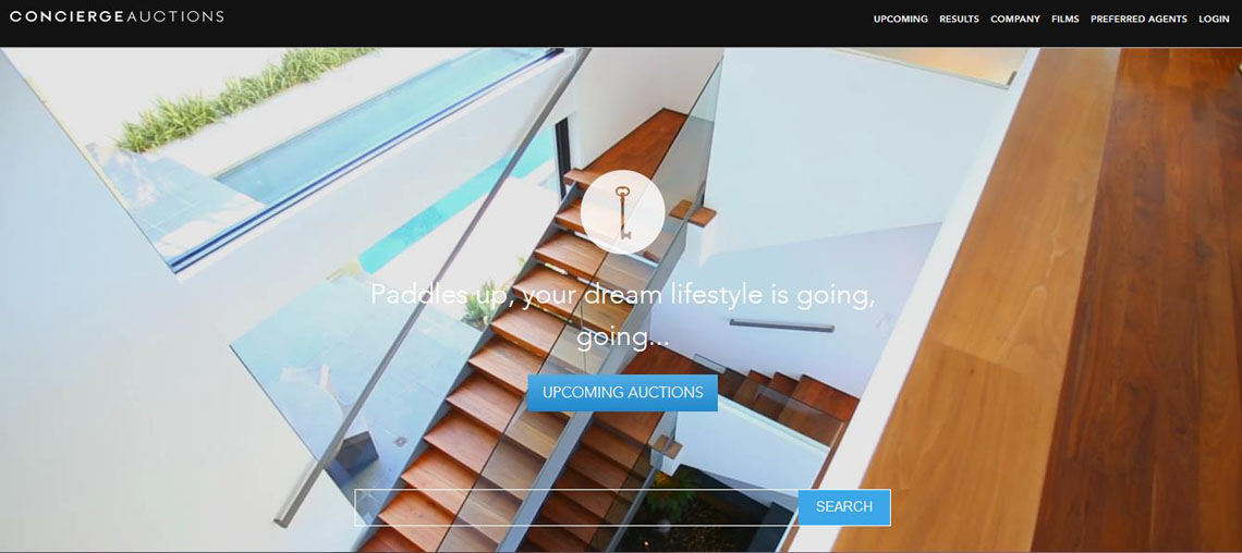
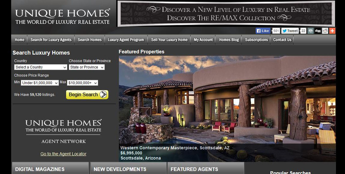
The first page is conciergeauctions.com and the second uniquehomes.com
Look at the two websites, which of them builds more trust from the first impression?
If you are like the most people, the answer is that Concierge auction appears much better.
It is because of 3 fundamental website design elements:
1. Sparseness and neatness
Clutter is the worst enemy of any website, weather it is overloaded with visual effects or long paragraph copy. Your site should be ruthlessly edited to contain only the essential elements that support your business goals. In other words give your website room to breathe.
This cannot be illustrated better when comparing the two of our websites. Concierge Auction website design is neat without any excess visual and text elements. It has a clear value proposition that resonates with its buyers.
Regardless of your buying Persona profiles or your business goals, the visual design should be professionally executed, and presented equally throughout the buyers journey. It should stick together and function as a single organism. The visual elements such as Fonts, Colors, graphic must combine into a single unified experience.
3. Organization and clarity
Too many choices of what to do on a webpage can be paralyzing. This role also applies to information architecture forcing the user to figure out what to click next to get to the desired out come. Disorganized pages force the usurers to figure out which information to digest first and what to click on to. This leads to impatience and encourages he user to leave the page without converting.
Szymon Binek
Pine Cove Consulting


