

Dear HubSpot user,
Welcome to the TURBO Documentation. This guide was created with the goal to help you understand all the cool features that the TURBO Theme has to offer and give you a hand in navigating through the HubSpot CMS. We hope that our brand-new theme will not only boost your RevOps performance but also make you feel proud of your brand. Without further ado, we just wanted to thank you for your interest in the TURBO Theme and say that we are very happy to have you here.
Happy HubSpotting!
The ClickRay Team

ClickRay is thrilled to present you with our brand-new, innovative HubSpot theme, called TURBO. The TURBO is aimed at supercharging your marketing campaigns through an intuitive navigation path and strategically-placed conversion points. As the theme centers around ease-of-use and versatility, we wanted to bring you the least amount of modules to manage, while giving you the largest amount of possibilities for functionality. Thanks to this theme that takes the storytelling approach in website design to a whole new level, you will be able to attract your visitors through captivating design elements, engage prospects by customizing your website to their buyer’s journey, and delight your existing clients with groundbreaking modular functionality.
The TURBO Theme consists of: four (4) global modules; twenty-two (22) website and landing modules; seven (7) blog modules; eight (8) website na landing templates; three (3) blog templates; and seven (7) system pages.
The TURBO Documentation aims to provide you with a knowledge base on what you can find in the theme and how to effectively use it in order to put your company at the forefront of your industry with the help of your website. Therefore, the Documentation is divided into ten (10) distinct categories:
PS. To quickly access the FAQs down below, please click here.
To show a hands-on example of the TURBO Theme, we created a DEMO website. A DEMO website works like a sweet-tooth sample you can try at a store. It aims to demonstrate the complete and versatile functionality of the modules, complemented by the unique visuals the theme has to offer.

In order to ease your content editing experience in the HubSpot editor, we compiled a list of definitions of module functionalities. Below is the complete list of the TURBO Theme vocabulary but these definitions can also be found in the editor as inline help text.
Active filter - a given filter that is currently showing the results.
Border radius - creates and controls the depth of rounded corners on the element’s border.
Box shadow - a shadow effect of a darkened outline around the element’s borders.
Container alignment on page - controls the position of the module on a page.
Container margin - controls the size of space outside of the module borders.
Container padding - controls the size of space between the content and the border of the module.
Content alignment - controls the position of the content within the module’s borders.
Content margin - controls the size of space outside of the content borders.
Content padding - controls the size of space between the content and the border of the field.
Content spacing - controls the size of space between the content.
CTA (Call-to-Action) - a button on website or landing pages that guides users towards your path of conversion.
Description bar - Module area with an additional description content box.
Element margin - controls the size of space outside of the element borders.
Element padding - controls the size of space between the content and the border of the element.
Element position from top / bottom etc. (%) - controls the element’s position from the top / bottom etc., as calculated in percentages.
Floating image - an image that is not defined by the grid and rests beyond the standard alignment of other elements in the module.
Gradient - a layer over the background with a directional change in color.
Gutters - padding between columns in the layout, used to responsively space and align content on a page.
Hamburger menu - a type of a menu with a button that opens into a full-width window with the complete navigation elements.
Header - defines the written content appearing in the module. Can include e.g., subheading, heading, description etc.
Hover - triggers a new layer when a user places a mouse over a designated area.
Hover scale effect - a subtle rise of an element triggered while a cursor is moved over it.
Image scroll - an image element with an icon, typically an arrow, that upon clicking moves the user down the page.
Index - an organized list to indicate the hierarchical placement of the elements. Can show both numbering or lettering.
Label - defines the text that appears as a label for the content underneath.
Layout - an arrangement of elements appearing in the module.
Line break - a horizontal line separating elements in the module.
Mask - controls the transparency of a color layer over the background.
Masonry - a 4-column grid layout with elements of different height and width.
Mousewheel active - a scroll effect that changes the carousel slide with a mousewheel (scroll up - left / scroll down - right).
Navigation menu - an organised list of links to other pages, typically internal website pages.
Opacity - controls the transparency of the layer.
Overlay - a frame design on the top and bottom borders of the module.
Pagination - the separation of items into distinct slides in a given module.
Padding between elements - controls the size of space between the contents.
Pagination padding - controls the size of space between the pagination and the content or the border of the module.
Pop-up background image - image appearing on the background of a pop-up window.
Sidebar - changes the module into a button appearing on the right side, that when clicked on, expands into a screen to show the module content.
Spacing between pagination - controls the size of space between the dotted elements, representing distinct slides.
Split screen - a type of a menu with a button that opens into a side menu with complete navigation elements.
Square bar - Module area with the square box (containing URL content) on the left side of the module.
Text link - a text element linking to other pages, typically internal website pages.
Top bar - a thin bar appearing above the navigation menu, typically used for displaying direct contact information.
Transform - formats and changes the text with one click.
Zoom effect - triggers an effect of the image being magnified when the mouse is hovered over it.
:focus - changes to a new effect when an input item (e.g., a field in forms) currently receives input (e.g., a checkmark).
:hover - triggers a new effect when a user places a mouse over the link.
:visited - changes to a new effect when a user has visited the link.
We do our best to meet our clients’ needs. Therefore, if you come across any issues with your TURBO Theme, submit a help ticket by clicking on the button below. After submitting a ticket, we will get back to you within a maximum of two business days.

Your #1 Technical Inbound HubSpot Partner.
We are a team of HubSpot techies who are dedicated to making the Internet an easier place to manage, one website at a time. Beyond creating state-of-the art HubSpot Themes, we help companies scale and grow using Inbound methodology by unifying CRM with CMS, Sales, and Marketing Hubs.

Learn how to download and prepare your TURBO Theme.
Before purchasing the TURBO Theme, make sure to review assets you can purchase based on your HubSpot account subscriptions, available at the link below.
HubSpot Knowledge Base
Learn more about purchasing a HubSpot theme here.
In your HubSpot account, click the Marketplace icon in the main navigation bar and then choose the “Asset Marketplace.”
Use the search bar to search for “TURBO Theme by ClickRay” and click on the appropriate result to go to the TURBO Theme page.
When you are on the TURBO Theme page, you can purchase the theme by clicking on the “Buy now” button on the upper right corner.
Once the purchase transaction is complete, your theme will automatically be added to the design manager. Your theme is now ready-to-go!
Before you get started customizing your theme, we recommend duplicating your theme so that you have two versions of the TURBO Theme - one that is untouched and the other one (the so-called “Child Theme”) that you can freely customize. The new copy you create will inherit all the assets and files of the TURBO Theme. Of course, you don’t necessarily have to create a Child Theme, however, this gives you the ability to change the code or customize it further while keeping the original copy intact, one that you can always go back to later.
To create a Child Theme, go to the “Design Tools” page by navigating through the “Marketing” and “Files and Templates” tabs on the main navigation menu in your HubSpot account. From the sidebar menu on the left, click on the folder titled, “The TURBO Theme by ClickRay”. This folder contains all the assets of the TURBO theme.
Once you are in the folder, click on the “File” button below the search bar in the sidebar menu and select “Clone Theme”. Type in the label for your copy and choose the folder you want your child theme to reside in. Click “Create” and voilà! You can get started on customizing your theme.
HubSpot Knowledge Base
Learn more about creating “Child Themes” here.
While HubSpot recommends using the latest version of jQuery [1.11], the TURBO Theme will also run on the 1.7 version of jQuery. However make sure that it is important that the “Include jQuery” box is checked for the theme to run properly.
You can adjust the jQuery settings by navigating to the Settings page using the 
HubSpot Knowledge Base
Learn more about jQuery in HubSpot here.
In February 2022, ClickRay published a new HubSpot theme, called the TURBO. This documentation refers to the first version of the TURBO Theme. While at this moment we are not creating new updates to the theme, we expect some theme updates to roll out in the future to bring you the most trendy and up-to-date designs and functionalities.
Updating your theme is a great way to keep your website fresh for visitors. However, please keep in mind that any updates for the theme will be only available for the original version, not the child theme. Furthermore, a newly updated theme will overwrite the existing theme.
“If you’re using a module and it gets updated, your page will pull in the new version.* However, if you are using a module and that module doesn’t exist in the new version, we do not delete it from your HubSpot account.”
* This might cause some errors in content for the module.
If you are working on your Child Theme copy and want to use new modules from the updated version, do not worry! Once we roll out a new update, we will let you know how to transfer the new modules into your Child Theme.
HubSpot Knowledge Base
Learn more about theme updates here.
PS. Join our TURBO mailing list to get info about the latest theme updates as well as tips and tricks on how to supercharge your website!

Or otherwise known as the 101 of the TURBO Theme.
The Grid Concept revolves around web responsive grids, which are structured in columns, based on which you can maneuver the modules to determine page layouts. The function of the web responsive grids is organization of page layout design so that it is responsive for the end-user.
Here’s an example image of a grid concept.
Columns are the thick, vertical pink blocks that make up the content width of your design. Typically in website designs, the column width doesn’t change but the number of columns between 12 on desktop; 8 on tablet; and 4 on mobile. Field Elements are the blue rectangles (representative of modules) that rest on a certain number of columns. And Gutters are the white spaces between the columns. Side Margins (also known as outside gutters) are the white spaces outside of the content width (the width of all columns).
And here are a few tips about the grid concept:
First of all, the field elements must rest on the columns and the edges of these elements cannot rest on the gutters. You can place the elements inside the grid and resize the modules into two in line, four in line or six in line etc. but they need to fit within the boundaries of the columns. Usually, leaving elements in the gutters would throw off the balance of the design. While it’s also best not to use the columns as outside padding, you can create full bleed graphics that bleed out of the columns. They should go edge to edge of the page layout and are best used in headers.
Now let’s move on to the responsive design. This means that as the number of columns changes depending on the device (desktop, tablet, mobile), the page layout should also respond to the change (from 12, through 8, to 4, respectively). There are two main types of responsive design: fixed and fluid. As you shrink the window in the fixed design, the outside margins will decrease but the sides of the elements will stay the same. In fluid design, you will notice that your text is wrapping and graphics are getting narrower.
The theme is built on a responsive 12-column grid layout, each column being 85px wide and gutter width being 16px. The total width of the layout is 1196px (1230px, inclusive of side margins) and the breaking points are the standard size of 768px and 360px.
Utilizing the Grid Concept, the TURBO Theme creates smoothly-responsive and visually-pleasing UI layouts to provide you with a variety of awesome possibilities. With modular design, you can create a more consistent and cleaner layout which elevates your website to offer a seamless digital experience for your visitors, regardless of the device.
All of the modules feature drag-and-drop functionality for easy content editing experience.
When you are on the page editor and click on a given module, a content editor window will pop-up on the left hand side of your screen. There, you will see two tabs: Content and Styles.
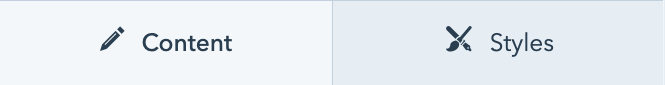
Each TURBO module has the possibility to modify its Content and Styles. The Content tab offers content editing options, which means you can change the text appearing in the module, place a background image or add content functions (e.g, a search bar) directly in there. The Styles tab allows users to customize module styles, such as the margins or paddings and colors.
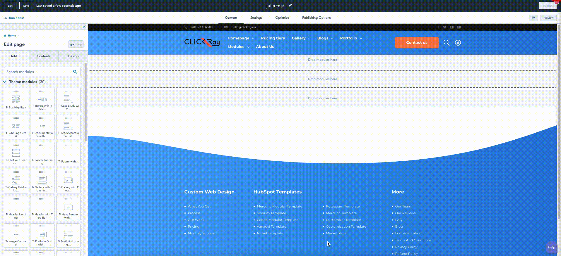
ClickRay’s TURBO Theme is based on a fixed web responsive design. The page layouts are divided into columns and each module represents a field element. With the TURBO Theme, however, you can utilize the newest HubSpot layout functionality, called Sections, which allows you to create layout variations for your modules. Here are the ways to create and edit sections on the page editor.
First, you need to create a page (see the Creating a Page section of the TURBO Documentation below for the how-to). Once you are on the page editor, hover over a module under which you want to create a section and press the round plus sign (+) button.*
*Make sure that you are on the “home” mode of the page editor. It is important that you have not selected a module to edit, because you will not be able to see the sections. If you are, use the breadcrumb menu on the upper right of the editor window on the left to click home. Now, you will be able to see the “Add”, “Contents”, and “Design” tabs. This way, you will see the (+) button.
The plus sign (+) button will open up an “Add section” window on the right side of your screen. Under the “Custom” tab, you’ve got three (3) pre-built TURBO Theme section layouts to choose from:
T- Section 1 column CTA
One column text (centered) with CTA button below.

T- Section 2 column CTA
Two column text with CTA button below.

T- Section 3 column CTA
Heading plus three column description text with CTA button below.
Once you’ve chosen one, feel free to edit the rich text in accordance with your content (to edit the CTA button, please reference the Theme Settings section of the TURBO Documentation).
You can also create your own custom Section. In the “Add section” window, choose the “Layouts” tab to select one of the HubSpot pre-designed layouts. This allows you to easily structure and customize sections by drag-and-dropping your modules from the list to the templates.
P.S. You can also customize the alignment and spacing as well as the background of your section by simply clicking on it.
HubSpot Knowledge Base
Learn more about creating and editing sections here.
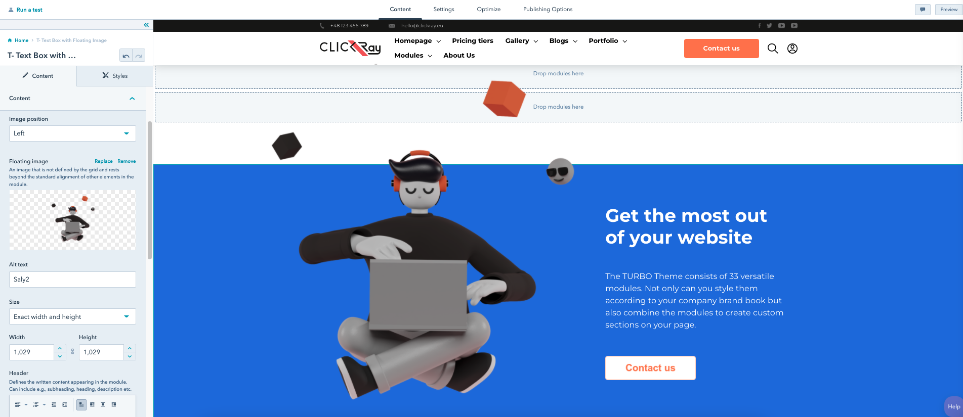
In addition, the TURBO Theme features novel, state-of-the-art graphic elements, called “Floating Images”. Although these elements exist within the modules, they are not bounded by their borders. They, often represented by figures or objects, are shaped by transparent backgrounds, giving you an impression of an image being suspended in the air- ergo the name “floating”. The purpose of TURBO’s floating images and their respective fields is to build a website that utilizes the newest design trends in design to catch the attention of your visitors.
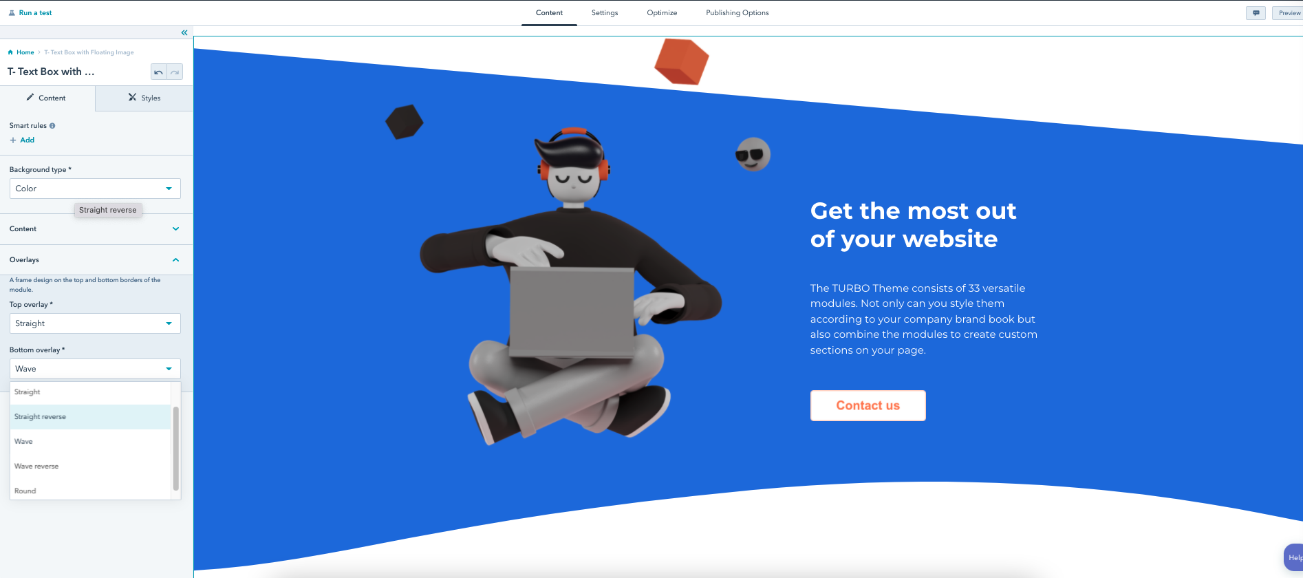
An overlay in the TURBO Theme is a frame design on the top and bottom borders of the module. There are five types of overlays: straight (a diagonal line) and wave (an arched outline) with their reverse counterparts plus round (a rounded outline). With overlays, you can create different visually pleasing section divisions. Similarly to the floating images, the purpose of the overlays is to bring the newest trends in design to your website.
In your HubSpot account, use the navigation bar to click on the “Marketing” and then hover to “Website” and click on the “Website Pages”. You will be redirected to a list of all the pages in your account.
Website Page
To create a website page, click on the “Create” button on the upper right corner and choose “Website Page” from the drop-down menu. Simply choose the URL of your website, type in the internal title of the page, and hit “Create”.
ClickRay’s Tip
Defining a naming convention is extremely important for organizing your CMS. Check out our blog post to learn more about how to create an effective naming convention that will help you manage your digital assets in HubSpot.
The next step is to choose a template from the pre-designed selection. The template you choose will depend upon your page needs - whether you want to create a Home, About Us, or a Product page. In the TEMPLATES category in the TURBO Documentation, you will find a detailed list of the TURBO templates, along with the modules existing in a given template, for your reference.
Once you have chosen a template you want to use or build upon, you can preview it or start working on it. In the case of the latter, click “Select Template”.
Congratulations, you created your first page!
Landing Page
To create a landing page, click on the “Create” button on the upper right corner and choose “Landing Page” from the drop-down menu. Follow the same instructions as outlined for the Website Page.
PS. Under the “Landing pages” tab, you will see all of the landing pages you have created.
HubSpot Knowledge Base
Learn more about creating and customizing pages here.
Alright, so you’ve created a page (whether website or landing). Before you start editing the content, we want to give you a quick overview of the other settings on the page editor mode to make sure you’ve got a complete understanding of the entire functionality of a page editor. These are: Settings; Optimize; and Publishing Options.
Settings
Under the “Settings” tab, you can type in the page title that appears in the browser title bar and in search results, as well as choose the page language, define your own slug, and write a meta description.
PS. The TURBO Theme supports multilingual websites via HubSpot’s Language Switcher functionality. Learn more about it in T- Footer with Language Switcher module.
ClickRay’s Tip
Writing the external page title as well as the meta description is extremely important for SEO purposes as they help drive search engine traffic to your page. Based on our own practices, we suggest including the key words (pertaining to the page’s topic as well as your own business) in the title and in the meta description. There are many external tools to use for previewing how the page title will look like on the search engine results page, for example Moz’s Title Tag Preview. We also recommend inputting the key words and phrases at the beginning of your page so the engines trace it faster and more efficiently.
Underneath the meta description, you also have an option to associate the page with a custom campaign.
ClickRay’s Tip
The “Campaigns” tool is very useful for managing your marketing content (e.g., sending marketing emails) but also for analyzing the performance of your marketing efforts. Once you associate specific elements (e.g, pages, blog posts, emails) with your campaign, you will be able to track how users behave with your content as well as report on the overall effectiveness of your content.
HubSpot Knowledge Base
Learn more about creating campaigns here.
Optimization
When you click on the Optimization tab, you see your entire page content back again. On the left side, there’s a split screen window, which lists all the native HubSpot suggestions on optimizing your page in accordance with the highest performance standards.
On the top of the window, you will see a “Topics” drop-down menu. This refers to an SEO strategy, helping search engines understand what your page is about.
HubSpot Knowledge Base
Learn more about creating custom topics here.
Publishing Options
Under this tab, you have a choice to publish the page right at this moment or schedule it for later. You also have an option to unpublish a page on a given date and time, and automatically redirect visitors to another page when this one will be unavailable.
There you go! We think you’ve got a pretty good idea how to create, customize, and manage your pages. Let’s move on to editing your TURBO Theme settings.
One of the key benefits of using HubSpot CMS is the ability to create multilingual content in just a few minutes. Using the HubSpot native Language Switcher functionality, you can clone your pages (website, landing, or blog) and define new language for pages that exist within the same domain as your website.
Simply head over the the lost of your pages using the “Marketing” and then “Website” tabs on the navigation bar in your HubSpot account. Once you see the list, click on the desired page. Go to the “Settings” tab in your page editor and select the main language for the page. This is a must if you want multilingual content. Save the changes and publish your page.
Now, go back to your page list and hover your mouse over the desired page. Next, click on the “More” button and choose “Create a multi-language variation”. A small window will appear, from which you choose the desired variation language. Once you choose it, click create.
This will clone the page you created and automatically associate it with the new language that you have chosen. From that point, you can start translating your content. When you preview any translation of that page, at the bottom of the screen (in the right hand corner of the footer), you will see the language switcher function that allows visitors to switch between the translations of your page.
PS. As you will notice, the pages reside on the same domain but have a different slug, depending on the language you have chosen. The HubSpot native Language Switcher functionality allows you to use just one domain (i. e., no need to purchase additional domains).
The TURBO Language Switcher will appear on the footer of that given page only if you have created at least one language variation (that’s different from the primary language of the page). To learn how to turn on / off that functionality, see the T- Footer with Language Switcher module described in the Module Library section of the TURBO Documentation.
ClickRay’s Tip
Creating multilingual content on your website is great if you have a broad audience of different geographical locations and therefore using different languages. Check out our blog post to learn more about multilingual variations in HubSpot CMS and to what extent they can be used.
To add your own company branding to the TURBO Theme, you have to access the settings (by clicking on the
HubSpot Knowledge Base
Learn more about customizing your branding here.
There are two ways to access the Theme Settings in HubSpot: from the settings page in your HubSpot account or directly from the page editor.
In your HubSpot account, click on the
And while you are on the page editor, you can edit the TURBO Theme settings, by clicking on the “Design” tab in the left window and then clicking on the button “Edit theme settings”.*
*Make sure that you are on the “home” mode of the page editor. It is important that you have not selected a module to edit, because you will not be able to see the tabs. If you are, use the breadcrumb menu on the upper right of the editor window on the left to click home. Now, you will be able to see the “Add”, “Contents”, and “Design” tabs.
The “Edit theme settings” button will redirect you to the Theme Editor page. Think of theme settings as “global” settings, meaning that they can change multiple styles in different areas at once. You can overwrite the styles in specific modules on the page editor.
The HubSpot native “View on” option allows you to preview the changes in the theme settings on other pages you have created. And the “Preview” button presents the full page preview. You can switch between the preview devices using the three icons (desktop, tablet, mobile) on the upper right corner of the window.
HubSpot Knowledge Base
Learn more about editing the theme settings here.
The Theme function (otherwise known as the theme color scheme) allows you to switch between the light and dark color scheme of the theme. This functionality allows you to swiftly select and change the tone of your theme, without changing the modules one by one. The default selection is the light color scheme, while if you choose the dark color scheme, the page background color will change.
You can change the dark theme color in the “Colors” category of the editor.
ClickRay’s Tip
People respond differently to certain color schemes. The theme color scheme you choose will affect the user experience that in turn impacts website performance. Your choice will depend on your brand identity, style guidelines (e.g., matches your brand color scheme), website content (is it more text-based or visual?) or target audience (think about accessibility for screen readers).

In the layout group, you can adjust the container width and the gutter width.
“Container width” applies to modules using the Center Content type Section. This changes the width between the borders of the module and the borders of the page. The larger the container width number, the wider the module is.
“Gutters width” applies to a section with at least two separate modules in a row. This functionality controls the space in between these modules. The larger the gutters width number, the more space there is between the modules (We recommend reviewing the 12-Column Layout topic in The Basics section of the TURBO Documentation for more information about gutters).
In this category, you can pick the colors for your theme.
The colors are divided into Primary, Secondary, Tertiary, and Gradients. Any changes made here will overwrite the elements that are currently set to these colors, for example:
Primary color - used as module background colors, pricing tier color, window pop-up and box background color, active pagination color, active checkbox and radio fields.
Secondary color - used as pricing tier color, index module description color, subscription toggle button, navigation menu active page colors, documentation menu color, sign colors (plus, minus, arrows, and bullets).
Tertiary color - used as mobile navigation menu second level background color.
In this category, you can also change the color of the dark theme scheme as well as the gradient colors applicable to all gradients in the theme.
ClickRay’s Tip
Defining the accurate color scheme, typography, as well as visual references is extremely important for conveying your brand story because it helps visitors identify your company and connect with your brand. Check out our blog post to learn more about how to establish brand identity through website design.
Typography refers to the changes in the style, size, and color of the fonts. In this category, you can change the typography of the entire text content with just a few clicks.
Under the Text category, you can choose the font style and color of the entire text appearing in the theme, as well as the paragraph font size. In addition, you can determine the “Line height”, which controls the space between the text lines of different content. The larger the line height, the more space there will be between the lines of text (even within the same text content, e.g., paragraph text).
You have three different choices in the Link category. These are default, :hover (triggers a new effect when a user places a mouse over the link), and :visited (changes to a new effect when a user has visited the link).
You can also determine the specific font size, color, and formatting (bold, italic, and underline) for the headings [from H1 to H6]. There’s a unique feature, called “Transform”, which formats and changes the text with one click. You can use this drop-down menu feature if you want to convert text between different letter cases: Capitalize, UPPERCASE, or lowercase.
ClickRay’s Tip
Header tags (such as H1, H2, H3 and so on) are key values to determine in your SEO strategy because they help to rank your content in search engines. Throughout your TURBO Theme experience, you will find yourself formatting your text into appropriate tags in rich text boxes. HubSpot provides a great resource that will give you clarity on how to use the header tags.
For a detailed list about the TURBO Theme Typography (font styles, sizes, colors, formatting as well as link and button styles), please consult this page.
There are two ways to edit your custom CTA (Call-to-Action) buttons.
One way is to do it via the theme settings. Here, you can define the style of up to three CTA buttons. That includes the colors, typography, borders, and spacing. The settings can be also changed for the :hover and :visited functions.
In the “Text” group, you can determine the specific font size, color, and formatting (bold, italic, and underline). There’s a unique feature, called “Transform”, which formats and changes the text with one click. You can use this drop-down menu feature if you want to convert text between different letter cases: Capitalize, UPPERCASE, or lowercase.
In the “Background” group, you can determine the background color (and opacity) for the CTAs.
In the “Border” group, you can determine the border style (Solid; Dotted; Dashed; Double), color (and opacity) as well as the width.
In the “Corner” group, you can determine the border radius depth.
In the “Spacing” group, you can determine the margins and paddings of the CTAs.
Another way is to do it directly on the page editor.
.gif?width=1916&name=CTAs%20(beyond).gif)
If you select a module that contains a CTA, you will find a CTA field. Once you click on the “Edit call-to-action” button, a sidebar window will appear through which you can start editing your CTA by hovering over the CTA and clicking the “Edit” button on the right side.
Here, you’ve got two choices of editing: you can either edit the button directly on the CTA editor (via “Custom Button” or “Image Button” choices available on the upper right corner) or connect one of the three TURBO Theme CTA buttons you have defined in the theme settings (CTA 1, CTA 2 or CTA 3). For this, choose the “Custom Button” selection and expand the “Advanced Options”.
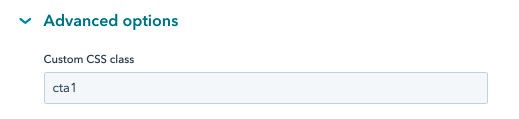
In the Custom CSS class, you will define the name of the button class associated with the TURBO Theme CTAs, as referenced below:
CTA 1 = cta1
CTA 2 = cta2
CTA 3 = cta3
In the next steps, all you need is to define the internal name of the CTA, choose the URL redirect type, etc. and click save!
ClickRay’s Tip
Since CTAs are supposed to guide your visitors through the conversion path (think the visitor-to-customer journey), it is extremely important to define that path when creating your pages. This means, thinking about what route your visitor is going to take on your website to schedule a meeting, buy a product, subscribe to a service, message with an inquiry, or download an ebook etc. In the TURBO Theme pre-built templates, you will find pages with strategically located conversion points (CTAs) yet you are free to customize your pages based on your own conversion path.
%202.gif?width=1916&name=CTAs%20(beyond)%202.gif)
By the way– you can also access the CTA editor through your HubSpot account by choosing the “Marketing” tab from the navigation bar, then “Lead Capture” and “CTAs”. There, you will find a list of all your CTAs, which you can edit directly from there or create a new CTA by clicking on the button in the upper right corner.
HubSpot Knowledge Base
Learn more about creating and editing the CTAs here.
The Forms category allows you to edit the styles of elements of the forms appearing on your website. This category is divided into following subcategories: Spacing; Labels; Help text; Consent text; Fields; and Errors.
Labels refer to the form field labels, which are the names of the fields that appear on the form. Help text however, refers to the informational text below the field's label that aims to guide visitors through completing the given field. Under both the “Label” and “Help text” tabs, you can choose the font size and color as well as determine the opacity of the elements (transparency of the layer) and the height of text lines (which controls the space between the text lines).
For the “Consent text”, which refers to the text appearing alongside the checkboxes, confirming that visitors agree with the outlined information, you can also determine its opacity as well as the text line height.
“Fields” refers to the text input elements that are based on HubSpot properties in the form editor. This subcategory is broken down into: Spacing; Text; Background; and Border. An additional style configuration is the change of the field border style to a :focus function, which allows you to make changes when a form field currently receives input (e.g., a checkmark).
As for “Errors”, you can change the font size and color for the error in a case e.g., if a visitor doesn’t check a required checkbox.
Creating and Editing Forms Beyond the Theme Settings
%202.gif?width=1916&name=Forms%20(beyond)%202.gif)
You can create or edit your in two ways, similarly to the CTAs.
One way is to do it directly on the page editor. If you select a module that contains a form, you will find native HubSpot form functionality. Here, you’ve got two possibilities depending whether you want to edit an existing form or create a new one. To edit a form, select a form from a drop-down menu under “Choose a form”, click on the “Actions” button underneath the drop-down menu and select “Go to full forms editor.” This action will redirect you to the form editor page. You can also create a new form by choosing “Create a new form” either from the drop-down menu or the “Actions” button. Then, all you need to do is type in an internal name and edit the form by clicking on the “Go to full forms editor”.
You can also access the form editor through your HubSpot account by choosing the “Marketing” tab from the navigation bar, then “Lead Capture” and “Forms”. There, you will find a list of all your forms, which you can edit directly from there or create a new form by clicking on the button in the upper right corner.
ClickRay’s Tip
For creating new forms, we recommend doing it by accessing the form editor through the “Marketing” tab. Why? Because once you hit that orange “Create a form” button on the upper right corner, you will first have to choose between different form types. These native HubSpot form layouts are of great use if you want to create e.g, a separate page for a form (Standalone page) as a client survey, shareable through a link. In addition, on the “Forms” page, you will be able to quickly access form reports by clicking on the “View detailed forms analytics” text link below the orange button. This can go a long way in helping you expand marketing campaigns.
HubSpot Knowledge Base
Learn more about creating and editing the forms here.

The last category refers to the styles on mobile devices and is very straightforward. Here, you will be able to choose the color of the browser address bar on mobile devices. This function is not available for desktop devices.
The proper performance of the colored browser address bar depends on the mobile browser compatibility with the function. The compatibility might change depending on the latest version of browsers, therefore please consult this Mozilla Reference Guide.
P.S. If no color is selected, it defaults to the Primary color.
In this section, you will find a list of all modules available in the TURBO Theme, divided into three categories: Global Modules, Website Modules, and Blog Modules.
PS. Besides the TURBO modules, HubSpot CMS offers default modules that you can drag-and-drop as well as edit on your page.
HubSpot Knowledge Base
Learn more about HubSpot default modules and how to use them here.
The global modules can be accessed from the page editor. Drag and drop one of the global modules listed below onto the page. Once you click on it on the page, you will see a window pop-up, titled “Edit global content?”. Now, go ahead and click the orange button, “Open in global content editor.” This will redirect you to the global content editor, where you will be able to edit the global module.
A quick note, you will only be able to edit one global module at a time. Therefore, if you need to edit a different global module, just click on the “< Back to page editor” button on the upper left corner and follow the directions outlined above.
T- Footer Landing
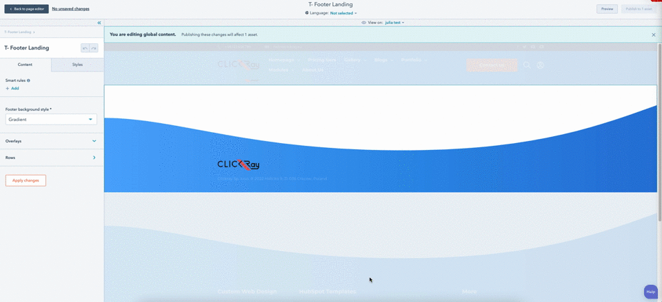
The T- Footer Landing module presents a simple design based on the T- Footer with Language Switcher module, designed specifically for landing pages so that the visitor can visually associate the landing page with your main website. It lacks the advanced navigation
- Add a top overlay and define the links.
- Customize the Bottom bar with contact information.
- Choose between background styles (color and gradient).
PS. For website pages, use the T- Footer with Language Switcher (described below).
> CONTENT
Footer background style
Here, you can choose the background style (Color or Gradient) from the dropdown menu. If you choose Color as the Background style, you will see a uniform color. If you choose Gradient as the Background style, you will see a gradient between two colors. The color and gradient can be defined in the STYLES section of the module.
Overlays
You can choose the top overlay of the module. Overlay is our unique frame design on the borders of the module. From the dropdown menu, choose between straight, straight reverse, wave, or wave reverse designs to up your website design game.
See Overlays section under The Basics in the TURBO Documentation for more information on the use of overlays.
Rows
In the Row top, you can define the social links and icons (appearing on the right) by pressing the “+ Add” button next to the Social links list. If you want to edit, clone, or delete a given listing, hover over one of the items and choose the appropriate icon on the right side.
The Row bottom settings give you the possibility to input a text (e.g., company address).
Your company logo will appear on the footer and be automatically derived from the Branding settings (see Branding under the Getting Started section of the TURBO Documentation for more information about inserting your company logo).
> STYLES
Font color
Here, you can choose the font color and opacity for the entire module.
Color (if chosen Color as the Background type)
Here, you can determine the background color (with opacity) of the module.
Gradient (if chosen Image with gradient as the Background style)
Here, you can determine the color gradient (with opacity) of the module.
Overlays
Here, you can define the color and opacity of the top overlay.
T- Footer with Language Switcher
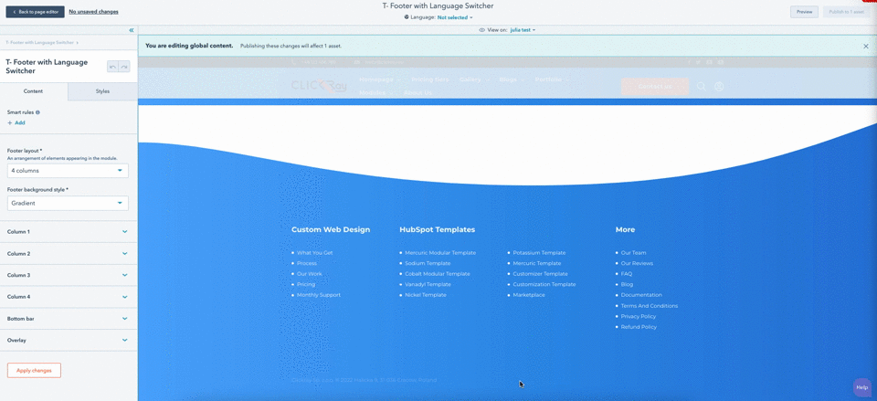
The T- Footer with Language Switcher module presents a site map of pages. An opposite of the header, this module is placed on the bottom of the page with an objective to capture the visitor’s attention right before exiting the page. It provides the key points for visitors to see again, supplemented by guided links so that the visitor won’t have to scroll back up the page.
- Choose between three column layout types.
- Add a top overlay and define the links.
- Add a CTA, search bar, and an additional linked icon (e.g., Membership).
- Customize the Bottom bar with contact information.
- Customize the language switcher option.
- Choose between background styles (color and gradient).
PS. For landing pages, use the T- Footer Landing (described above).
> CONTENT
Footer layout
From a dropdown menu, choose one of the following three options:
Footer background style
Here, you can choose the background style (Color or Gradient) from the dropdown menu. If you choose Color as the Background style, you will see a uniform color. If you choose Gradient as the Background style, you will see a gradient between two colors. The color and gradient can be defined in the STYLES section of the module.
Columns 1 - 3
In the header field, you can define the titles of the columns.
To edit the link list above the title, click on the “Edit menu content” button below. A new window will pop-up on screen. Similarly to the navigation menu in the Header module, you can choose the names of the pages appearing in the site map bar as well as link them to specific internal pages on your websites or even external pages by clicking on the “Add menu item” below the list.
HubSpot Knowledge Base
Learn more about setting up your navigation menu here.
Column 4
There are three options for inputting content in the fourth column, depending on the footer layout choice.
If you choose the 4 column layout, this field will have the same functionality as the Columns 1-3.
If you choose the 3 columns + form layout, in the Column 4 you will have an option to define the column title as well as add a form.
ClickRay’s Tip
Forms are a great way to acquire new leads, because the information a visitor inputs can automatically transfer into your HubSpot CRM.
See Forms section under Theme Settings in the TURBO Documentation for more information on how to edit forms in HubSpot.
If you choose the 3 columns + logos layout, in the Column 4 you will have an option to define the column title as well as add up to two logos (or images) with links.
HubSpot Knowledge Base
Learn more about inserting images or videos to your modules here (by scrolling down to the “Edit an image in an image module” section).
Bottom bar
The Bottom bar settings give you the possibility to input a text (e.g., company address) and in the social links and icons by pressing the “+ Add” button next to the Social links list. If you want to edit, clone, or delete a given listing, hover over one of the items and choose the appropriate icon on the right side.
In addition, you have the option to show the language switcher function by checking the box below the Social links. This will appear in the right hand corner of the footer. Remember, you first need to set up the pages in multiple languages for the function to appear.
See Multilingual Pages under the The Basics section in the TURBO Documentation on how to create and manage multi-language page variations.
Overlays
You can choose the top overlay of the module. Overlay is our unique frame design on the borders of the module. From the dropdown menu, choose between straight, straight reverse, wave, or wave reverse designs to up your website design game.
See Overlays section under The Basics in the TURBO Documentation for more information on the use of overlays.
> STYLES
Font color
Here, you can choose the font color and opacity for the entire module.
Color (if chosen Color as the Background type)
Here, you can determine the background color (with opacity) of the module.
Gradient (if chosen Image with gradient as the Background style)
Here, you can determine the color gradient (with opacity) of the module.
Overlays
Here, you can define the color and opacity of the top overlay.
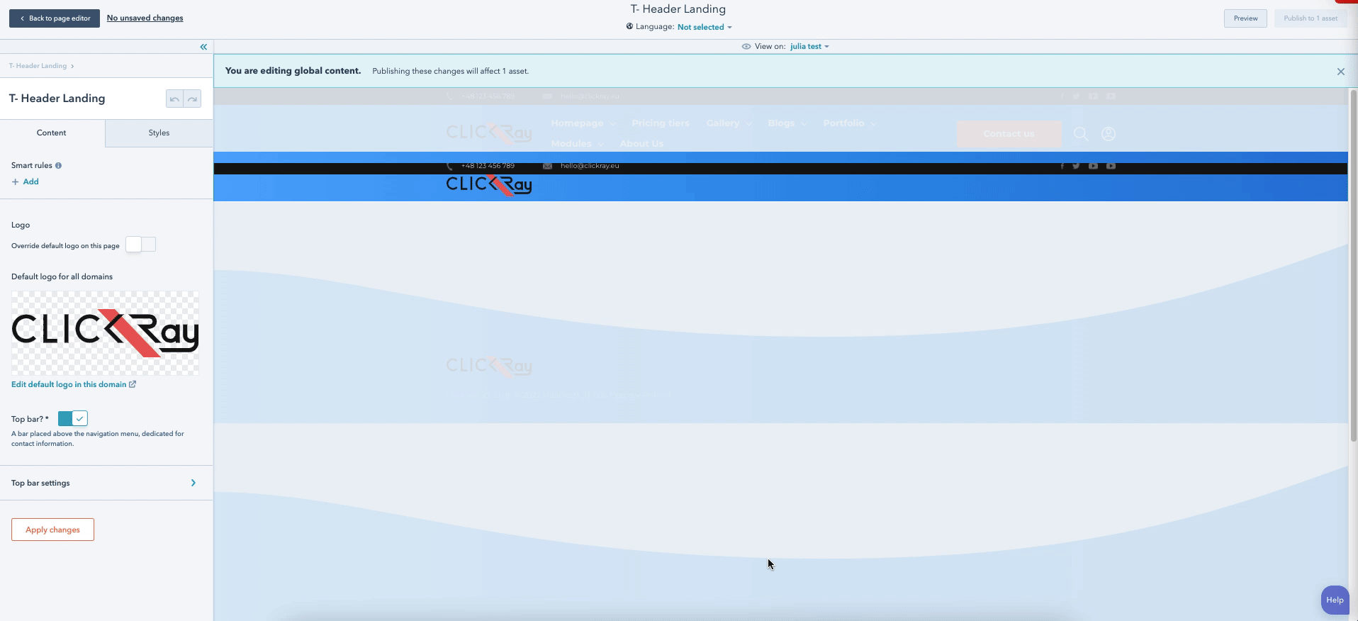
The T- Header Landing module presents a simple design based on the T- Header with Top Bar module, designed specifically for landing pages so that the visitor can visually associate the landing page with your main website.
- Add a company logo.
- Customize the Top bar with contact information.
- Choose between background styles (color and gradient).
PS. For website pages, use the T- Header with Top Bar (described below).
> CONTENT
Logo
You have the option to place your logo on the left side of the navigation bar. There are two ways to edit the logo: either directly on the global module editor by clicking on the “Edit default logo in this domain” text link below the logo image or from the Settings on your HubSpot account (see Branding under the Getting Started section of the TURBO Documentation).
You also have the option to overwrite the default logo on this page by pressing the switch button. If you don’t have a logo, you can switch on the option “Show company name when logo isn’t set”. This will make your company name appear on the place of the logo in accordance with the typography set in the Theme Settings.
HubSpot Knowledge Base
Learn more about inserting images or videos to your modules here (by scrolling down to the “Edit an image in an image module” section).
Top bar
You can add a top bar above the navigation menu by switching on the “Top bar” option. A top bar is a thin bar placed above the main navigation bar menu. It’s best used for providing direct contact details, such as phone or email, as well as links to social pages. The Top bar settings give you the possibility to add icons that link your company phone number, email address, and pages on social networks such as Facebook, Twitter, Linkedin, Instagram, Youtube, or whatever social network site you want.
> STYLES
Background style
Here, you can choose the background style (Color or Gradient) from the dropdown menu. If you choose Color as the Background style, you will see a uniform color. If you choose Gradient as the Background style, you will see a gradient between two colors. You can change the background settings below.
Header background color (if chosen Color as the Background style)
Here, you can determine the background color (with opacity) of the module.
Gradient (if chosen Image with gradient as the Background style)
Here, you can determine the color gradient (with opacity) of the module.
Top bar
If you have switched on the “Top bar” function, you can set its background and font colors and opacities.
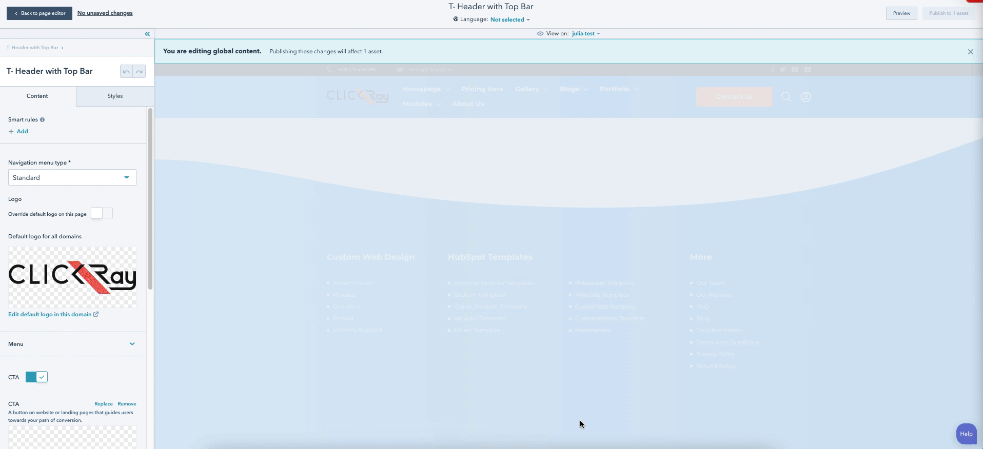
The T- Header with Top Bar module presents a navigation menu bar of your pages. The objective of this module is to allow visitors to quickly access the most useful pages on your website. As it is one of the first things that the visitor sees, it needs to capture their attention and provide guidance through your conversion path. In addition to the top bar with contact information, the module consists of three different navigation menu types.
- Choose between three different navigation menus (Standard, Split screen, Hamburger).
- Add a CTA, search bar, and an additional linked icon (e.g., Membership).
- Add a company logo.
- Customize the Top bar with contact information.
- Choose between background styles (color and gradient).
PS. For landing pages, use the T- Header Landing (described above).
> CONTENT
Navigation menu type
In the T- Header module, you can choose between three different navigation menu types:
Standard - A horizontal drop-down menu with separated categories.
Split screen - A drop-down menu with a Hamburger icon on the right. The menu levels of the navigation bar are aligned horizontally, therefore if you have page subcategories, two or more columns of the same size will appear to the left of the Split screen menu.
Hamburger - A menu accessible by an icon of three lines on the right side. Similarly to the Split screen, the menu levels of the navigation bar are aligned horizontally, however the heights of the levels are dependent upon the amount of the pages within a given level, therefore present different in size.
When the window size is reduced (either on desktop or in regards to the mobile / tablet appearance), the Hamburger icon will appear on the right side of the menu. When the visitor clicks on the Hamburger icon, a full screen window will appear with the pages and subpages.
PS. Remember that the navigation bar is a sticky one - meaning that when a visitor scrolls down the page, the navigation bar will still appear on top. This will allow the visitor to quickly gain access to any page they desire even without the need for wasting time scrolling to the top of the page.
Logo
You have the option to place your logo on the left side of the navigation bar. There are two ways to edit the logo: either directly on the global module editor by clicking on the “Edit default logo in this domain” text link below the logo image or from the Settings on your HubSpot account (see Branding under the Getting Started section of the TURBO Documentation).
You also have the option to overwrite the default logo on this page by pressing the switch button. If you don’t have a logo, you can switch on the option “Show company name when logo isn’t set”. This will make your company name appear on the place of the logo in accordance with the typography set in the Theme Settings.
HubSpot Knowledge Base
Learn more about inserting images or videos to your modules here (by scrolling down to the “Edit an image in an image module” section).
Menu
Under the Menu tab, you have an option to select the menu navigation. You can edit it or create a new one by pressing on the buttons below the dropdown menu. This will redirect you to the Settings page on your HubSpot account. Here, you can choose the names of the pages appearing on your navigation menu bar as well as link them to specific internal pages on your websites or even external pages by clicking on the “Add menu item” below the list.
PS. Another way to access the Navigation editor is through the “Settings” icon on your HubSpot account. Once you click on it, head over to the left sidebar menu, navigate to the “Website” tab and choose “Navigation”.
HubSpot Knowledge Base
Learn more about setting up your navigation menu here.
CTA
Here, you can add, remove, or edit the “Call-to-action” button appearing on the right side of the navigation menu.
See CTA under the Theme Settings section in the TURBO Documentation on how to edit the CTA button.
Search
You can add search functionality to your menu by switching on the “Search” option. The search functionality will allow users to search certain keywords throughout your website pages, landing pages, and/or blog pages. To enable any of these options just scroll down to the end of this Search section and switch on the desired toggle buttons.
Moreover, you have the options to add multiple icons:
Search icon - an icon seen on the navigation menu bar. A search bar will appear upon clicking on the search icon.
Search icon (after scroll) - an icon seen on the navigation menu bar after the visitor scrolls down the page. A search bar will also appear upon clicking on the search icon.
PS. This is useful when changing the color of the navigation bar after scrolling. You can change the background color of the navigation bar in the Styles tab by choosing the Color (after scroll) under the Header background color. This is available if the Background style was chosen as Color. If you choose Gradient as the Background style, navigate to Gradient and choose the First and second color (after scroll).
Close icon - an icon that replaces the Search icon, as seen on the navigation menu bar, when the search bar appears. This will allow the user to exit the search bar option.
HubSpot Knowledge Base
Learn more about inserting images or videos to your modules here (by scrolling down to the “Edit an image in an image module” section).
Additional icon
You can add an additional icon on the right side of the navigation by switching on the “Additional icon” option. This icon will appear on the right side of the Search icon. Here, you also have an option to add multiple icons: Icon and an icon variant after scroll. In addition, you can link the icon to an internal page or an external site.
ClickRay’s Tip
This is a great functionality if you have (or want to have) a Membership Area on your website. Although the themes available on the Asset Marketplace do not provide the Membership Area functionality, HubSot has a built-in Memberships feature available for CMS Hub Enterprise (membership registration) and Service Hub Professional and Enterprise packages (for knowledge base articles) that you can add to your Theme upon purchasing.
If you are interested in creating and customizing a curated Membership Area on your HubSpot website, get in touch with us! We are happy to set that up for you.

Top bar
You can add a top bar above the navigation menu by switching on the “Top bar” option. A top bar is a thin bar placed above the main navigation bar menu. It’s best used for providing direct contact details, such as phone or email, as well as links to social pages. The Top bar settings give you the possibility to add icons that link your company phone number, email address, and pages on social networks such as Facebook, Twitter, Linkedin, Instagram, Youtube, or whatever social network site you want.
> STYLES
Background style
Here, you can choose the background style (Color or Gradient) from the dropdown menu. If you choose Color as the Background style, you will see a uniform color. If you choose Gradient as the Background style, you will see a gradient between two colors. You can change the background settings below.
Font color
Here, you can choose the navigation font color and opacity. You can select a different font color to change to after the visitor scrolls down the page. This is useful if you want to change the background color of your navigation bar after scroll.
Navigation menu style
Here, you can define the navigation menu colors and opacity, including the Hamburger icon as well as font and background for multiple menu levels.
Header background color (if chosen Color as the Background style)
This will define the background colors (and their opacity) for the main navigation bar.
Gradient (if chosen Gradient as the Background style)
This will define the background color gradients (and their opacity) for the main navigation bar.
Top bar
If you have switched on the “Top bar” function, you can set its background and font colors and opacities.
The website modules can be accessed directly from the page editor. Simply use the search bar to find the desired modules.
PS. You don’t have to use T-, you can just use the key words for specific modules. For example, if you type in “index” in the search bar, you will find the T- Boxes with Index Symbols.
The T- Boxes with Index Symbols is a module consisting of unlimited boxes with content. You can use this module to list your products / services or, if you want to provide a seamless customer experience for your clients, you can clarify the journey they need to take in order to acquire your product or service.
- Add as many boxes as you need.
- Fill the boxes with icons, text, and links.
- Design the CTA.
> CONTENT
Background type
From a dropdown menu, choose a module background between a solid color or gradient. The color and gradient can be defined in the STYLES section of the module.
Header
By switching on the Header, a heading above the boxes will appear to introduce your visitors to the content below. You can input the heading in the rich text below the switch.
HubSpot Knowledge Base
Learn more about editing content in a rich text here.
CTA
Call your visitors to action with a button that appears below the box grid. You can choose to show or hide the CTA with a toggle switch.
See CTA under the Theme Settings section in the TURBO Documentation on how to edit the CTA button.
Box list
This option allows you to add as many boxes as you need. Add a description text, index, and icon into your box by adding a new box with the “+ Add” button. If you want to edit, clone, or delete a given listing, hover over one of the items and choose the appropriate icon on the right side.
Besides filling the box with content (description, index, and icon), you can also link each box to a website page or other. You can turn on this option by switching the “Box as link” toggle button, located below the box icon. In addition, you can change the background and description colors, as well as determine the width and the border radius for each box. All of these actions are available once you add or edit a box listing from the box list.
HubSpot Knowledge Base
Learn more about inserting images or videos to your modules here (by scrolling down to the “Edit an image in an image module” section).
Overlays
You can choose the top and bottom overlays of the module. Overlay is our unique frame design on the borders of the module. From the dropdown menu, choose between straight, straight reverse, wave, or wave reverse (and round for bottom overlay) designs to up your website design game.
See Overlays section under The Basics in the TURBO Documentation for more information on the use of overlays.
> STYLES
Container settings
In the Container settings, you can determine alignment of boxes as well as the paddings and background color (with opacity) of the module.
The larger the Container padding, the more space there will be between the content and the top border of the module (top); between the content and the bottom border of the module (bottom); between the content and the left side of the module (left); and between the context and the right side of the module (right).*
Box settings
In the Box settings, you can determine alignment of box text (Left, Center, Right), turn on / off the index option and choose its color (and opacity). In addition, you can add a shadow under the boxes and turn on the hover scale effect.
Overlays
Here, you can define the color and opacity of the both top and bottom overlays.
Color (If Color chosen in the Background type)
Here, you can define the color and opacity of the module background color.
Gradient (If Gradient chosen in the Background type)
Choose the color and opacity of the gradient between two colors as well as determine the gradient direction from a dropdown menu with five options: Horizontal; Vertical; Diagonal (top-bottom); Diagonal (bottom-top); and Radial.
T- Case Study with Sidebar Menu
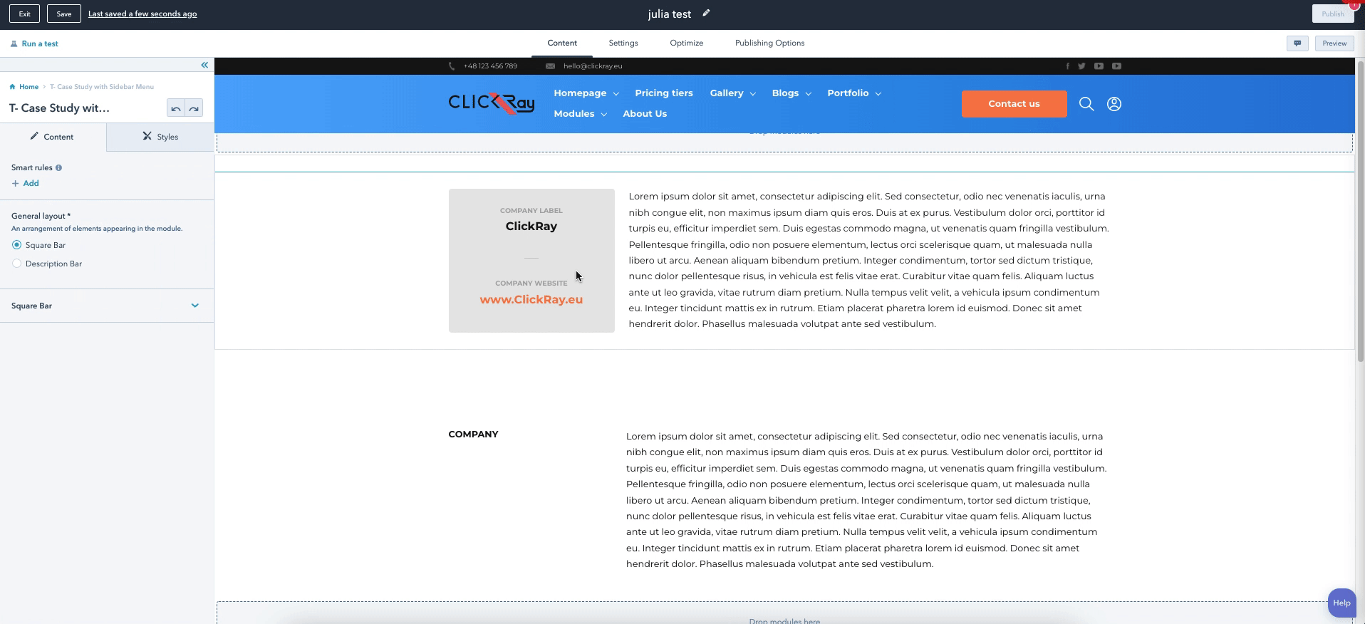
The T- Case Study with Sidebar Menu is a text-based module consisting of two different variations. Both of them have the same layout: a square box on the left and a rectangular box on the right. While the module was designed in mind of presenting your company’s case studies, it can also be used for presenting any other content, which you want to divide into sections (this can be done by changing the label text in the square box).
- Use two module variations.
- Customize the labels to your specific content.
- Create a section by stacking as many modules as you need.
> CONTENT
General layout
Choose the layout of the module between the two variations: Square Bar and Description Bar. Below, you will find more details about what is included in each.
Square Bar (if chosen Square Bar in the General layout)
In the Square Bar variation, you can define the labels appearing above the detailed content in the square box on the left side (as well as define the detailed content below). This gives you the freedom of versatility. As a placeholder text, we defined the label texts as Company name and website however you can customize it to your needs. You can also link the detailed text to an internal or external page. In the last rich text box, Description, you can input the text that will appear on the right.
HubSpot Knowledge Base
Learn more about editing content in a rich text here.
Description Bar (if chosen Description Bar in the General layout)
The Description Bar works similarly to the Square Bar, however it only features one text box label without detailed content below it. If you are using this module for a case study, you can use this variation to list your project goals or outcomes. If you want to present details of your products or services, you can e.g., list additional information.
Overlays
You can choose the top and bottom overlays of the module. Overlay is our unique frame design on the borders of the module. From the dropdown menu, choose between straight, straight reverse, wave, or wave reverse (and round for bottom overlay) designs to up your website design game.
See Overlays section under The Basics in the TURBO Documentation for more information on the use of overlays.
> STYLES
Module settings
In the Module settings, you can determine the background color (with opacity) and margins of the entire module module.
The larger the margin, the more space there will be above the module (top) and below the module (bottom).
Container settings
In the Container settings, you can determine the background color (with opacity) as well as the margins and paddings of the container (the label and the content boxes together).
The larger the margin, the more space there will be above the container (top); below the container (bottom); on the left side of the container (left); and on the right side of the container (right).
The larger the padding, the more space there will be between the upper module border and the container (top); the lower module border and the container (bottom); the left module border and the container (left); and the right module border and the container (right).
Square Bar (if chosen Square Bar in the General layout)
In the Square Bar settings, you can determine the background color (and opacity) of the details box on the left side of the Square Bar as well as of the description content box on the right side of the Square Bar.
Moreover, you can also define the margins and paddings both for the details box and the description content box of the Square Bar.
The larger the Square margin, the more space there will be above the square (top); below the square (bottom); on the left side of the square (left); and on the right side of the square (right).
The larger the Square padding, the more space there will be between the text and the top border of the square (top); between the text and the bottom border of the square (bottom); between the text and the left side of the square (left); and between the text and the right side of the square (right).
The larger the Content margin, the more space there will be above the description text on the right (top); below the text (bottom); on the left side of the text (left); and on the right side of the text (right).
The larger the Content padding, the more space there will be between the text and the top border of the module (top); between the text and the bottom border of the module (bottom); between the text and the left side of the module (left); and between the text and the right side of the module (right).*
*The difference between the Content margin and padding is clearly visible when the Content background color is different from the background color of the module or the page.
Description Bar (if chosen Description Bar in the General layout)
In the Description Bar settings, you can determine the background color (and opacity) of the label box on the left side of the Description Bar as well as of the description content box on the right side of the Description Bar.
Moreover, you can also define the margins and paddings both for the label box and the description content box of the Description Bar (similarly to the Square Bar functionality).
Overlays
Here, you can define the color and opacity of the both top and bottom overlays.
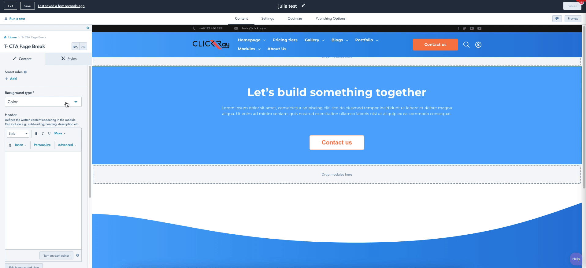
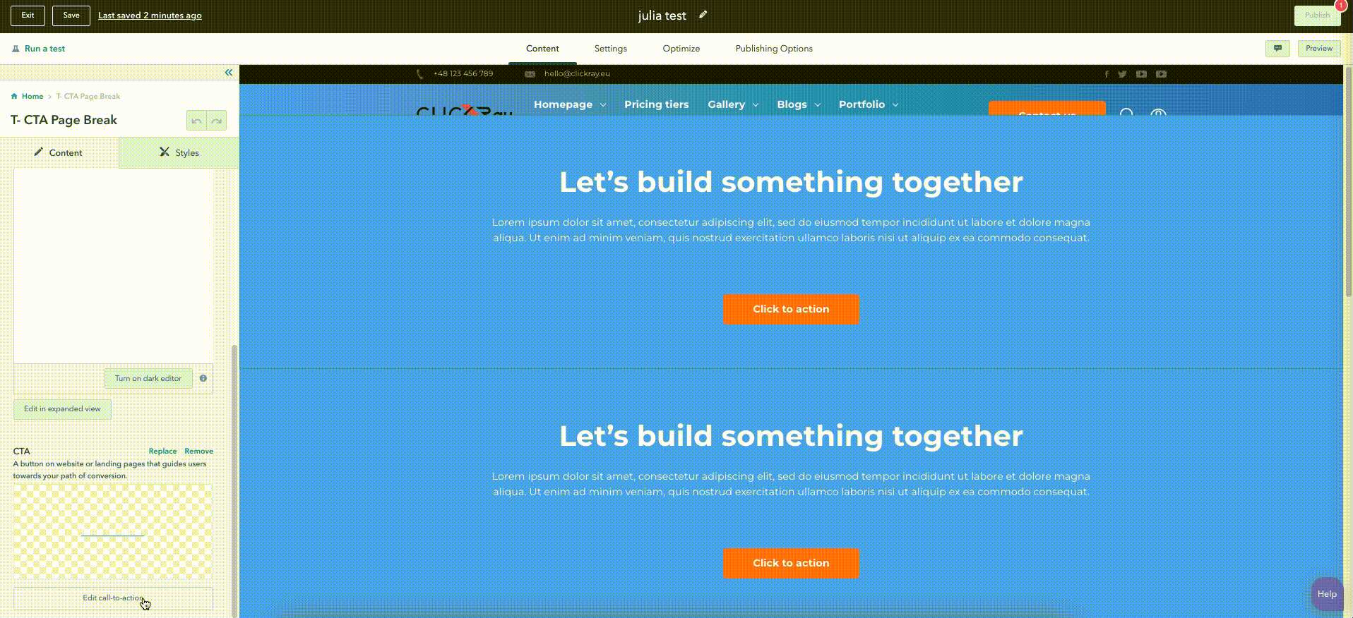
The T- CTA Page Break module is used to insert a powerful message with a CTA within your conversion flywheel. It also can be utilized to provide a break between the other content on the page.
- Choose a module background between a solid color, image, or an image with a gradient.
- Define background gradient color and style.
- Design the CTA.
ClickRay’s Tip
Because your website should not be “just a business card” of your company, planning the journey through which your visitor goes on your website is extremely important for the visitor-to-customer conversion process. That means, that the main purpose of your website should be to attract, engage, and delight your visitors so that they become your customers. HubSpot came up with a Flywheel Concept, which will help you understand and define through the buyer’s journey on your website and beyond (and here comes the HubSpot CRM). Check out our blog post to learn more about the benefits of integrating both HubSpot CMS and CRM together and learn more about the ugly truth of Franeksystems in this blog post.
> CONTENT
Header
Using the rich text box, you can write a powerful message to guide your visitors to get in touch with you.
HubSpot Knowledge Base
Learn more about editing content in a rich text here.
Background type
From a dropdown menu, choose a module background between a solid color, image, or an image with a gradient. The color and gradient can be defined in the STYLES section of the module. If you choose to add an image to your background, an image field will appear under the dropdown menu, into which you can insert the image.
HubSpot Knowledge Base
Learn more about inserting images or videos to your modules here (by scrolling down to the “Edit an image in an image module” section).
CTA
Call your visitors to action with a button that appears below the Header text.
See CTA under the Theme Settings section in the TURBO Documentation on how to edit the CTA button.
Overlays
You can choose the top and bottom overlays of the module. Overlay is our unique frame design on the borders of the module. From the dropdown menu, choose between straight, straight reverse, wave, or wave reverse (and round for bottom overlay) designs to up your website design game.
See Overlays section under The Basics in the TURBO Documentation for more information on the use of overlays.
> STYLES
Height
This functionality lets you determine the height of the module. This will also change the height of the background image, if applicable. The larger the height, the bigger the module will appear.
Color (if chosen Color as the Background type)
Here, you can determine the background color (with opacity) of the module.
Gradient (if chosen Image with gradient as the Background style)
Here, you can determine the color gradient (with opacity) of the module.
Container settings
Here, you can determine the module margins.
The larger the container margin, the more space there will be above the upper border of the module (top); and below the bottom border of the module (bottom).
Content settings
Here, can change the maximum width of the description text content (i.e., text set as paragraph style in the Header).* The larger the width, the more space the text will contain within the module.
*If text in the Header is set as H1 / H2 etc., this text will not change.
Header settings
Here, you can determine the Header padding.
The larger the padding, the more space there will be between the Header and the top border of the module.
CTA settings
In the CTA settings, you can determine the CTA padding.
The larger the padding, the more space there will be between the CTA and Header (top); and the CTA and the bottom border of the module (bottom).
Overlays
Here, you can define the color and opacity of the both top and bottom overlays.
T- Documentation with Select Dropdown
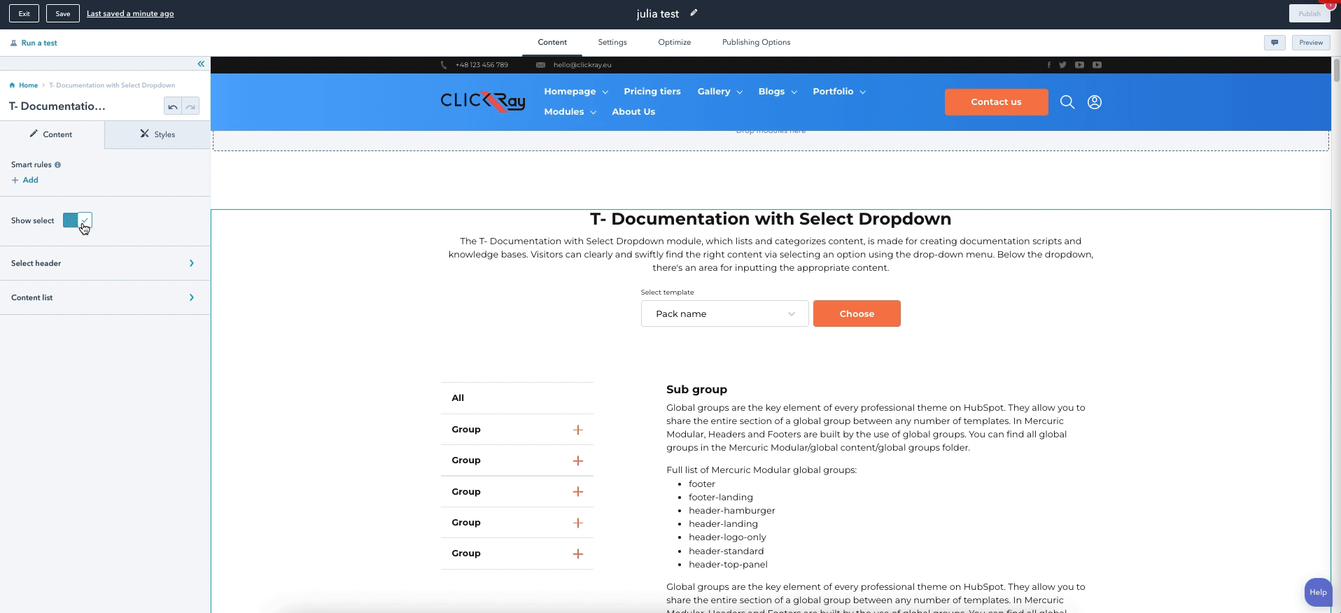
The T- Documentation with Select Dropdown module, which lists and categorizes content, is made for creating documentation scripts and knowledge bases. Visitors can clearly and swiftly find the right content via selecting an option using the drop-down menu. Below the dropdown, there's an area for inputting the appropriate content.
- Define the drop-down menu and button text.
- List as many documentation sources as you need.
- Choose group categories.
- Add content to the subgroup categories.
> CONTENT
Show select
You can turn on / off the Select header part of the module, which includes the Header as well as the dropdown menu “Select template” with a button. It’s best to turn this function on if you want to list multiple content, therefore the visitors can use the dropdown menu to navigate through the different content.
Select header (if turned on the Show select option)
This part of the module allows you to write the Header text appearing above the dropdown menu and the button.
HubSpot Knowledge Base
Learn more about editing content in a rich text here.
In addition, the Content pack listing allows you to list as many content sources as you need. Link your content source from a Content dropdown menu and define a name for it by adding a new box with the “+ Add” button. If you want to edit, clone, or delete a given listing, hover over one of the items and choose the appropriate icon on the right side.
If you want multiple documentations listed in the dropdown menu, you first need to create a website page for each separate documentation and drag-and-drop this module onto the page. Then, you can attribute the pages to the dropdown menu in the Content pack by selecting a desired documentation page under the Content dropdown menu. You can name the Documentation as it appears on the dropdown menu by defining the Template label.
See the Creating a Page section under The Basics in the TURBO Documentation for a guide on how to create a page.
In addition, you have three text fields to define the following content: text appearing above the dropdown menu (Select label); text appearing on the button (Button label); and text appearing within the Content list to show all of the documentation content on one page (All label).
Content list
Here, you can define the categories and subcategories for your documentation, where you can include your content. For each category, you can define its name and for each subcategory, you can define the title and include the written content. Since it’s a rich text box, you can also include photos, videos, or links etc.
> STYLES
Select header spacing
In the Select header spacing, you can define the margins and paddings both for the Select header part of the module.
The larger the Select header margin, the more space there will be above the text (top); below the dropdown menu (bottom); on the left side of the area (left); and on the right side of the area (right).
The larger the Select header padding, the more space there will be between the text and the top border of the module (top); between the Select header and the Content list (bottom); between the text and the left side of the module (left); and between the text and the right side of the module (right).
Content list spacing
In the Content list spacing, you can define the margins and paddings both for the Content list part of the module.
The larger the Content list margin, the more space there will be above the categories (top); below the content (bottom); on the left side of the area (left); and on the right side of the area (right).
The larger the Content list padding, the more space there will be between the Content list and the Select header or the top border of the module (top); between the Content list and the bottom border of the module (bottom); between the categories and the left side of the module (left); and between the text and the right side of the module (right).
Menu settings
Here, you can define the colors and the opacities of the box background of the categories, the border lines between the categories, as well as the font appearing in the on the menu box.
In addition, you can also set the border radius for the menu box. The larger the border radius, the menu box will show more rounded corners.
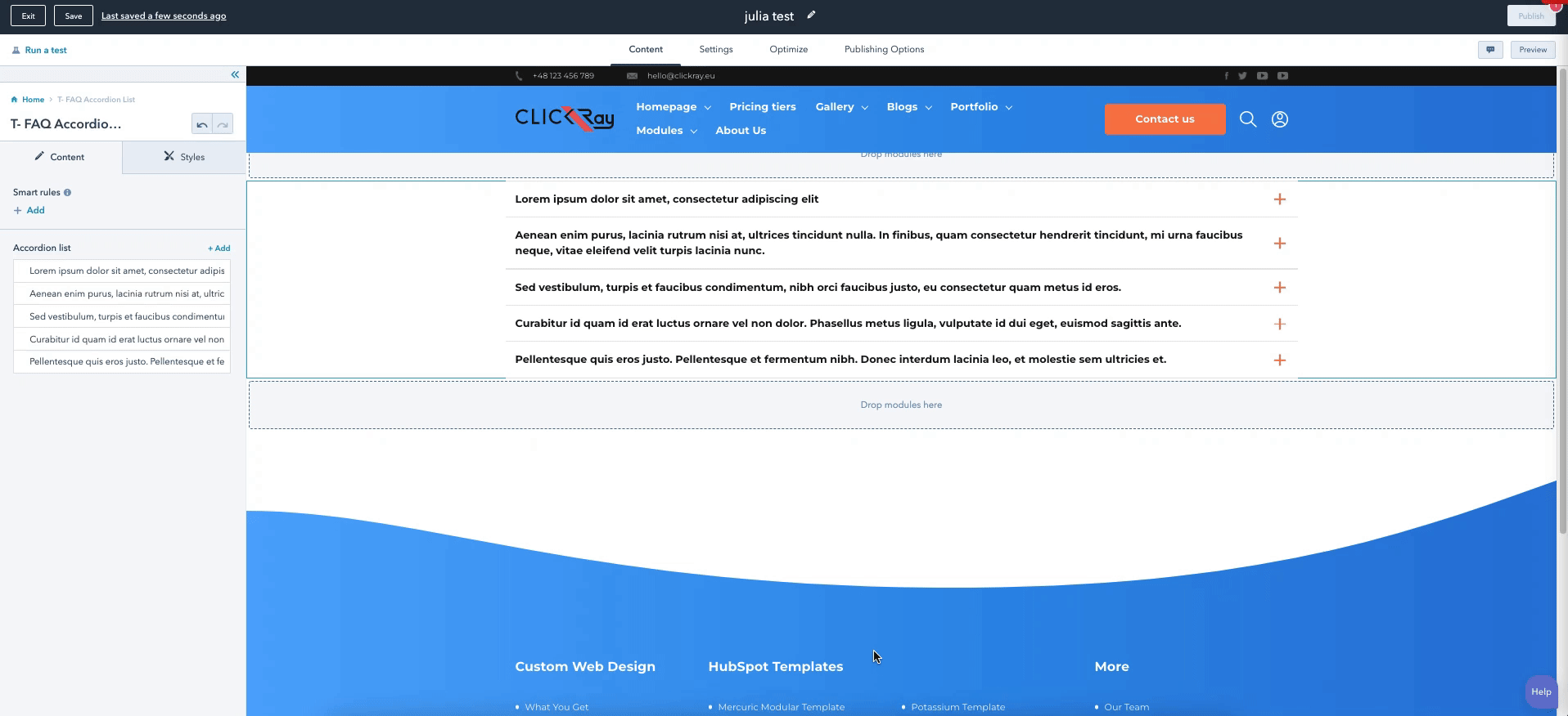
The T- FAQ Accordion List presents an expandable text content. This module can show answers to any questions that the visitor might have, providing them greater detail into your products / services / company information etc.
- List an unlimited number of expandable text content with a heading and description.
> CONTENT
Background type
From the dropdown menu, choose between two background types: Color and Gradient. You can change the background settings in the STYLES section.
Overlays
You can choose the top and bottom overlays of the module. Overlay is our unique frame design on the borders of the module. From the dropdown menu, choose between straight, straight reverse, wave, or wave reverse (and round for bottom overlay) designs to up your website design game.
See Overlays section under The Basics in the TURBO Documentation for more information on the use of overlays.
Accordion list
This option allows you to add as much expandable text content as you need. Add a header and a description text into your list by adding a new box with the “+ Add” button. If you want to edit, clone, or delete a given listing, hover over one of the items and choose the appropriate icon on the right side.
HubSpot Knowledge Base
Learn more about editing content in a rich text here.
> STYLES
Overlays
Here, you can define the color and opacity of the both top and bottom overlays.
Color (If Color chosen in the Background type)
Here, you can define the color and opacity of the module background color.
Moreover, if you switch on the Font color (white) toggle button, the module text (excluding the window pop-up) will appear as white. If it’s turned off, it will appear as black. This setting can be overridden using the rich text boxes for each specific content.
Gradient (If Gradient chosen in the Background type)
Choose the color and opacity of the gradient between two colors as well as determine the gradient direction from a dropdown menu with five options: Horizontal; Vertical; Diagonal (top-bottom); Diagonal (bottom-top); and Radial.
Container margins
In the Container margins, you can define the margins for the module as well as choose the border color (and opacity).
The larger the Container margin, the more space there will be above the list (top) and below the list (bottom).
Content margins
In the Content margins, you can define the margins for the module.
The larger the Content margin, the more space there will be above the list (top) and below the list (bottom).
T- FAQ with Search Function
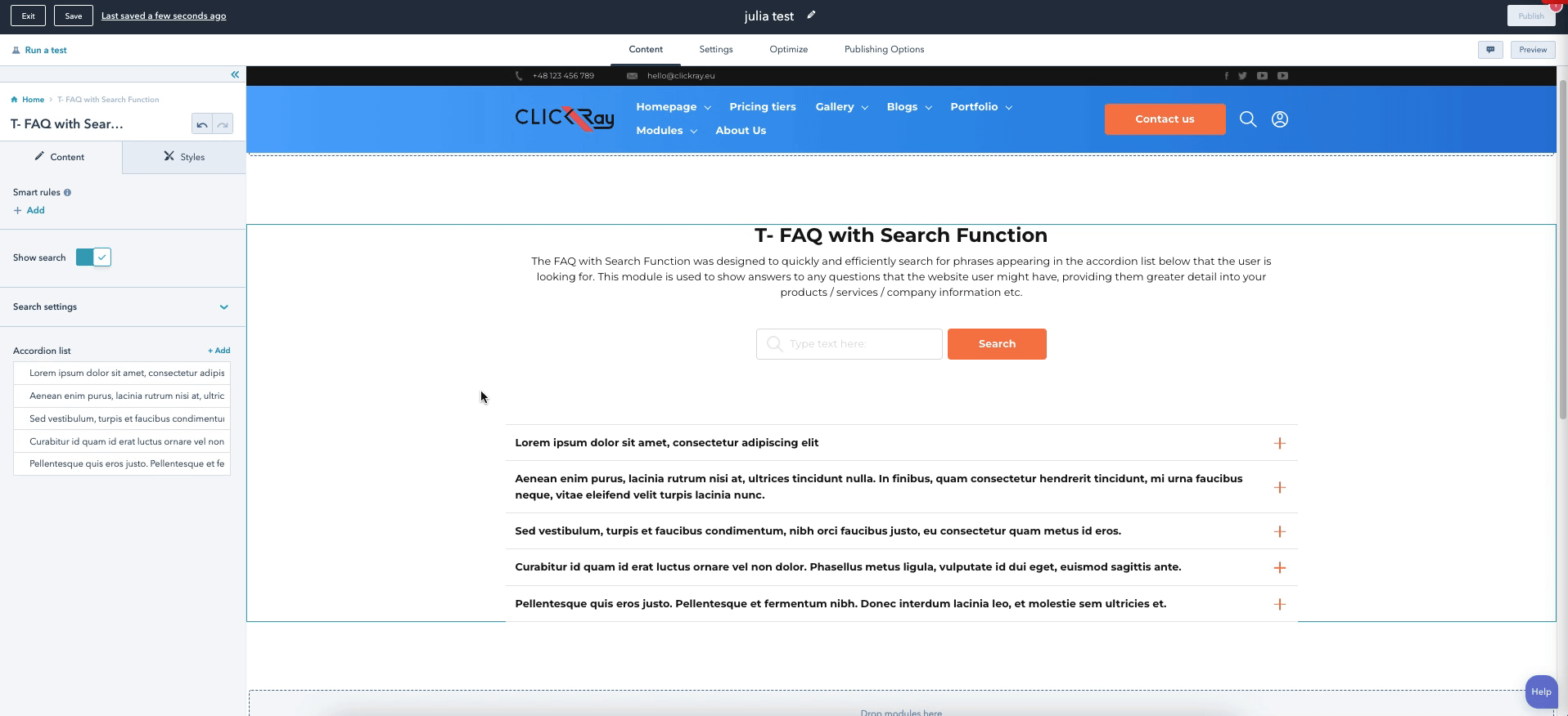
The FAQ with Search Function was designed to quickly and efficiently search for phrases appearing in the accordion list below that the user is looking for. This module is used to show answers to any questions that the website user might have, providing them greater detail into your products / services / company information etc.
- Turn off / on the search button only for the accordion component to remain.
- Define the button text.
- Add a custom icon on the left of the search bar.
- List an unlimited number of expandable text content with a heading and description.
> CONTENT
Background type
From the dropdown menu, choose between two background types: Color and Gradient. You can change the background settings in the STYLES section.
Overlays
You can choose the top and bottom overlays of the module. Overlay is our unique frame design on the borders of the module. From the dropdown menu, choose between straight, straight reverse, wave, or wave reverse (and round for bottom overlay) designs to up your website design game.
See Overlays section under The Basics in the TURBO Documentation for more information on the use of overlays.
Show search
If you turn on the Show search function, the Search part of the module will appear (i.e. header, search bar, and button). You can define the content for the Search part in the Search settings below.
Search settings
Here, you can add the Header text appearing above the search bar, define the search and button labels, as well as input an icon to show up within the search bar.
HubSpot Knowledge Base
Learn more about editing content in a rich text here.
Accordion list
Same as in the T- FAQ Accordion List, this option allows you to add as much expandable text content as you need. Add a header and a description text into your list by adding a new box with the “+ Add” button. If you want to edit, clone, or delete a given listing, hover over one of the items and choose the appropriate icon on the right side.
HubSpot Knowledge Base
Learn more about inserting images or videos to your modules here (by scrolling down to the “Edit an image in an image module” section).
> STYLES
Search settings
In the Search settings, you can define the margins for the search part of the module (header, search bar, and button).
The larger the Container margin, the more space there will be above the search part and the (top); and between the search part and the accordion list (bottom).
Accordion settings
In the Accordion settings, you can define the margins for the accordion list.
The larger the Container margin, the more space there will be between the dropdown menu and or above the accordion list (top); and below the accordion list (bottom).
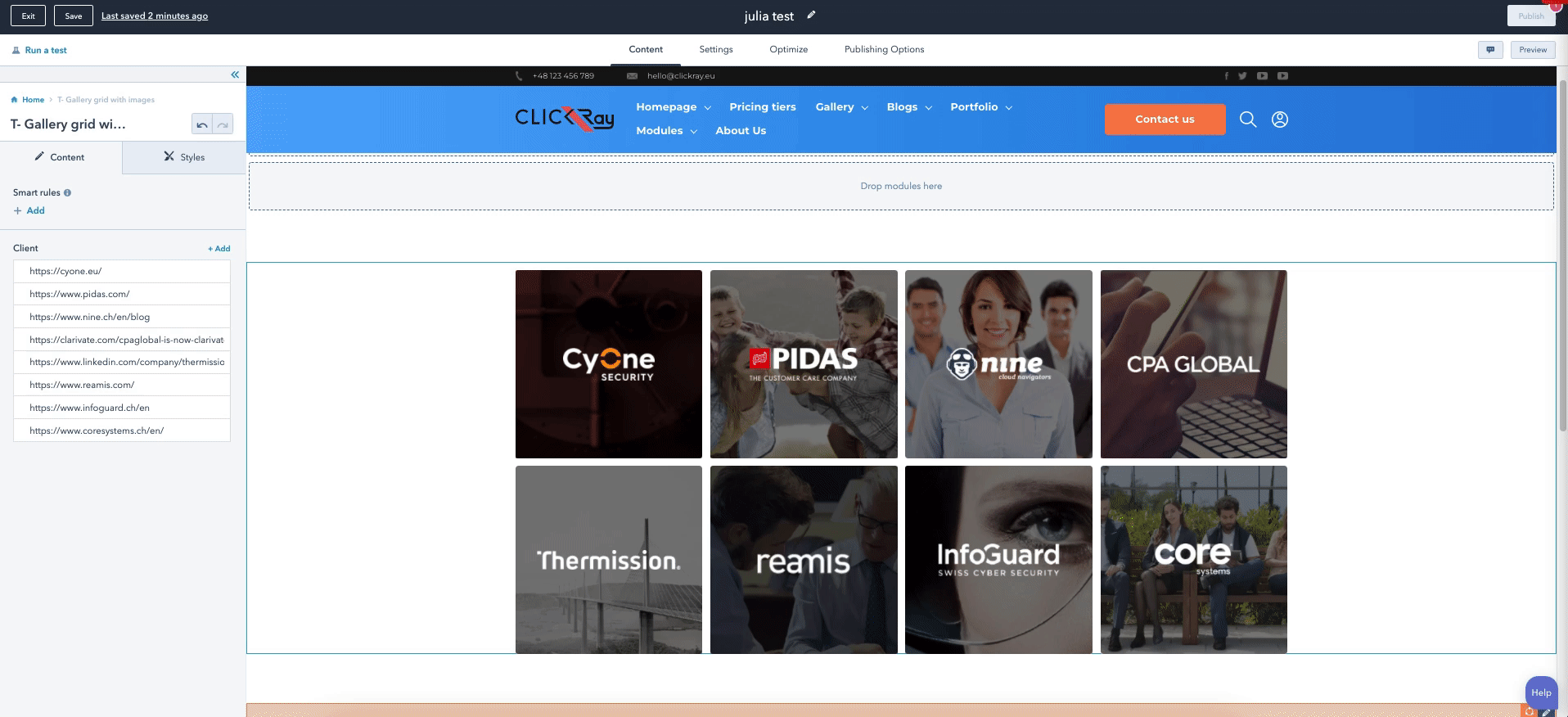
The T- Gallery Grid with Images module uses images, logos, and links for. It was designed in mind for you to showcase your clients and link the grid boxes to specific pages or websites, however it also can be used as a gallery grid to promote your products / services, company culture, or team members. When you add more items to the grid, the gallery boxes will align automatically.
- Add image background.
- Add logos / icons on top of the image backgrounds.
- Link grid boxes to specific pages.
- A hover effect is automatically applied to the individual boxes.
> CONTENT
Background type
From the dropdown menu, choose between two background types: Color and Gradient. You can change the background settings in the STYLES section.
Client
This option allows you to add as many boxes as you need in the grid. Add a background image and a logo into your gallery by adding a new box with “+ Add” button. If you want to edit, clone, or delete a given listing, hover over one of the items and choose the appropriate icon on the right side. Here, you can also link each gallery box to an internal or external page.
HubSpot Knowledge Base
Learn more about inserting images or videos to your modules here (by scrolling down to the “Edit an image in an image module” section).
Overlays
You can choose the top and bottom overlays of the module. Overlay is our unique frame design on the borders of the module. From the dropdown menu, choose between straight, straight reverse, wave, or wave reverse (and round for bottom overlay) designs to up your website design game.
See Overlays section under The Basics in the TURBO Documentation for more information on the use of overlays.
> STYLES
Arrangement of elements
From the dropdown menu, you can choose between two layout options. When you have an even number of boxes in a row, this will not make a visual difference. However, if you have an uneven number of boxes in the last row:
Space between - will align the last row to the sides, with more space in between the boxes. When the window size will become smaller, the elements in the last row will be aligned to the sides.
Space around - will align the last row to the center, with more space in around the boxes. When the window size will become smaller, the elements in the last row will be aligned to the center.
Color (If Color chosen in the Background type)
Here, you can define the color and opacity of the module background color.
Moreover, if you switch on the Font color (white) toggle button, the module text (excluding the window pop-up) will appear as white. If it’s turned off, it will appear as black. This setting can be overridden using the rich text boxes for each specific content.
Gradient (If Gradient chosen in the Background type)
Choose the color and opacity of the gradient between two colors as well as determine the gradient direction from a dropdown menu with five options: Horizontal; Vertical; Diagonal (top-bottom); Diagonal (bottom-top); and Radial.
Container settings
In the Container settings, you can define the margins for the module.
The larger the Container margin, the more space there will be above the module (top) and below the module (bottom).
Overlays
Here, you can define the color and opacity of the both top and bottom overlays.
Items settings
In the Item settings, you can define the spacing between the rows as well as the height of the gallery boxes. In addition, you can also choose the color and opacity of the mask and hover over the image.
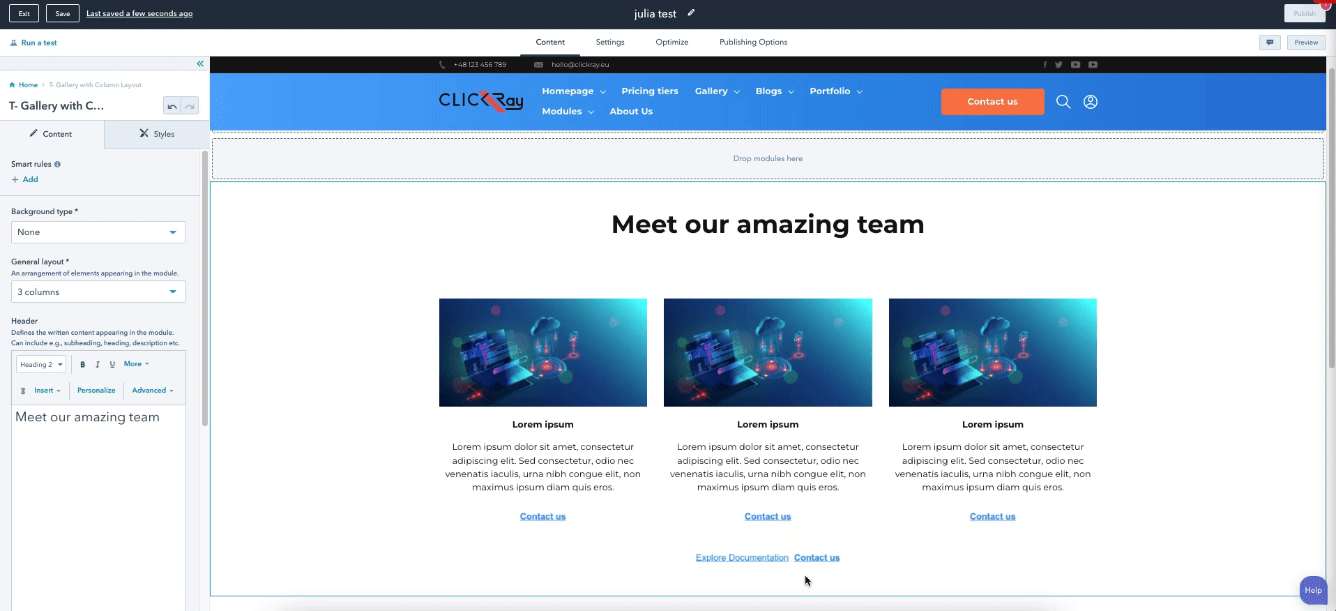
The T- Gallery with Column Layout is a variation of a gallery module with a row layout. Have a smaller team, so there's no need to group them into departments? Or do you want to list your products / services with short descriptions and links to the appropriate pages? We've got you!
- Choose a background type between a color and a gradient.
- Choose between wave and straight (top and bottom) overlay designs.
- List as many items as you need with linked buttons.
- Add one general CTA under the entire content.
> CONTENT
Background type
From a dropdown menu, choose a module background between a solid color or gradient. The color and gradient can be defined in the STYLES section of the module.
General layout
Choose the layout of the module between one (1) to six (6) columns in a row. For either of these elements, the text will appear below the image. You can have a smaller number of items in the module than columns e.g., if you have three items and you choose the 6 column layout, you will see that the content will become smaller.
Header
Using the rich text box, you can write a compelling message for presenting the content below.
HubSpot Knowledge Base
Learn more about editing content in a rich text here.
Card list
This option allows you to list your content into separate items with a description text, image, and a CTA. Simply add a new box with the “+ Add” button. If you want to edit, clone, or delete a given listing, hover over one of the items and choose the appropriate icon on the right side.
HubSpot Knowledge Base
Learn more about inserting images or videos to your modules here (by scrolling down to the “Edit an image in an image module” section).
Besides adding the CTA, you can also align its position using the CTA position dropdown menu.
See CTA under the Theme Settings section in the TURBO Documentation on how to edit the CTA button.
CTA
Call your visitors to action with a button (or two!) that appear(s) below the grid.
See CTA under the Theme Settings section in the TURBO Documentation on how to edit the CTA button.
Overlays
This is where it gets interesting. You can choose the top and bottom overlays of the module. Overlay is our unique frame design on the borders of the module. From the dropdown menu, choose between straight, straight reverse, wave, or wave reverse designs to up your website design game.
See Overlays section under The Basics in the TURBO Documentation for more information on the use of overlays.
> STYLES
Container settings
In the Container settings, you can define the paddings for the module.
The larger the Container padding, the more space there will be between the content and the module top border (top) and between the content and the module bottom border (bottom).
Card list settings
In the Card list settings, you can define the margins for the card list.
The larger the Card list margins, the more space there will be between the Card list and Header (top) and between the Card list and the CTAs (bottom).
Overlays
Here, you can define the color and opacity of the both top and bottom overlays.
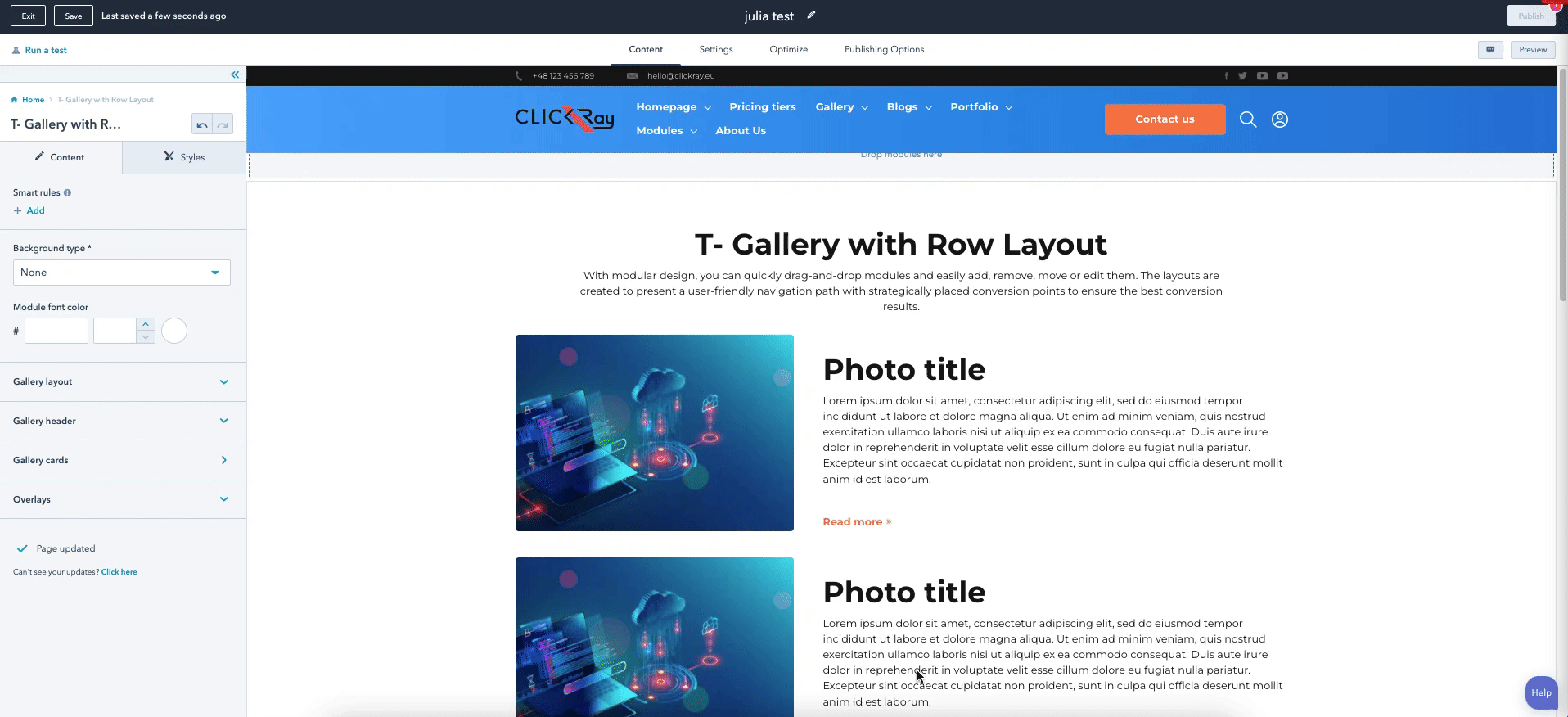
A variation of the column gallery module, this T- Gallery with Row Layout module is made to present a row layout with images, text, and text links for your product / services.
-Select a gallery layout (one, two, or four images in a row).
- Unlimited potential of listing as many items as you need.
- Choose between wave and straight overlay designs.
> CONTENT
Background type
From a dropdown menu, choose a module background between a solid color or gradient. The color and gradient can be defined in the STYLES section of the module.
Module font color
Change the color and opacity of the fonts throughout the entire module. You can overwrite these settings for separate texts by changing the Header font color in the rich text box of the Gallery cards.
Gallery layout
From a dropdown menu, choose the layout of one (1), two (2), or four (4) items in a row. When the window size is minimized, the module will present in a 1 card in a row layout.
Gallery header
Using the rich text box, you can write a compelling message for presenting the content below. You can choose to show / hide the Header by switching the toggle button.
HubSpot Knowledge Base
Learn more about editing content in a rich text here.
Gallery cards
This option allows you to list your content into separate items with a description text, image, and a text link. Simply add a new box with the “+ Add” button. If you want to edit, clone, or delete a given listing, hover over one of the items and choose the appropriate icon on the right side.
Besides adding the text link, you can also add an icon image appearing on the right side of the text link.
HubSpot Knowledge Base
Learn more about inserting images or videos to your modules here (by scrolling down to the “Edit an image in an image module” section).
Overlays
You can choose the top and bottom overlays of the module. Overlay is our unique frame design on the borders of the module. From the dropdown menu, choose between straight, straight reverse, wave, or wave reverse designs to up your website design game.
See Overlays section under The Basics in the TURBO Documentation for more information on the use of overlays.
> STYLES
Container settings
In the Container settings, you can define the paddings for the module.
The larger the Container padding, the more space there will be between the content and the module top border (top) and between the content and the module bottom border (bottom).
Card settings
In the Card list settings, you can define the item spacing, text alignment, as well as shadow, border radius, and hover effect.
The larger the item spacing, the more space there will be between the rows.
Using a dropdown menu, you can choose to align the text to the left, center or right for all of the cards at once.
In addition, you can add a shadow under the boxes and turn on the hover scale effect (change the hover color mask), and add a border radius to the image.
Overlays
Here, you can define the color and opacity of the both top and bottom overlays.
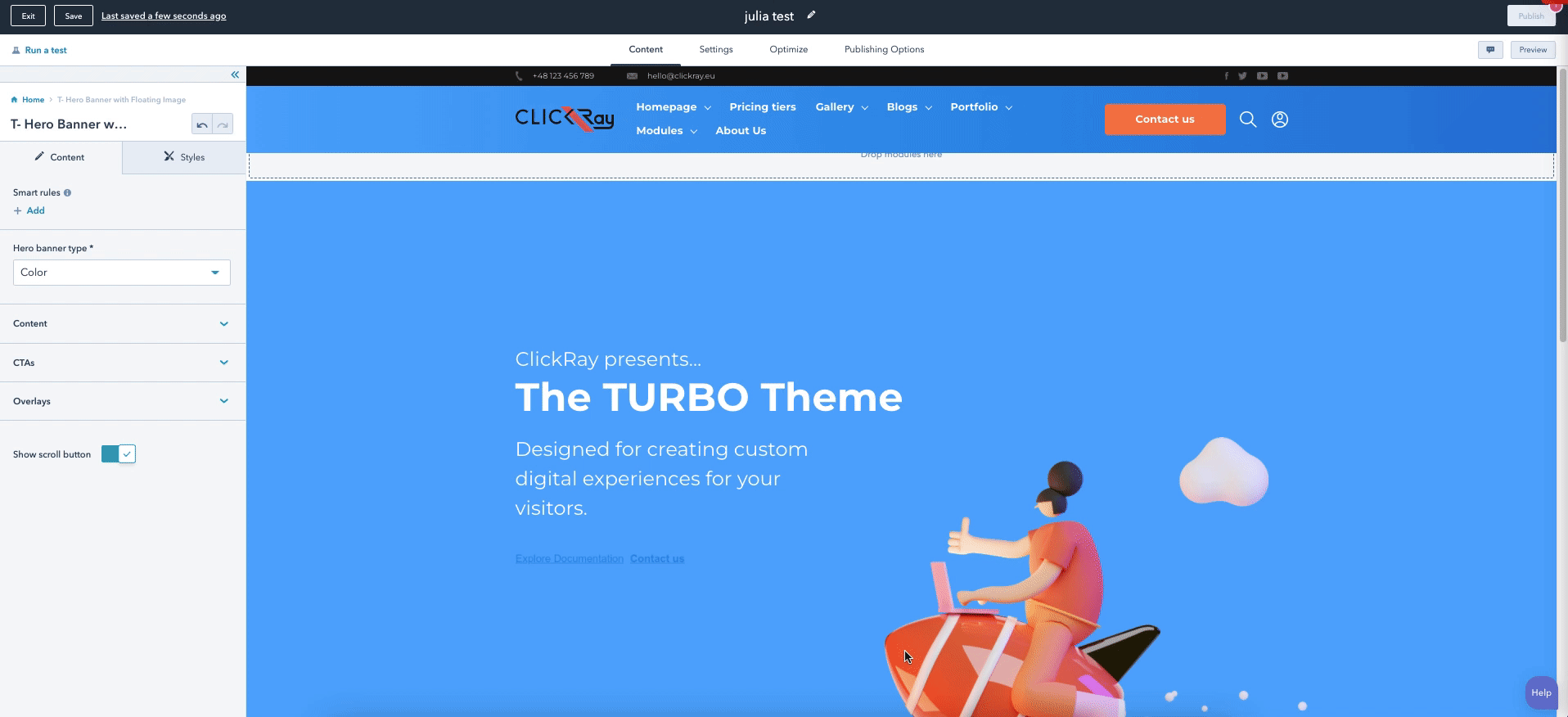
The T- Hero Banner with Floating Image module is the first thing you see on the home page, and therefore the most important. We bring you a fresh design that will catch the eyes of your visitors with CTAs that will lead them through your conversion path.
- Select a banner from a variety of types (color, gradient, image or video).
- Choose between wave and straight (top and bottom) overlay designs.
- Add a floating image.
- Show / hide scroll button.
> CONTENT
Hero banner type
From a dropdown menu, choose the hero banner type between color, gradient, gradient, image or video. The color and gradient can be defined in the STYLES section of the module, while the image and video can be added in the sections below.
Image (if chosen Image as the Hero banner type)
Add an image to the background of your hero banner.
HubSpot Knowledge Base
Learn more about inserting images or videos to your modules here (by scrolling down to the “Edit an image in an image module” section).
Video (if chosen Video as the Hero banner type)
Add an on-loop video to the background of your hero banner.
Content
Here, you can edit your Hero banner text as well as add a floating image to your banner. You can choose to show or hide the floating image with a “Show image” toggle switch.
If the switch is turned off, an additional function for Hero banner text alignment will appear. From the dropdown menu, you can choose to align the text to left, center or right.
See Floating Images under The Basics section in the TURBO Documentation to learn more about the functionality of floating images.
HubSpot Knowledge Base
Learn more about editing content in a rich text here.
CTAs
Call your visitors to action with a button (or two!).
See CTA under the Theme Settings section in the TURBO Documentation on how to edit the CTA button.
Overlays
You can choose the top and bottom overlays of the module. Overlay is our unique frame design on the borders of the module. From the dropdown menu, choose between straight, straight reverse, wave, or wave reverse designs to up your website design game.
See Overlays section under The Basics in the TURBO Documentation for more information on the use of overlays.
Show scroll button
You can choose to show or hide the scroll button in the bottom border of the hero button with a toggle switch. The scroll button can be edited in the STYLES section.
> STYLES
Container settings
Here, you can adjust the hero banner height and the text padding.
The larger the Hero banner height, the larger the background.
The larger the Hero banner text padding, the more space there will be between the top border of the module and the text (top) and more space there will be between the bottom border of the module and the text (bottom).
Color (if chosen Color as the Hero banner type)
Choose the color and opacity of the background.
Gradient (if chosen Gradient as the Hero banner type)
Choose the color and opacity of the gradient between two colors as well as determine the gradient direction from a dropdown menu with five options: Horizontal; Vertical; Diagonal (top-bottom); Diagonal (bottom-top); and Radial.
Image (if chosen Image as the Hero banner type)
Choose the background color and opacity of the color mask over the image. In addition, from dropdown menus, you can choose the Background size; Background position (center, top, bottom, left, or right); or Background repeat (horizontally or vertically).
Note that these three options, background size, position, and repeat, are dependent upon each other. For example, if you choose the Background position as Top and Background repeat as Vertically, you will see that the image will begin from the upper margin of the module. However, if you choose the Background position as Center, you will see that the image will repeat from the Center, and extend the repeat on top and bottom (possibly cutting the top and bottom repeated images slightly). This functionality is very versatile and therefore you have the power to choose whatever fits your design best.
Video (if chosen Video as the Hero banner type)
Choose the background color and opacity of the color mask over the video as well as determine the video size from a dropdown menu (Cover or Contain), similarly to the Image section of the module.
Overlays
Here, you can define the color and opacity of the both top and bottom overlays.
Scroll button
Add images for the scroll button and a direction arrow, if desired.
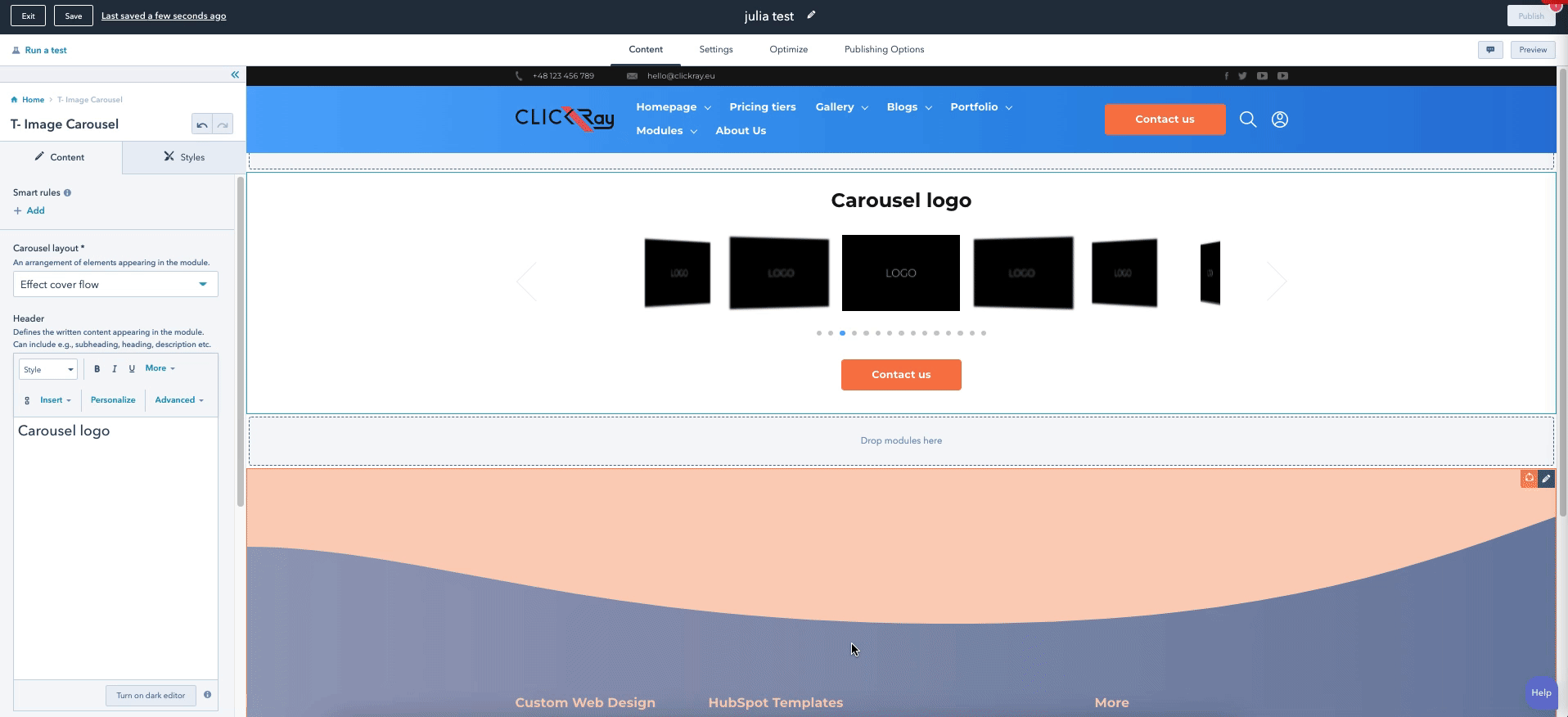
Use the T- Image Carousel module for displaying images of products or client logos.
- Add as many images / logos as you want.
- Add a CTA below the carousel.
> CONTENT
Background type
From a dropdown menu, choose a module background between a solid color or gradient. The color and gradient can be defined in the STYLES section of the module.
Carousel layout
From a dropdown menu, choose one of the following five options:
Header
Using the rich text box, you can write a compelling message for presenting the content below.
HubSpot Knowledge Base
Learn more about editing content in a rich text here.
Slide list
This option allows you to add as many slides as you need. Add a slide logo or image by adding a new box with the “+ Add” button. If you want to edit, clone, or delete a given listing, hover over one of the items and choose the appropriate icon on the right side.
HubSpot Knowledge Base
Learn more about inserting images or videos to your modules here (by scrolling down to the “Edit an image in an image module” section).
Carousel CTA
Call your visitors to action with a button that appears below the carousel.
See CTA under the Theme Settings section in the TURBO Documentation on how to edit the CTA button.
Carousel settings
These settings include a lot of functionalities. Here, you can turn on / off carousel autoplay mode, select a number of slides appearing in a row, or set the duration of transitions between the slides for autoplay (the higher the number, the more time there will be between the slides).
Moreover, you can use the toggle switches to turn on / off the ability to change the slides with a mouse wheel; show pagination and arrow navigation; or enable the zoom slide effect (which zooms into the slide when hovered / click on). Lastly, you can determine on which slide the carousel begins with a “Start from slide” function.
Overlays
You can choose the top and bottom overlays of the module. Overlay is our unique frame design on the borders of the module. From the dropdown menu, choose between straight, straight reverse, wave, or wave reverse (and round for bottom overlay) designs to up your website design game.
See Overlays section under The Basics in the TURBO Documentation for more information on the use of overlays.
> STYLES
Container settings
Here, you can change the color and opacity of the module background as well as the module paddings.
The larger the Container padding, the more space there will be between the top border of the module and the content (top) and more space there will be between the bottom border of the module and the content (bottom).
Arrow settings
In this section, you can control the alignment of the arrows from the upper margin of the module as well as change the color and opacity of the arrows.
Pagination settings
Here, you can control the pagination padding as well as the spacing between the paginations and the color (and opacity) of the dotted pagination.
The larger the Pagination padding, the more space there will be between the carousel and the pagination (top) and more space there will be between the CTA or the bottom border of the module and the pagination (bottom).
The larger the spacing between the pagination, the more space there will be between the dots.
Color (If Color chosen in the Background type)
Here, you can define the color and opacity of the module background color.
Gradient (If Gradient chosen in the Background type)
Choose the color and opacity of the gradient between two colors as well as determine the gradient direction from a dropdown menu with five options: Horizontal; Vertical; Diagonal (top-bottom); Diagonal (bottom-top); and Radial.
Overlays
Here, you can define the color and opacity of the both top and bottom overlays.
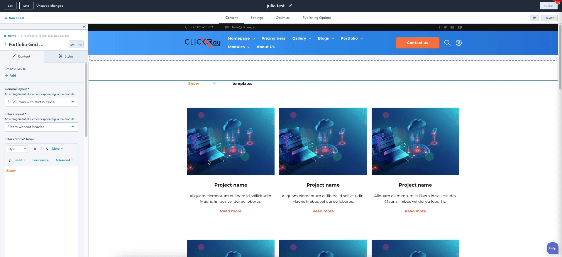
Show off your work with the T- Portfolio Grid with Masonry Layout module. The animated grid will catch the attention of your visitors. This highly versatile module can act as a picture gallery of your work or a case study listing.
- Choose module layout (column grid or masonry view).
- Categorize products / services using filters.
- Customize content with projects and link each project to a separate page.
> CONTENT
Background type
From the dropdown menu, choose between two background types: Color and Gradient. You can change the background settings in the STYLES section.
General layout
From a dropdown menu, choose one of the following five options:
4 Columns with text - a four (4) column layout with text below the image.
3 Columns with text - a three (3) column layout with text below the image.
4 Columns without text inside - a four (4) column layout with text inside the image (with hover effect).
3 Columns without text inside - a three (3) column layout with text inside the image (with hover effect).
Masonry - a 4 column grid layout with elements of different height and width.*
*If you select the Masonry layout, the on-page view will look different than the actual view.
Filters layout
From a dropdown menu, choose one of the following four options:
Filters with border - shows a filter section above the gallery grid with a border over filters.
Filters without border - shows a filter section above the gallery grid without a border over filters, however shows an active category as bolded.
Filters with active bottom border - shows a filter section above the gallery grid with an active bottom border.
Filters with dropdown menu - shows the filters as a dropdown menu on the upper left corner.
Project list
This option allows you to add as many projects to the gallery as you need. Add a project name, filter group, description text, button text (with a link), and an image to your box by adding a new box with the “+ Add” button. If you want to edit, clone, or delete a given listing, hover over one of the items and choose the appropriate icon on the right side.
HubSpot Knowledge Base
Learn more about editing content in a rich text here.
HubSpot Knowledge Base
Learn more about inserting images or videos to your modules here (by scrolling down to the “Edit an image in an image module” section).
Overlays
You can choose the top and bottom overlays of the module. Overlay is our unique frame design on the borders of the module. From the dropdown menu, choose between straight, straight reverse, wave, or wave reverse (and round for bottom overlay) designs to up your website design game.
See Overlays section under The Basics in the TURBO Documentation for more information on the use of overlays.
> STYLES
Read more button color
Choose the color and opacity of the text links appearing below each box (or within one), all with just one click.
Text inside image settings
Here, you can set the transition time of the gradient hover effect, the image height, spacing between the images, as well as margins and paddings for the text content.
The larger the Transition time, the longer it will take for the image to transition into the gradient when hovered over.
The larger the Project name padding (bottom), the larger the space between the project name and description.
The larger the Text content margin (bottom), the larger the space between the text content (inclusive of the button) and the bottom border of the image.
The larger the Description padding (bottom), the larger the space between the description and the button.
Text outside image settings
Similarly to the Text inside image settings, you can set the image height, spacing between the projects, as well as margins and paddings for the text content.
The larger the Project name padding (bottom), the larger the space between the project name and description.
The larger the Text content margin (top), the larger the space between the image and the text content.
The larger the Description padding (bottom), the larger the space between the description and the button.
Gradient (for Text inside and Masonry)
Here, you can determine the color gradient (with opacity) of the boxes for text inside the image and masonry layouts.
Overlays
Here, you can define the color and opacity of the both top and bottom overlays.
Color (If Color chosen in the Background type)
Here, you can define the color and opacity of the module background color.
Gradient (If Gradient chosen in the Background type)
Choose the color and opacity of the gradient between two colors as well as determine the gradient direction from a dropdown menu with five options: Horizontal; Vertical; Diagonal (top-bottom); Diagonal (bottom-top); and Radial.
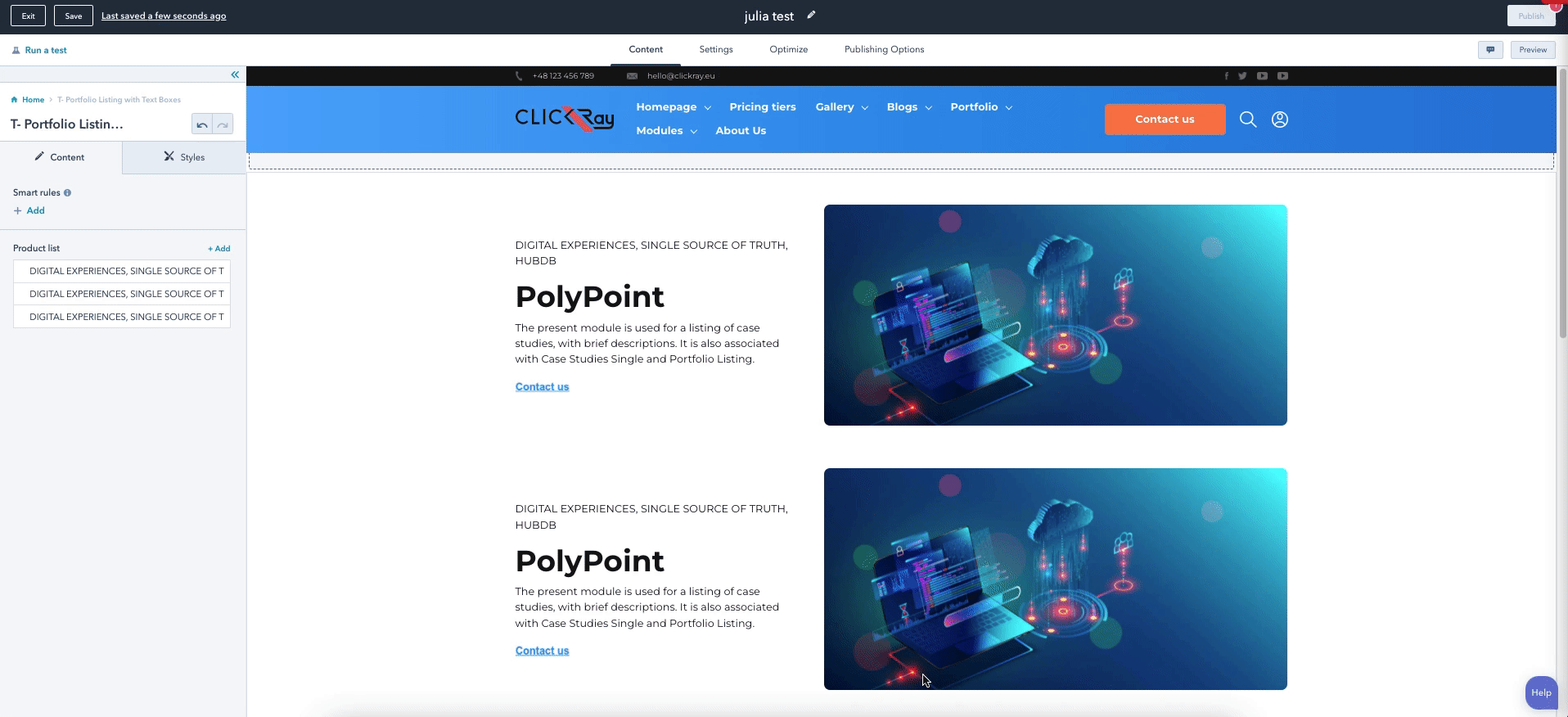
Different from the Portfolio Grid, this T- Portfolio Listing with Text Boxes module is designed to present a listing (rather than a grid-style layout) of your products / services, complemented with tags, and custom buttons.
- Add images of your products.
- Flip module layout (Left / Right).
- Choose text and image proportions.
- Add product tags.
- Link custom buttons to product pages.
> CONTENT
Product list
This option allows you to add as many boxes as you need. Add a description text and image into your box by adding a new box with the “+ Add” button. If you want to edit, clone, or delete a given listing, hover over one of the items and choose the appropriate icon on the right side.
HubSpot Knowledge Base
Learn more about editing content in a rich text here.
HubSpot Knowledge Base`
Learn more about inserting images or videos to your modules here (by scrolling down to the “Edit an image in an image module” section).
Product layout settings
From dropdown menus, you can choose the box layout as well as its propositions and the alignment of the text inside the box. In addition, you can choose the background color of the text field and its opacity.
Layout (Text / Image) - text appearing on the left; image agrappearing on the right.
Layout (Image / Text) - image appearing on the left; text appearing on the right.
Layout proportions (Text 50% / Image 50%) - text and image fields being the same width.
Layout proportions (Text 40% / Image 60%) - image field larger than the text field.
Layout proportions (Text 60% / Image 40%) - text field larger than the image field.
Text box settings
Here, you can determine the text paddings as well as add a CTA in the given box.
The larger the text box padding, the larger the space above the text (top); the larger the space below the text (bottom); the larger the space on the left border of the module or image, depending on the box alignment (left); the larger the space on the right border of the module or image (right).
Note that the text paddings are dependent upon the box layout and proportions. For example, if you choose the image to be on the right, the larger the text box padding (right), the larger space between the text and image. If the layout is reversed and the image is on the left, then the larger the text box padding (right), the larger the space between the text and the right border of the module.
Moreover, when the text box paddings are changed, the image height will automatically adjust in accordance with the height of the text box.
To learn how to edit the CTA button, see CTA under the Theme Settings section in the TURBO Documentation.
Background type
From the dropdown menu, choose between two background types: Color and Gradient. You can change the background settings in the STYLES section.
Overlays
You can choose the top and bottom overlays of the module. Overlay is our unique frame design on the borders of the module. From the dropdown menu, choose between straight, straight reverse, wave, or wave reverse (and round for bottom overlay) designs to up your website design game.
See Overlays section under The Basics in the TURBO Documentation for more information on the use of overlays.
> STYLES
Container settings
In the Container settings, you can determine the module paddings as well as the background color of the module (and its opacity).
The larger the Container padding, the larger the space between the first box and the upper module border (top); and the larger the space between the last box and the bottom border of the module (bottom).
Overlays
Here, you can define the color and opacity of the both top and bottom overlays.
Color (If Color chosen in the Background type)
Here, you can define the color and opacity of the module background color.
Gradient (If Gradient chosen in the Background type)
Choose the color and opacity of the gradient between two colors as well as determine the gradient direction from a dropdown menu with five options: Horizontal; Vertical; Diagonal (top-bottom); Diagonal (bottom-top); and Radial.
Product layout settings
In the Product layout settings, you can turn on / off the box shadow, image border radius, and hover scale effect. In addition, you can determine the color (and opacity) of the image mask color (when hovered over) and the spacing between the boxes.
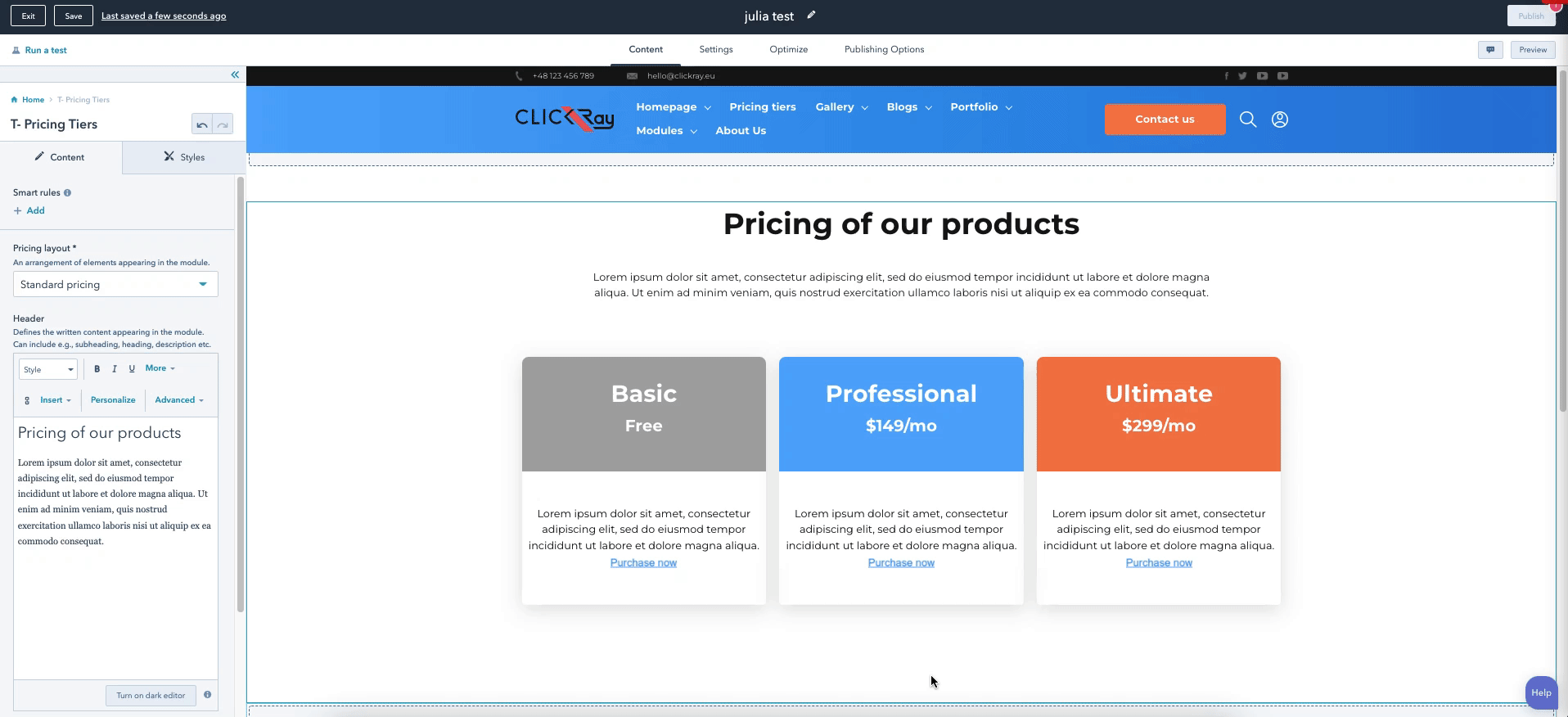
This sales oriented module, the T- Pricing Tiers, will help your visitors understand your pricing tiers in a clear and effective way. The pricing module is used to build trust and stability in your customer relationships because they would be getting the price they can expect, without hidden costs. Here, you can also define recommended pricing using a special header.
- Choose different box layouts.
- Add an unlimited number of pricing tiers.
- Change style settings for all tiers with just one click.
> CONTENT
Pricing layout
Here, you can choose the layout from the dropdown menu between three options: Standard pricing; Pricing with border; and Recommended pricing.
Standard pricing layout presents a pricing tier divided into two parts: a header with a color background, and a description text below with a CTA.
The Pricing with border has the same layout as the Standard pricing but contains a border around each tier.
Recommended pricing, however, presents a different style. Unlike the Standard pricing and the Pricing with border, it is not divided into two parts but rather consists of one unified tier block with a single background color. In addition, it has an extra tab above a specified tier to show “recommended” pricing - the text in the tab is customizable to fit your needs.
Header
Using a rich text box, you can define your own module header, defining the title and the description of the module.
HubSpot Knowledge Base
Learn more about editing content in a rich text here.
Pricing tiers
This option allows you to add as many pricing tiers as you need. Add a tier title, price, and a description, and a CTA (as well as define the custom background color for each tier individually) into your box by adding a new box with the “+ Add” button. If you want to edit, clone, or delete a given listing, hover over one of the items and choose the appropriate icon on the right side.
If you select the Recommended pricing from the Pricing layout dropdown menu, you will be able to highlight a tier with a tab that says “Recommended”. Just switch on the Recommended pricing toggle button (you can also change its tab color). The Recommended layout also gives you an option to change the text font color appearing on each pricing tier (between white and black). If you want a different color, you can overwrite this setting for description text using the rich text box module below.
To learn how to edit the CTA button, see CTA under the Theme Settings section in the TURBO Documentation.
> STYLES
Container settings
Here, you can determine the margins for the module.
The larger the container margin, the larger the space above the module (top); and the larger the space below the module (bottom).
Header settings
Here, you can determine the bottom margin for the module Header.
The larger the Header margin, the larger the space below the module Header (bottom).
Single tier header settings (if chosen Standard pricing / Pricing with border in the Pricing layout)
Here, you can determine the vertical padding for the pricing tier headers.
The larger the vertical padding, the more space there will be between the tier title and the upper and lower borders of its box.
Single tier content settings (if chosen Standard pricing / Pricing with border in the Pricing layout)
Here, you can determine the paddings and margins for the pricing tier headers.
The larger the top margin, the more space there will be between the tier title box and the description below.
The larger the horizontal padding, the more space there will be between the description and the left and right borders of the pricing tier.
Button settings (if chosen Standard pricing / Pricing with border in the Pricing layout)
Here, you can determine the paddings and margins for the CTAs appearing in the pricing tiers.
The larger the top margin, the more space there will be between the description text and the button.
The larger the vertical padding, the more space there will be above and below the description, within the pricing tier box.
The larger the horizontal padding, the more space there will be on the right and left sides of the description, within the pricing tier box.
Pricing tier settings (if chosen Recommended pricing in the Pricing layout)
Here, you can determine the margins and paddings for the pricing tiers.
The larger the pricing padding, the larger the space between the tier title and the upper border of the pricing tier (top); and the larger the space between the CTA and bottom border of the pricing tier (bottom)
The larger the horizontal pricing padding, the more space there will be between the right and left borders of the pricing tiers.
The larger the Recommended margin between tab and tier, the more space there will be between the tab and the pricing tier below it.
Pricing tier content settings (if chosen Recommended pricing in the Pricing layout)
Here, you can determine the margins for the content in the pricing tiers.
The larger the title margin, the more space there will be between the title tier and the description text below.
The larger the description margin, the more space there will be between the description and the price below.
The larger the price margin, the more space there will be between the price and the CTA below.
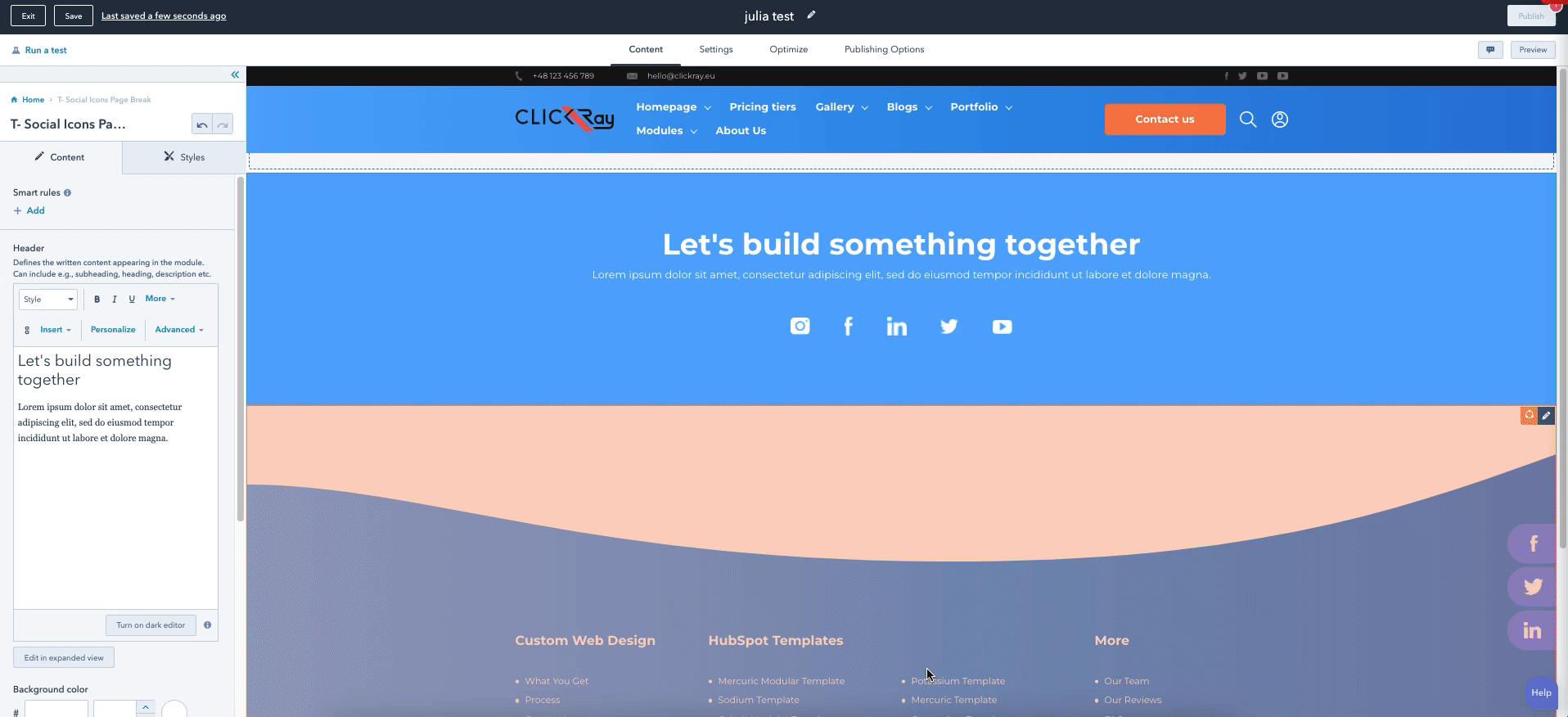
This T- Social Icons Page Break module ideally acts as a page break to illuminate your social networks. Let your visitors connect with your company on multiple platforms for greater exposure.
- List your socials.
- Add a hovering option for the social icons.
> CONTENT
Header
Using a rich text box, you can define your own module header, defining the title and the description of the module.
HubSpot Knowledge Base
Learn more about editing content in a rich text here.
Hover scale effect
By switching on the toggle button, you can turn on a hover scale effect, which creates a subtle rise of the social icons while the cursor is placed over it.
Socials sidebar
If you turn on the toggle switch, the module transforms into a button appearing on the right side of the screen, that when clicked on, expands into a screen to show the module content.
Social links
This option allows you to add as many social links as you need. Add an icon and a URL into your box by adding a new box with the “+ Add” button. If you want to edit, clone, or delete a given listing, hover over one of the items and choose the appropriate icon on the right side.
HubSpot Knowledge Base
Learn more about inserting images or videos to your modules here (by scrolling down to the “Edit an image in an image module” section).
Background type
From the dropdown menu, choose between two background types: Color and Gradient. You can change the background settings in the STYLES section.
Overlays
You can choose the top and bottom overlays of the module. Overlay is our unique frame design on the borders of the module. From the dropdown menu, choose between straight, straight reverse, wave, or wave reverse (and round for bottom overlay) designs to up your website design game.
See Overlays section under The Basics in the TURBO Documentation for more information on the use of overlays.
> STYLES
Container settings
Here, you can determine the paddings of the module.
The larger the container padding, the larger the space between the content and the upper border of the module (top); the larger the space between the box content and the lower border of the module (bottom).
Header settings
Here, you can determine the margin of the Header.
The larger the bottom margin, the larger the space between the text and the social icons below.
Icons settings
Here, you can determine the margins and paddings of the icons.
The larger the bottom padding, the larger the space between the social icons and the lower margin of the module.
The larger the margin between the icons, the larger the space between them.
Overlays
Here, you can define the color and opacity of the both top and bottom overlays.
Color (If Color chosen in the Background type)
Here, you can define the color and opacity of the module background color.
Gradient (If Gradient chosen in the Background type)
Choose the color and opacity of the gradient between two colors as well as determine the gradient direction from a dropdown menu with five options: Horizontal; Vertical; Diagonal (top-bottom); Diagonal (bottom-top); and Radial.
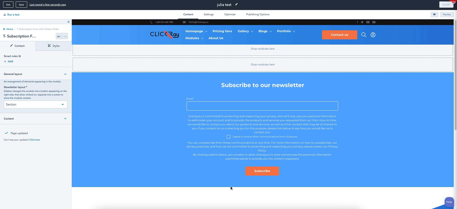
Get your visitors to subscribe to your newsletter using T- Subscription Form with Sidebar Slider. Send them engaging content to attract your prospects or delight your clients. With this intuitive module, you can choose between different types of the module layout (either a section or a sidebar).
> CONTENT
Background type
From the dropdown menu, choose between two background types: Color and Gradient. You can change the background settings in the STYLES section.
General layout
Using a dropdown menu, choose between two newsletter subscription layouts:
Section - presents a standard module on the page with content.
Sidebar - presents an expandable sidebar button on the right side of the screen that moves along the page when scrolling down, instead of an on-page module. Upon expanding, it presents a window to show the module content.
Content
Using a rich text box, you can define your own module header, defining the title and the description of the module, along with uploading an image of your own.*
*If the Section layout is chosen, the image will appear on the right side of the form. If the Sidebar layout is chosen, the image will appear on the left side of the form.
HubSpot Knowledge Base
Learn more about editing content in a rich text here.
HubSpot Knowledge Base
Learn more about inserting images or videos to your modules here (by scrolling down to the “Edit an image in an image module” section).
Here, you can also choose or create a form that will allow your visitors to subscribe to your newsletter. What you see on the module editor is a standard HubSpot forms editor.
ClickRay’s Tip
Forms are a great way to acquire new leads, because the information a visitor inputs can automatically transfer into your HubSpot CRM.
See Forms section under Theme Settings in the TURBO Documentation for more information on how to edit forms in HubSpot.
Overlays
You can choose the top and bottom overlays of the module. Overlay is our unique frame design on the borders of the module. From the dropdown menu, choose between straight, straight reverse, wave, or wave reverse (and round for bottom overlay) designs to up your website design game.
See Overlays section under The Basics in the TURBO Documentation for more information on the use of overlays.
> STYLES
Background color (if chosen Sidebar in the General Layout)
Choose the background color (and its opacity) of the expandable screen (Sidebar).
Section settings (if chosen Section in the General layout)
Here, you can determine the content width as well as its alignment. Moreover you can also set the module paddings.
The larger the container padding, the larger the space between the header and the upper border of the module (top); the larger the space between the button and the lower border of the module (bottom).
Sidebar settings (if chosen Sidebar in the General layout)
Here, you can determine the sidebar positioning on the page and its border radius. Moreover, you can also set the color (and opacity) of the toggle button, determine its radius, and add your own icon to the button.
Overlays
Here, you can define the color and opacity of the both top and bottom overlays.
Color (If Color chosen in the Background type)
Here, you can define the color and opacity of the module background color.
Gradient (If Gradient chosen in the Background type)
Choose the color and opacity of the gradient between two colors as well as determine the gradient direction from a dropdown menu with five options: Horizontal; Vertical; Diagonal (top-bottom); Diagonal (bottom-top); and Radial.
T- Team with Navigation Menu
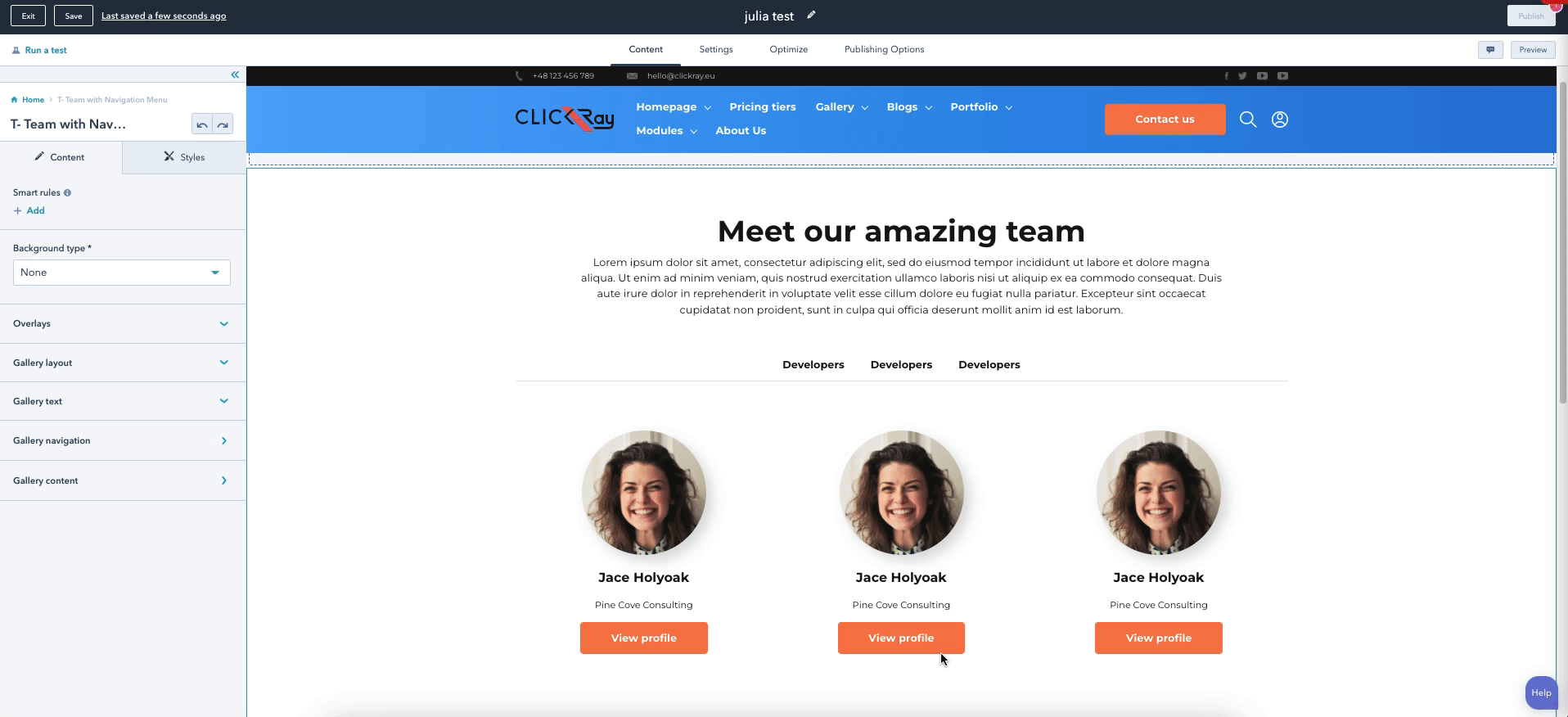
The T- Team with Navigation Menu module is designed to recognize the specific members of your team with a variety of layout choices. What differentiates this module is that the content is divided into categories, which will allow your prospects to easily access the profile or contact information of an employee that could answer their questions (e.g., if they are interested in customer service or a tech specialist). This versatile module can also be used for displaying not only employees but also products or services that you offer, depending upon the content that you choose to fill your module.
- Choose between wave and straight overlay designs.
- Select layout effects (hover or pop-up).
- Group employees based on their departments.
- Define employee name, position, social profiles.
- Expand their profile with a biography.
> CONTENT
Background type
From the dropdown menu, choose between two background types: Color and Gradient. You can change the background settings in the STYLES section.
Overlays
You can choose the top and bottom overlays of the module. Overlay is our unique frame design on the borders of the module. From the dropdown menu, choose between straight, straight reverse, wave, or wave reverse designs to up your website design game.
See Overlays section under The Basics in the TURBO Documentation for more information on the use of overlays.
Gallery layout
From the dropdown menu, choose the layout between two options.
Hover effect - defines the images in square boxes with a header containing title and subtitle, and the detailed text appearing inside of the image when hovered over.
Pop-up effect - defines the images in rounded shapes with a title and subtitle below the image. In addition, a button is presented below. When clicked, a window pop-up will appear containing the detailed information.
Gallery text
Using a rich text box, you can define your own module header, defining the title and the description of the module.
HubSpot Knowledge Base
Learn more about editing content in a rich text here.
Gallery navigation
This option allows you to add as many categories as you need. Add a category title and filter into your profile by adding a new one with the “+ Add” button. If you want to edit, clone, or delete a given listing, hover over one of the items and choose the appropriate icon on the right side.
The Category filter field will determine which category a given employee belongs to. This can be edited in the Gallery content section below.
The categories will appear between the module header and the employee profiles.
Gallery content
This option allows you to add as many profiles as you need. Add a title, filter, subtitle, a detailed description, and an image into your box by adding a new box with the “+ Add” button. If you want to edit, clone, or delete a given listing, hover over one of the items and choose the appropriate icon on the right side.
Besides filling the profile with content (titles, category, description, and image), you can also link each box to social pages by adding icons and links. In addition, you can customize the button text below the profiles and text links on the pop-up window linking to separate pages (if chosen Pop-up effect).
HubSpot Knowledge Base
Learn more about inserting images or videos to your modules here (by scrolling down to the “Edit an image in an image module” section).
> STYLES
Container settings
Here, you can determine the module paddings.
The larger the container padding, the more space there will be between the header and the upper border of the module (top); and the more space there will be between the last row of images and the bottom border of the module (bottom).
Navigation settings
Here, you can change the color (and the opacity) for the category that is currently active and the line break appearing below the categories.
Pop-up layout settings
Here, you can change the settings for the Pop-up layout. Add a shadow under the images and choose the background color (and opacity) of the buttons that will direct the visitor to the pop-up window. In addition, you can insert your own pop-up window “close” icon and determine the background color (and opacity) of the pop-up window.
A very cool feature is that you can also determine the overlay color (and opacity) of your page around the pop-up window when it appears, using the “Pop-up overlay background color” feature. This will visually bring the pop-up window into focus.
Hover layout settings
Here, similarly to the Pop-up layout settings, you can add a show under the images. Moreover, you can choose to turn on a hover scale effect and determine the hover mask color (and opacity) when the mouse is placed over the box.
Overlays
Here, you can define the color and opacity of the both top and bottom overlays.
Color (If Color chosen in the Background type)
Here, you can define the color and opacity of the module background color.
Moreover, if you switch on the Font color (white) toggle button, the module text (excluding the window pop-up) will appear as white. If it’s turned off, it will appear as black. This setting can be overridden using the rich text boxes for each specific content.
Gradient (If Gradient chosen in the Background type)
Choose the color and opacity of the gradient between two colors as well as determine the gradient direction from a dropdown menu with five options: Horizontal; Vertical; Diagonal (top-bottom); Diagonal (bottom-top); and Radial.
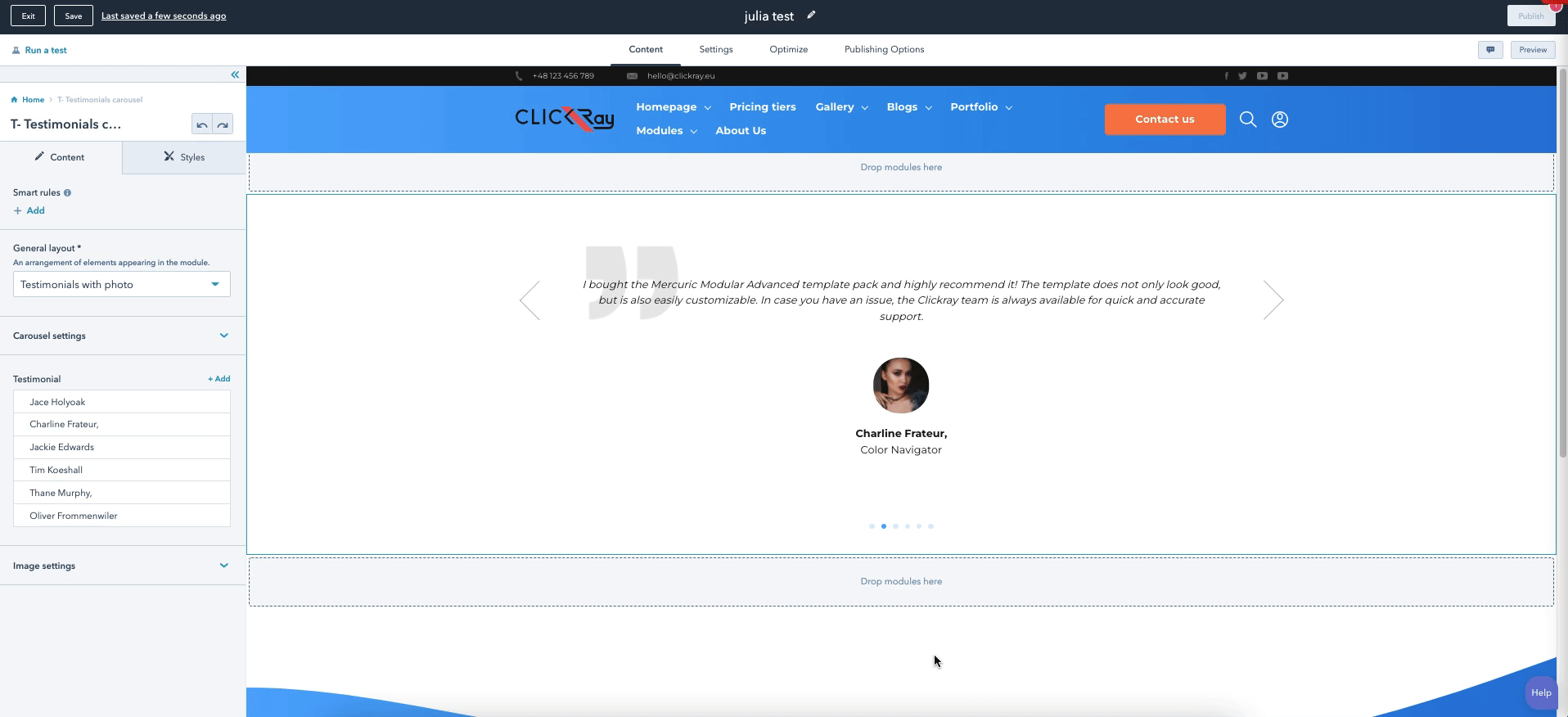
Similar to the Logo Carousel, the T- Testimonial Carousel functions as a slideshow of written text. You can choose whether you want to show off client testimonials of your company or specific product, or even highlight specific features of your services (without images).
- Choose carousel effect options (slide / fade / cube / coverflow / flip).
- Determine animation speed.
- Add a background icon.
- Turn on / off autoplay for an automated slideshow.
- Show / hide side arrows for manual slideshow.
> CONTENT
General layout
From the dropdown menu, choose one of the three layout options:
Background type
From the dropdown menu, choose between two background types: Color and Gradient. You can change the background settings in the STYLES section.
Carousel settings
Here, you can choose whether to display arrows or set the animation for the carousel. By switching on a toggle button, you can turn on autoplay for the slides and choose the animation delay (after the page is loaded) as well as the speed (for the cycle).
From a dropdown menu, you can choose a transition effect from five options:
The carousel settings also allows you to add an icon to the upper left corner of the module. The placeholder icon that’s native to the TURBO Theme is a quote symbol, denoting a testimonial.
HubSpot Knowledge Base
Learn more about inserting images or videos to your modules here (by scrolling down to the “Edit an image in an image module” section).
Testimonial
This option allows you to add as many slides as you need. Add an author name and position, as well as a description and image by adding a new box with the “+ Add” button. If you want to edit, clone, or delete a given listing, hover over one of the items and choose the appropriate icon on the right side.
HubSpot Knowledge Base
Learn more about editing content in a rich text here.
Overlays
You can choose the top and bottom overlays of the module. Overlay is our unique frame design on the borders of the module. From the dropdown menu, choose between straight, straight reverse, wave, or wave reverse (and round for bottom overlay) designs to up your website design game.
See Overlays section under The Basics in the TURBO Documentation for more information on the use of overlays.
> STYLES
Container settings
Here, you can set the paddings of the module.
The larger the padding, the more space there will be between the content and the upper border of the module (top); and the more space there will be between the content and the lower border of the module (bottom).
Description settings
Here, you can set the paddings of the testimonial.
The larger the padding, the more space there will be between the testimonial and the upper border of the module (top); the more space there will be between the testimonial and the author profile (bottom); the more space there will be between the content and the left border of the module (left); and the more space there will be between the content and the right border of the module (right).
Author settings
In the Author name settings, you can set the top and bottom paddings for the author name field.
The larger the padding, the more space there will be between the image and the author name (top); the more space there will be between the author name and the author position (bottom).
In the Author position settings, you can also set the top and bottom paddings for the author position field.
The larger the padding, the more space there will be between the author name and the author position (top); the more space there will be between the author position and the pagination (bottom).
Profile picture settings
Here, you can set the image paddings and determine the border radius of the image.
The larger the padding, the more space there will be between the testimonial and the image (top); the more space there will be between the image and the author name (bottom).
The larger the border radius, the more rounded the image appears.
Pagination settings
Here, you can set the margins and paddings, as well as the color (and its opacity) of the dotted pagination.
The larger the top padding, the more space there will be between the author position and the pagination.
The larger the margin between pagination, the more space there will be between the pagination dots.
Background icon settings
This function allows you to change the horizontal and vertical background icon alignment.
The larger the background icon alignment, the icon is moved downwards (vertical); and the icon is moved to the right (horizontal).
Arrow settings
In the arrow settings, you can change its position from top (in percentages) as well as the color (and opacity) and the width of the pagination dots.
Overlays
Here, you can define the color and opacity of the both top and bottom overlays.
Color (If Color chosen in the Background type)
Here, you can define the color and opacity of the module background color.
Gradient (If Gradient chosen in the Background type)
Choose the color and opacity of the gradient between two colors as well as determine the gradient direction from a dropdown menu with five options: Horizontal; Vertical; Diagonal (top-bottom); Diagonal (bottom-top); and Radial.
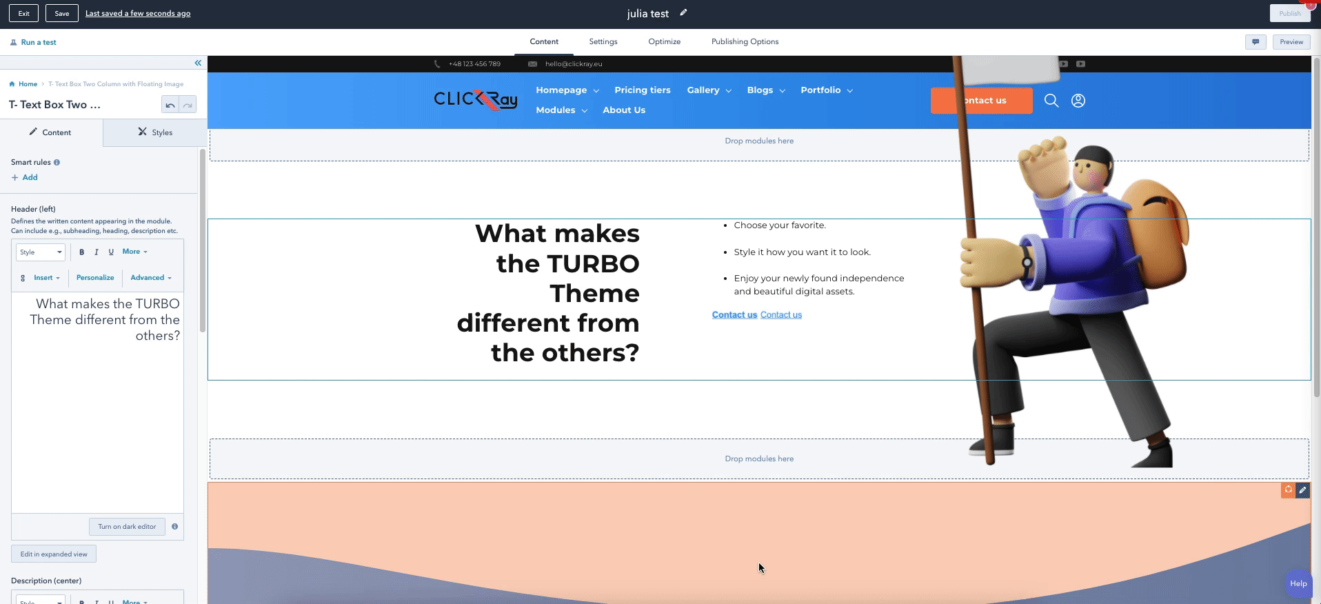
The T- Text Box Two Column with Floating Image is a variation of a text-based module, with a possibility to add a floating image inside. The module is divided into two columns and can work as a page break with CTA that will guide your visitors through the conversion path on your website.
- Featuring a two-column text layout with two CTAs.
- Add a floating image.
> CONTENT
Background type
From the dropdown menu, choose between two background types: Color and Gradient. You can change the background settings in the STYLES section.
Header (left)
Using a rich text box, you can define your own module header, defining the title and the description of the module.
HubSpot Knowledge Base
Learn more about editing content in a rich text here.
Description (center)
Here, you can place the description text that will appear to the left of the header text.
CTAs
Call your visitors to action with a button (or two!) that appear(s) below the grid.
See CTA under the Theme Settings section in the TURBO Documentation on how to edit the CTA button.
Floating image
Here, you can add a floating image to your module and adjust the vertical and horizontal placement of the image.
PS. When the window screen will be minimized, the floating image will disappear from view, but don’t worry – only until the window will be appropriate size again.
See Floating Images under The Basics section in the TURBO Documentation to learn more about the functionality of floating images.
HubSpot Knowledge Base
Learn more about inserting images or videos to your modules here (by scrolling down to the “Edit an image in an image module” section).
Overlays
You can choose the top and bottom overlays of the module. Overlay is our unique frame design on the borders of the module. From the dropdown menu, choose between straight, straight reverse, wave, or wave reverse (and round for bottom overlay) designs to up your website design game.
See Overlays section under The Basics in the TURBO Documentation for more information on the use of overlays.
> STYLES
Container settings
Here, you can set the margins paddings of the module.
The larger the margin, the more space there will be above the upper border of the module (top); and the more space there will be below the lower border of the module (bottom).
The larger the padding, the more space there will be between the content and the upper border of the module (top); between the content and the lower border of the module (bottom); between the header and the left border of the module (left); and between the floating image or the description and the right border of the module (right).
Color (If Color chosen in the Background type)
Here, you can define the color and opacity of the module background color.
Gradient (If Gradient chosen in the Background type)
Choose the color and opacity of the gradient between two colors as well as determine the gradient direction from a dropdown menu with five options: Horizontal; Vertical; Diagonal (top-bottom); Diagonal (bottom-top); and Radial.
Overlays
Here, you can define the color and opacity of the both top and bottom overlays.
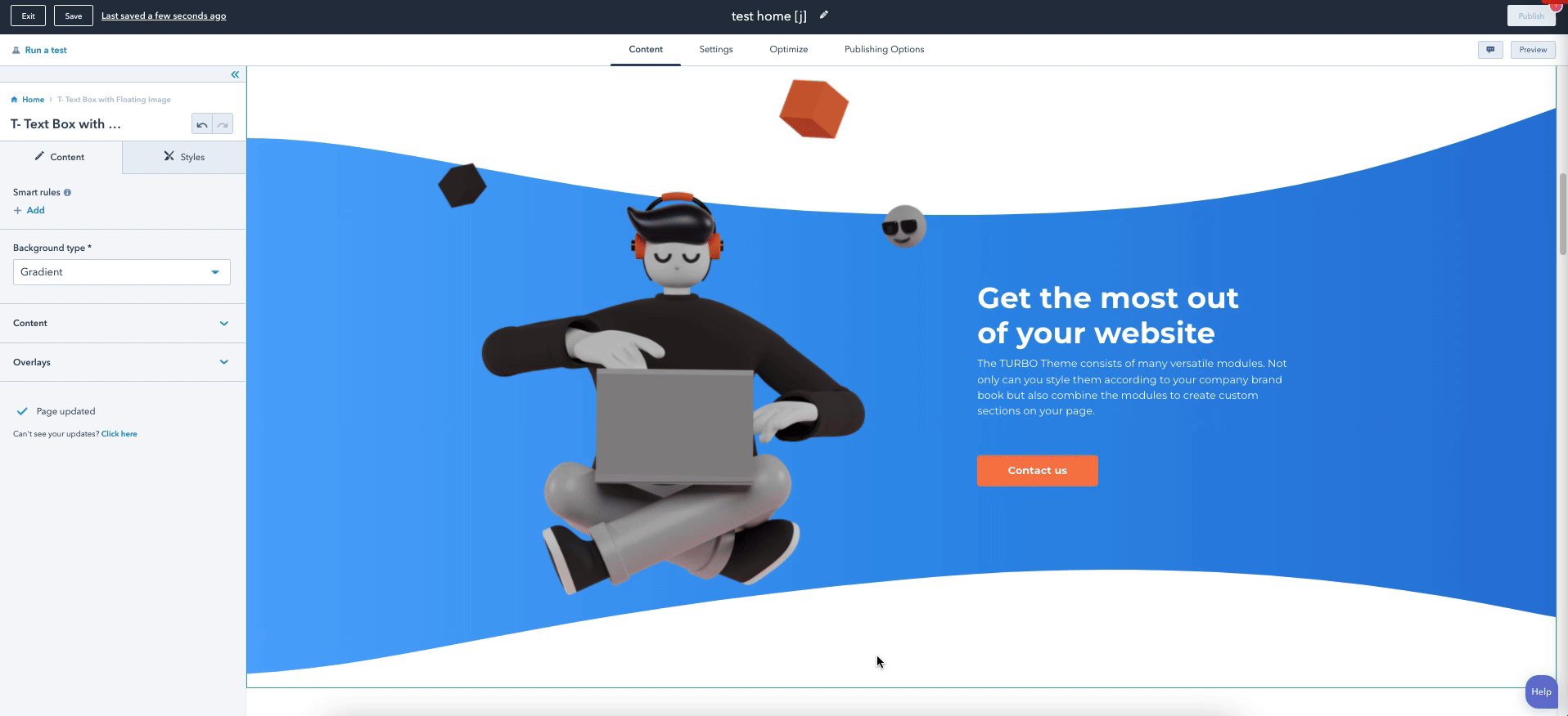
The T- Text Box with Floating Image is a text and image-based module. The purpose of this module is to bring inspiring messages to your visitors and guide them through your conversion path.
- Complement the text with images.
- Flip module layout (Left / Right).
- Choose background type (color / gradient).
- Choose between wave and straight (top and bottom) overlay designs.
> CONTENT
Background type
From a dropdown menu, choose a module background between a solid color or gradient. The color and gradient can be defined in the STYLES section of the module.
Content
Here, you can add a floating image to the module and change its positioning (left or right). Changing the image position will flip the module layout from text on the left and image on the right (Image position right) to text on the right and image on the left (Image position left).
HubSpot Knowledge Base
Learn more about inserting images or videos to your modules here (by scrolling down to the “Edit an image in an image module” section).
Below, using the rich text box, you can write a compelling message for presenting the content below.
HubSpot Knowledge Base
Learn more about editing content in a rich text here.
You can also add a CTA inside the rich text box by clicking on the “Insert” button.
See CTA under the Theme Settings section in the TURBO Documentation on how to edit the CTA button.
Overlays
You can choose the top and bottom overlays of the module. Overlay is our unique frame design on the borders of the module. From the dropdown menu, choose between straight, straight reverse, wave, or wave reverse designs to up your website design game.
See Overlays section under The Basics in the TURBO Documentation for more information on the use of overlays.
> STYLES
Container margins
Here, you can set the margins for the module.
The larger the margin, the more space there will be above the module (top); and the more space there will be below the module (bottom).
Container paddings
Here, you can set the paddings for the module.
Color (If Color chosen in the Background type)
Here, you can define the color and opacity of the module background color.
Gradient (If Gradient chosen in the Background type)
Choose the color and opacity of the gradient between two colors as well as determine the gradient direction from a dropdown menu with five options: Horizontal; Vertical; Diagonal (top-bottom); Diagonal (bottom-top); and Radial.
Overlays
Here, you can define the color and opacity of the both top and bottom overlays.
Different from the Text Box with Floating Image, this T- Text Box with Image or Video module was strictly designed to accommodate images and videos that lay within the gird, as compared to the floating image that lies outside of the grid. The purpose of this module is to present the values of your company or bring forth certain qualities of your products / services in a clear and communicative way for the visitors.
- Add images or videos to our texts.
- Flip module layout (Left / Right).
- Choose background type (color / gradient).
- Choose between wave and straight (top and bottom) overlay designs.
- Add as many listings as you want.
> CONTENT
Background type
From the dropdown menu, choose between two background types: Color and Gradient. You can change the background settings in the STYLES section.
Overlays
You can choose the top and bottom overlays of the module. Overlay is our unique frame design on the borders of the module. From the dropdown menu, choose between straight, straight reverse, wave, or wave reverse designs to up your website design game.
See Overlays section under The Basics in the TURBO Documentation for more information on the use of overlays.
Boxes list
This option allows you to add as many boxes as you need. Choose the layout and placement of the text and images, Add an author name and position, as well as a description and image by adding a new box with the “+ Add” button. If you want to edit, clone, or delete a given listing, hover over one of the items and choose the appropriate icon on the right side.
From the dropdown menu Layout content, you can decide whether to use an image with text or a video with text layout. The image or video can be inserted in a section below.
HubSpot Knowledge Base
Learn more about inserting images or videos to your modules here (by scrolling down to the “Edit an image in an image module” section).
Using the dropdown menu Direction of system, you can choose the arrangement of the layout between two options:
Image / Video on left - image or video placed on the left with text on the right.
Image / Video on right - text placed on the left with image or video on the right.
The text field below will allow you to add a description text, with H1 / H2 / H3 tags etc.
HubSpot Knowledge Base
Learn more about editing content in a rich text here.
In addition to adding videos to the module, you can also customize your video title, description, and meta tags by clicking on the “Edit’ button below “Video details”.
ClickRay’s Tip
Make sure to use your videos to their fullest potential. An innovative and unique video functionality is adding a CTA or form overlay into your video. You can determine the display time when they are set to appear (before the video starts or after the video finishes). This is creating a new conversion point on your website. On top of that, HubSpot allows you to analyze video performance (e.g., use and retention statistics), which can greatly contribute to the understanding of your audience. These analytics can further supercharge your marketing campaigns. Check out our blog post on the possibilities of Video Marketing.
Besides adding a CTA into your video, you can insert it below the text using the CTA function at the bottom of the editor.
See CTA and Forms sections under the Theme Settings section in the TURBO Documentation for more information on how to edit the CTAs and forms.
HubSpot Knowledge Base
Learn more about adding video content and analyze its reports here.
> STYLES
Container settings
Here, you can set the paddings of the module.
The larger the padding, the more space there will be between the content and the upper border of the module (top); and more space there will be between the content and the lower border of the module (bottom).
Items settings
In Item settings, you can turn on the hover scale effect as well as adjust the margins for the boxes within the module.
The larger the margin, the more space there will be between above the boxes (top); and more space there will be between below the boxes (bottom).
Overlays
Here, you can define the color and opacity of the both top and bottom overlays.
Color (if chosen Color as the Background type)
Here, you can determine the background color (with opacity) of the module.
Gradient (if chosen Image with gradient as the Background style)
Here, you can determine the color gradient (with opacity) of the module.
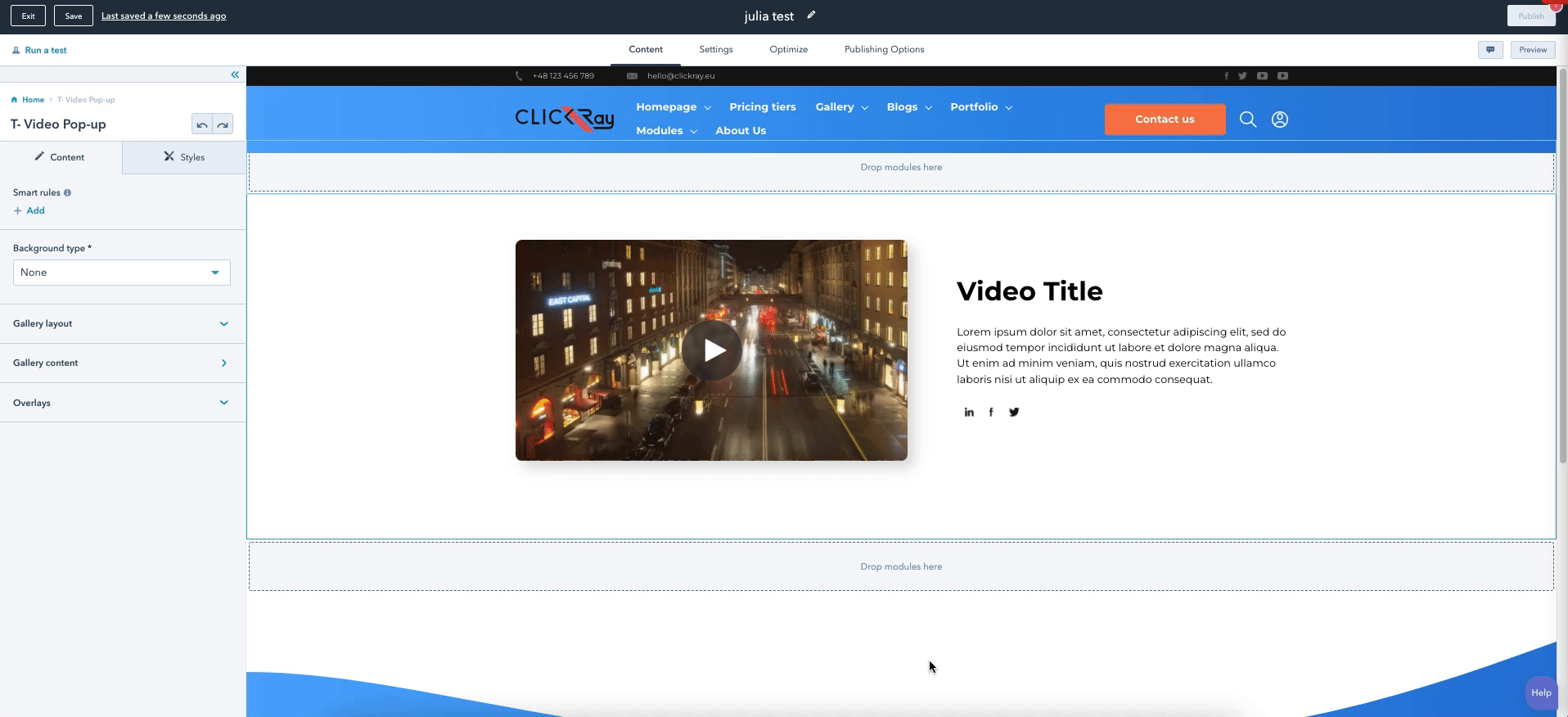
This T- Video Pop-up module allows you to showcase your video with a pop-up function for a better view. You can showcase your product videos or films about company culture on an About Us page. This is the only module that is centered around video content.
- Add videos, complemented by texts.
- Add social links.
- Change and flip module layouts (Left / Right / gallery).
- Use a video pop-up function.
- Choose between wave and straight (top and bottom) overlay designs.
- Add as many listings as you want.
> CONTENT
Background type
From a dropdown menu, choose a module background between a solid color or gradient. The color and gradient can be defined in the STYLES section of the module.
Gallery layout
Using a dropdown menu, choose between three layout options:
Gallery content
This option allows you to add as many boxes as you need. Add a title, description text, CTA or form to the video, and social sharing options* into your box by adding a new box with the “+ Add” button. If you want to edit, clone, or delete a given listing, hover over one of the items and choose the appropriate icon on the right side.
* Social sharing functionality will share the entire page (not just the content) on the appropriate social media networks.
If you activate pop-up functionality with the “Activate pop-up” toggle switch, your video content will appear in a new pop-up window.
HubSpot Knowledge Base
Learn more about editing content in a rich text here.
Here, you can also customize your video title, description, and meta tags by clicking on the “Edit’ button below “Video details”.
ClickRay’s Tip
Make sure to use your videos to their fullest potential. An innovative and unique video functionality is adding a CTA or form overlay into your video. You can determine the display time when they are set to appear (before the video starts or after the video finishes). This is creating a new conversion point on your website. On top of that, HubSpot allows you to analyze video performance (e.g., use and retention statistics), which can greatly contribute to the understanding of your audience. These analytics can further supercharge your marketing campaigns. Check out our blog post on the possibilities of Video Marketing.
See CTA and Forms sections under the Theme Settings section in the TURBO Documentation for more information on how to edit the CTAs and forms.
HubSpot Knowledge Base
Learn more about adding video content and analyze its reports here.
Overlays
You can choose the top and bottom overlays of the module. Overlay is our unique frame design on the borders of the module. From the dropdown menu, choose between straight, straight reverse, wave, or wave reverse designs to up your website design game.
See Overlays section under The Basics in the TURBO Documentation for more information on the use of overlays.
> STYLES
Container settings
Here, you can set the paddings of the module.
The larger the padding, the more space there will be between the content and the upper border of the module (top); and more space there will be between the content and the lower border of the module (bottom).
Gallery settings
In the Gallery settings, you can determine the font color for the entire module as well as the spacing between the single gallery cards (corresponding to the text and video content box).
You can also adjust the video player width as well as turn on the video player border radius, shadow, and hover scale effect.
Pop-up layout settings
Here, you can determine the background color (and opacity) of the pop-up window as well as insert your own pop-up window “close” icon and floating images behind the title in the pop-up window (Pop-up title background image).
HubSpot Knowledge Base
Learn more about inserting images or videos to your modules here (by scrolling down to the “Edit an image in an image module” section).
A very cool feature is that you can also determine the overlay color (and opacity) of your page around the pop-up window when it appears, using the “Pop-up overlay background color” feature. This will visually bring the pop-up window into focus.
Overlays
Here, you can define the color and opacity of the both top and bottom overlays.
Color (If Color chosen in the Background type)
Here, you can define the color and opacity of the module background color.
Gradient (If Gradient chosen in the Background type)
Choose the color and opacity of the gradient between two colors as well as determine the gradient direction from a dropdown menu with five options: Horizontal; Vertical; Diagonal (top-bottom); Diagonal (bottom-top); and Radial.
Blog modules differ from website / landing modules because they can only be used on blog pages (and neither on website nor landing pages). However, the editing mode is the same for blog modules as for website / landing modules. To learn more about blogs, see the BLOG section of the TURBO Documentation.
As a blog module, T- BLOG Banner is one of modules that consists of another blog template, an alternative to the single blog post. This module was created in mind to give an introduction to a blog post (with key details included in the banner) or can be used for case study purposes.
- Choose between two different Banner layouts.
- Add key information to three different text boxes.
- Add a CTA.
> CONTENT
Banner layout
From a dropdown menu, choose a module background two banner types:
Regular banner - smaller-sized banner with text boxes appearing below the image.
Full width banner - larger-sized banner with text boxes appearing over the image (on the right side).
Banner image
Here you can add a banner image to the module.
HubSpot Knowledge Base
Learn more about inserting images or videos to your modules here (by scrolling down to the “Edit an image in an image module” section).
Text boxes 1-3
Using a text field, you can define the text box title, while using a rich text field you can add a short description appearing below the title.
HubSpot Knowledge Base
Learn more about editing content in a rich text here.
CTA
Call your visitors to action with a button that appears on the right side of the text boxes (Regular banner) and below the text boxes (Full width banner).
See CTA under the Theme Settings section in the TURBO Documentation on how to edit the CTA button.
> STYLES
Regular banner (if Regular banner chosen in Banner layout)
The settings will differ depending on the banner layout you have chosen in the CONTENT. In this area, you can adjust the settings for the Regular banner.
Container settings
Here, you can adjust the margins for the module as well as the banner image height.
The larger the container margin, the more space there will be above the module (top); and the more space there will be below the module (bottom).
The larger the banner image height, the larger the image will appear.
Description panel
Here, you can adjust the paddings for the section below the banner image that holds the text boxes. You can also set its background color (and opacity) as well as the font color. The font color can be overridden for each separate text box in the Text box settings below.
The larger the description padding, the more space there will be above the text boxes (top); and below the text boxes (bottom).
Text boxes 1-3
Here, you can adjust the upper paddings for all of the text boxes separately.
The larger the text box padding, the more space there will be above the text box label.
Full width banner (if Full width banner chosen in Banner layout)
The settings will differ depending on the banner layout you have chosen in the CONTENT. In this area, you can adjust the settings for the Full width banner.
Container settings
Here, you can adjust the margins for the module as well as the banner image height.
The larger the container margin, the more space there will be above the module.
The larger the banner image height, the larger the image will appear.
Header settings
Here, you can change the font color (and opacity) of the Header text as well as adjust the upper header margin.
PS. The Blog title will appear as Header text in the module. To change the Header text, you can go to the Settings tab in the Blog menu and edit the Blog title.
The larger the header margin, the more space there will be between the header text and the upper border of the header image.
Description panel settings
Here, you can change the color (and opacity) for the font and background of the text box panel settings as well as adjust the upper margin and left padding for the panel.
The larger the description margin, the more space there will be between the upper border of the banner image and the panel.
The larger the description padding, the more space there will be between the left border of the panel and the content within it.
Text boxes 1-3
Here, you can adjust the upper paddings for all of the text boxes separately.
The larger the text box padding, the more space there will be above the text box label.
Button container settings
Here, you can adjust margins for the button.
The larger the button margin, the more space there will be above the button (top); and the more space there will be below the button (bottom).
As a blog module, T- BLOG Column Gallery is one of modules that consists of another blog template, an alternative to the single blog post. You can use this module to complement the text appearing on page with a grid of images arranged in a three column layout. You can also choose to present solely the images, without inputting text below.
- Add as many images as you want.
- Add a rich text below.
> CONTENT
Three column layout
This option allows you to add as many images as you need. Simply add a new box using the “+ Add” button. If you want to edit, clone, or delete a given listing, hover over one of the items and choose the appropriate icon on the right side.
HubSpot Knowledge Base
Learn more about inserting images or videos to your modules here (by scrolling down to the “Edit an image in an image module” section).
Second part of blog content
Using a rich text box, you can add blog or case study text below the image grid.
HubSpot Knowledge Base
Learn more about editing content in a rich text here.
> STYLES
Here, you can adjust the container margins as well as the image height of the grid and the padding between the images.
The larger the Container margin, the more space there will be above the module (top) and more space there will be below the module (bottom).
The larger the Image height, the larger the images will appear on screen.
The larger the Padding between icons, the more space there will be between the icons.
As a blog module, T- BLOG Masonry Gallery is one of modules that consists of another blog template, an alternative to the single blog post. You can use this module to complement the text appearing on page with a grid of images arranged in a masonry layout. Empower your brand story with a visual narrative.
- Add as many images as you want.
> CONTENT
Masonry layout
This option allows you to add as many images as you need. Simply add a new box using the “+ Add” button. If you want to edit, clone, or delete a given listing, hover over one of the items and choose the appropriate icon on the right side.
HubSpot Knowledge Base
Learn more about inserting images or videos to your modules here (by scrolling down to the “Edit an image in an image module” section).
> STYLES
Container settings
Here, you can adjust the container margins as well as the image height of the grid and the padding between the images.
The larger the Container margin, the more space there will be above the module (top) and more space there will be below the module (bottom).
The larger the Image height, the larger the images will appear on screen.
The larger the Padding between icons, the more space there will be between the icons.
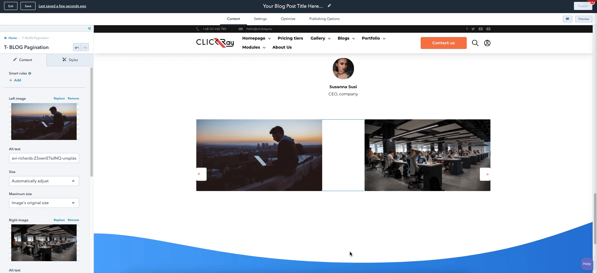
As a blog module, T- BLOG Pagination is one of modules that consists of another blog template, an alternative to the single blog post. This module was designed to show older and newer blog posts, so that the user can quickly access other posts on your blog. The post sources for this custom-designed pagination are automatically extracted by HubSpot.
- Automatic older and newer post placement.
- Add images for the pagination.
> CONTENT
Here, you can add a left image as well as a right image to your pagination. In addition, you can add your own arrow icons that act as buttons.
HubSpot Knowledge Base
Learn more about inserting images or videos to your modules here (by scrolling down to the “Edit an image in an image module” section).
> STYLES
Container settings
Here, you can adjust the container margins as well as the width of images in the pagination.
The larger the Container margin, the more space there will be above the module (top) and more space there will be below the module (bottom).
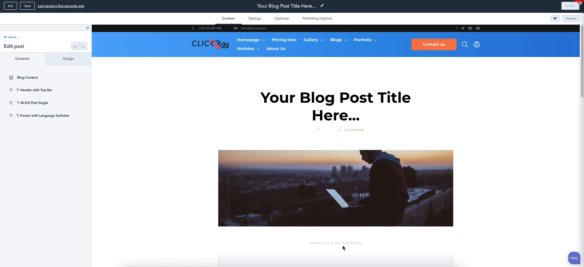
As a blog module, T- BLOG Post Single presents a single blog post, accompanied by a header, author details, and comment sections. This module was created in mind to present your posts with the most details and bring your content to light. The posts will be presented in a clear and communicative manner, so that your visitors can easily engage with your content.
- Choose between two different Header types.
- Add a sidebar to the post page.
- Include a detailed author section.
- Add social sharing options.
> CONTENT
Header type
From a dropdown menu, choose the header type between a regular header and a full-width header. The settings of the header types can be defined in the STYLES section of the module.
Regular header - a header containing a smaller-sized image, with the blog title above and author details below.
Full width header - a header containing a larger-sized image, with the blog title and author details appearing on the image.
Sidebar (If Regular header chosen in the Header type)
Switch on the sidebar for the Related articles, Tags, and Form to appear on the right side of the screen instead of below the comments section.
When a user clicks on a desired tag, all of the posts tagged with it will appear in one line. That page will be automatically generated based on the layout and settings of the listings page that you have designed.
Header with author label
Here, you set the background image of the header, the tags and comments icons, as well as determine the author and comments (“Written at”; “By”; and “Comments”) labels for translation purposes.
HubSpot Knowledge Base
Learn more about inserting images or videos to your modules here (by scrolling down to the “Edit an image in an image module” section).
Socials
This section allows you to connect your social networks to the page. You can connect up to three social networks using the switch buttons. You can also add appropriate icons and define the text appearing above the icons.
When a website visitor clicks on one of the icons, they will automatically be transferred to the sharing options on their own social profiles.*
* Social sharing functionality will share the entire page (not just the content) on the appropriate social media networks.
Author
From the Author layout type dropdown menu, you can choose the author image type in the author section layout (below the blog content) between three options:
Radius image - author image appearing in the shape of a circle.
Square image with border - author image appearing in the shape of a square with grey lines above and below the author section.
Square image without border - author image appearing without a container background color instead of a border.
From the Button type dropdown menu, you can choose the button style in the author section. While below there’s a field where you can define the button text, you can edit the button styles in the Theme Settings.
For more information about styling the CTAs, see the CTAs in the Theme Settings section of the TURBO Documentation.
In addition, you can also define the author company and add up to three social icons (Linkedin, Twitter, and Website) to the author section. These links can be determined in the Blog Author settings in your HubSpot account.
See Manage Blog Author Details under the Blog section of the TURBO Documentation for more information on how to update author profiles.
Comments
Here, you can define the header text for the comments section.
Related articles
Here, you can define the header text for the related articles section.
Tags
Here, you can define the header text for the tags section.
HubSpot Knowledge Base
Learn more about creating and managing blog tags here.
Form
Here, you can also choose or create a form that will allow your visitors to subscribe to your newsletter. What you see on the module editor is a standard HubSpot forms editor.
ClickRay’s Tip
Forms are a great way to acquire new leads, because the information a visitor inputs can automatically transfer into your HubSpot CRM.
See Forms section under Theme Settings in the TURBO Documentation for more information on how to edit forms in HubSpot.
> STYLES
Regular header (If Regular header chosen in the Header type)
This section allows you to change the settings for the header image and text, as well as the tags and comments section and author details.
For Header image, you can change the upper image margin.
The larger the margin, the more space there will be above the header.
For Header text, you can change the upper and lower header margins as well as the font color of the header text.
PS. The Blog title will appear as Header text in the module. To change the Header text, you can go to the Settings tab in the Blog menu and edit the Blog title.
The larger the margin, the more space there will be above the Header text (top); and the more space there will be (bottom).
For the Tags and comments section appearing under the Header text, you can adjust their containers' margins.
The larger the tags icon margin, the more space there will be between the tags icon and the left side of the screen (left); and the more space there will be between the tags icon and the tags text (right).
The larger the comments icon margin, the more space there will be between the tags text and the comment icon (left); and comments icon and the comments text (right).
For the Author details, appearing over the Header image, you can adjust the author text margins and image size, as well as set the font colors (and opacities) for the author labels (“Written”; “At”; “By”) as well as (separately) for author name.
The larger the author details margin the more space there will be between the author image and the author details text (top); and the more space there will be between the author details text and blog content (bottom).
Full width header (If Full width header chosen in the Header type)
Here, you’ve got similar settings as for the Regular header. This section allows you to change the settings for the header image and text, as well as the tags and comments section and author details.
For Header image, you can change the lower image margin as well as the image height.
The larger the margin, the more space there will be below the header.
The larger the image height, the larger the image will appear on screen.
For Header text, you can change the margin and padding of as well as the font color (and opacity) of the header text.
The larger the Header padding, the more space there will be above the Header text.
The larger the Header margin, the more space there will be between the header text and the left side of the image.
For the Tags and comments section appearing over the Header image, you can adjust their containers' margins as well as the opacity of the font.
The larger the opacity, the less transparent the font will be.
The larger the tags and comments margin, the more space there will be between the upper border of the image and the tags and comments text (top).
The larger the tags icon margin, the more space there will be between the tags icon and the left side of the screen (left); and the more space there will be between the tags icon and the tags text (right).
The larger the comments icon margin, the more space there will be between the tags and the comments icon (left); and the more space there will be between the comments icon and the comments text text (right).
For the Author details section appearing over the Header image, you can adjust the margin and padding of the text and the image (and image size) as well as the color (and opacity) of the font.
The larger the Author details margin, the more space there will be between the tags and comments line and the author details.
The larger the Author details padding, and the more space there will be between the left header image border and the author details.
The larger the author image margin, the larger the space between the author image and the author details text.
Author settings
Here, you can adjust the settings for the Author container below the blog post content.
You can start by selecting the background color of the box (and its opacity).
Adjust the paddings for the author name.
The larger the author name padding, the more space there will be between the author name and the upper border of the box (top); the more space there will be between the author name and the company (bottom); and the more space there will be between author name and author image (left).
You can also adjust the paddings for the company text.
The larger the company padding, the more space there will be between the author name and the company (top); the more space there will be between the company and the biography (bottom); and the more space there will be between company and author image (left).
You can also adjust the paddings for the biography container.
The larger the biography padding, the more space there will be between the biography and the company (top); the more space there will be between the biography and button (and socials) (bottom); and the more space there will be between the biography and author image (left).
The larger the biography width, the more space the text will cover within the Author container.
Lastly, you can adjust the paddings for author social icons.
The larger the socials padding, the more space there will be between the biography and the socials (top); the more space there will be between the socials and the lower margin of the container (bottom); and the more space there will be between the button and the socials (left).
Socials
Here, you can control the settings for the social sharing fields.
First, the Header. Adjust the margins for the socials header and select the font color (and the opacity).
The larger the Socials header margin, the more space there will be above the text (top); and more space there will be below the text (bottom).
For social icons, you can adjust the icon background size and color (and its opacity), control the opacity of the icons as well as adjust the padding between the icons.
The larger the Icon background size, the larger the icons and their corresponding round backgrounds appear.
The larger the Padding between icons, the more space there will be between the icons.
The larger the Opacity, the less transparent the icons will appear.
Using the T- BLOG Posts Listing module, you can create a blog listing page on your website. This arrangement of blog posts is highly accessible and therefore allows visitors to quickly find the topic that interests them, all within one source page. Think of it as a pillar page of your blog posts that is an automatically updated feed of your latest posts right there on your page. All of the blog information is derived automatically, therefore you won’t be inputting any additional written content here.
- Choose from seven different layouts.
- Choose a different background type.
- Categorize content using labels and settings.
- Add a form.
- Add overlays.
> CONTENT
Background type
From a dropdown menu, choose a module background between a solid color or gradient. The color and gradient can be defined in the STYLES section of the module.
General layout
Using a dropdown menu, choose between seven layout options:
One Column Large - a row of a rectangular image on the left and blog post details on the right.
One Column Small - a row of a square image on the left and blog post details on the right.
Two Column Large - a two column arrangement with a rectangular image above (with tags over the image) and blog post details below.
Two Column Small - a two column arrangement with a square image on the left and blog post details on the right.
Two Column Large Reversed - a two column arrangement with blog post details on the left and a rectangular image on the right.
Two Column with Text Below - similar to Two Column Large, a two column arrangement with a wider rectangular image above (with tags over the image) and blog post details below.
Three Column - a three column arrangement with a narrow image above (with tags over the image) and blog post details below.
Post box settings
Here, you’ve got a list of toggle switches that allow you to turn on or off the following functionalities: Featured image; Tags; Title; Published date; Description; and Comments list.
Label settings
Here, you can determine the author, comments, and text button link labels (“Written at”; “By”; “Comments”; and “Read more”) for translation purposes.
Tags settings
This functionality focuses on the tags section that is seperate from the tags on the post boxes (see post box settings).
HubSpot Knowledge Base
Learn more about creating and managing blog tags here.
By switching on the “Show tags” toggle button, you can show an additional section for all of the tags. When a user clicks on a desired tag, all of the posts tagged with it will appear in one line. That page will be automatically generated based on the layout and settings of the listings page that you have designed.
Besides defining the header text for the tags section, you can also determine the source blog of the tags and how many tags to show.
HubSpot Knowledge Base
Learn more about editing content in a rich text here.
Form settings
Here, you can also choose or create a form that will allow your visitors to subscribe to your newsletter. What you see on the module editor is a standard HubSpot forms editor.
ClickRay’s Tip
Forms are a great way to acquire new leads, because the information a visitor inputs can automatically transfer into your HubSpot CRM.
See Forms section under Theme Settings in the TURBO Documentation for more information on how to edit forms in HubSpot.
Pagination settings
To determine the pagination for this module, begin by switching it on using the “Show pagination” toggle button.
From the dropdown menu, you will be able to choose between two pagination types: Load more button or Numerical pagination.
You can also determine the number of posts loaded at the start of the page as well as the number of posts loaded on the next page. This latter option is only available for button pagination. The numerical pagination will follow the number of posts loaded at the start of the page throughout all pages.
For the button text, you can determine your own label for translation purposes.
While the Numerical pagination will show the number of pages, it is also complemented by two buttons (Previous and Next) on the sides of the numbers. These labels can be defined in the field texts. If none are defined, they will default to “Previous” and “Next”.
Overlays
You can choose the top and bottom overlays of the module. Overlay is our unique frame design on the borders of the module. From the dropdown menu, choose between straight, straight reverse, wave, or wave reverse designs to up your website design game.
See Overlays section under The Basics in the TURBO Documentation for more information on the use of overlays.
> STYLES
Container settings
In the Container settings, you can define the paddings for the module.
The larger the Container padding, the more space there will be between the content and the module upper border (top); between the content and the module lower border (bottom); the content and the module left border (left); and the content and the module right border (right).
Blog post settings
All of the settings here relate to the blog post container. Here, you can turn the hover effect, image shadow, as well as the overlay color (upon hover) of the featured image.
Moreover, you can adjust the image border radius (the larger the radius, the more rounded the image will look).
In addition, you can add a tags icon (if chosen the following layouts: One Column Large, One Column Small or Two Column Large Reversed); comment icon and read more arrows (applicable for all layouts).
HubSpot Knowledge Base
Learn more about inserting images or videos to your modules here (by scrolling down to the “Edit an image in an image module” section).
In addition, you can define the following colors (with opacities): Tags font color, Tags background color, Blog title color, Published date color, Author color, and the Description text color.
Tags container settings
In the tags container setting, you can adjust the margins for the section appearing on the right side of the screen (if turned on in the Tags settings).
The larger the margin, the more space there will be above the tags section border (top); below the tags section border (bottom); and to the left of the tags section (left).
In addition, you can also change the Tags color, their background color, and the border color (with opacities), as well as adjust the border radius (the larger the radius, the more rounded the tags borders will appear).
Forms settings
Here, you can adjust the form container margins and paddings, its border radius as well as choose the following colors (and opacities): form background color, form input font color, form input border color.
The larger the form container margin, the more space there will be above the form (top); below the form (bottom); and to the left of the form (left).
The larger the padding, the more space there will be between the borders of the form and the content within it.
The larger the form container border radius, the more rounded the form will appear.
Pagination settings
The pagination settings are divided into two styles, as set in the CONTENT section: Load more button and Numerical pagination.
For the Load more button, you can choose the Text and Border colors (and their opacities) as well as the border radius and alignment (Left, Center, Right).
For the Load more button, you can choose the Text and Buttons colors (and their opacities) as well as the border radius of the buttons and the color of the number of a page the visitor is currently on.
Overlays
Here, you can define the color and opacity of the both top and bottom overlays.
Color (If Color chosen in the Background type)
Here, you can define the color and opacity of the module background color.
Gradient (If Gradient chosen in the Background type)
Choose the color and opacity of the gradient between two colors as well as determine the gradient direction from a dropdown menu with five options: Horizontal; Vertical; Diagonal (top-bottom); Diagonal (bottom-top); and Radial.
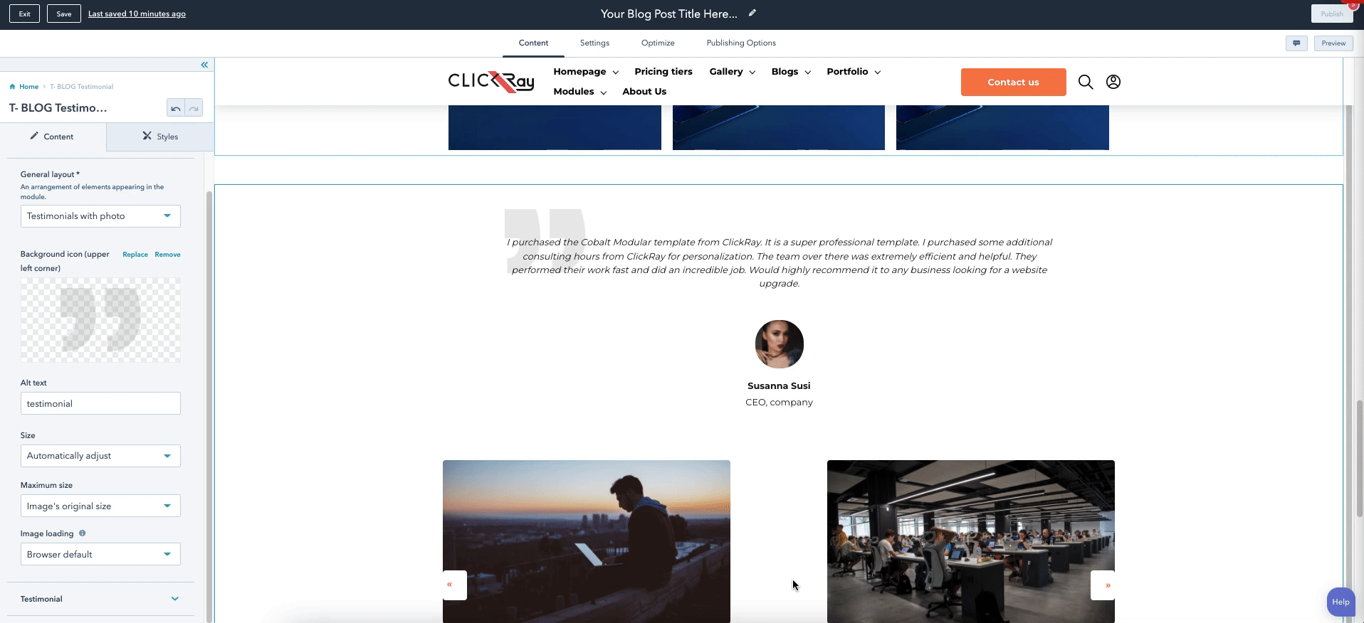
As a blog module, T- BLOG Testimonial is one of modules that consists of another blog template, an alternative to the single blog post. Similar to the website module, it functions to highlight a single client testimonial. You can choose whether you want to show off a client testimonial of your company or specific product, or even highlight a specific feature of your services (without images).
- Input testimonial text.
- Add a profile with name, company, and image.
- Add a background icon.
> CONTENT
General layout
From the dropdown menu, choose one of the three layout options:
Testimonials with photo - text showing with an image below.
Text with photo (horizontal) - text showing on the left side, while image showing on the right side.
Text without photo - only written content showing.
Background icon
Here, you can add an icon to the upper left corner of the module. The placeholder icon that’s native to the TURBO Theme is a quote symbol, denoting a testimonial.
HubSpot Knowledge Base
Learn more about inserting images or videos to your modules here (by scrolling down to the “Edit an image in an image module” section).
Testimonial
This option allows you to add a single testimonial. Using text fields, add author name and position, while using a rich text field, add the testimonial text. Below, you can also change the profile picture of the author.
HubSpot Knowledge Base
Learn more about editing content in a rich text here.
> STYLES
Container settings
Here, you can set the paddings of the module.
The larger the padding, the more space there will be between the content and the upper border of the module (top); and the more space there will be between the content and the lower border of the module (bottom).
Description settings
Here, you can set the paddings of the testimonial.
The larger the padding, the more space there will be between the testimonial and the upper border of the module (top); the more space there will be between the testimonial and the author profile (bottom); the more space there will be between the content and the left border of the module (left); and the more space there will be between the content and the right border of the module (right).Profile picture settings
Here, you can set the image paddings and determine the border radius of the image.
The larger the padding, the more space there will be between the testimonial and the image (top); the more space there will be between the image and the author name (bottom).
The larger the border radius, the more rounded the image appears.
Author settings
In the Author name settings, you can set the top and bottom paddings for the author name field.
The larger the padding, the more space there will be between the image and the author name (top); the more space there will be between the author name and the author position (bottom).
In the Author position settings, you can also set the top and bottom paddings for the author position field.
The larger the padding, the more space there will be between the author name and the author position (top); the more space there will be between the author position and the pagination (bottom). .
Background icon settings
This function allows you to change the horizontal and vertical background icon alignment.
The larger the background icon alignment, the icon is moved downwards (vertical); and the icon is moved to the right (horizontal).
In this section, you will find all of the templates available with the TURBO Theme, along with a list of modules appearing in each template. To learn more about the purpose and functionality of each specific module, please reference the Module Library section of the Documentation.
What are templates? Well, templates are pre-made website, landing or blog pages consisting of certain modules with the purpose of presenting you sample pages, e.g., Home, About Us, Services Listing (and Single), Contact etc.* Below, we list the templates website, landing, and blog templates available in the TURBO Theme. The TURBO Theme also features additional module templates - also pages with the modules inside of them.
* Please note that as of August 18, 2020, HubSpot is no longer accepting new submissions of Website, Landing Page, Blog Templates, and Template Packs. Therefore, the TURBO Theme that is available on the Asset Marketplace is only limited to the Website Theme and Modules, in accordance with the new HubSpot standards. However, our TURBO Theme DEMO shows the versatile functionality of all the modules included in the Theme, arranged in templates.
In this section, we will show you how to create, edit, and manage your TURBO Blog.
Please note that the TURBO Theme has 2 (two) blog post templates and 1 (one) blog listing template:
TURBO Blog Post page
TURBO Blog Post (Case Study) page
TURBO Blog Listing page
While the TURBO Blog Post page is perfectly fitted for blogging purposes; the TURBO Blog Post (Case Study) page was designed in mind for presenting case studies. However, you can use these two templates for whatever purpose best suits your business needs. For this, the Case Study blog post type has editable box fields so you can use the boxes appearing on the page banner however you like. Yet, you can only use one blog post template with one blog listing template in one blog feed, meaning that you can create two separate blog feeds for different purposes.
You will find all of the Blog Templates in the Templates section of the Documentation. To learn more about the purpose and functionality of each specific blog module, please reference the Blog Modules in the Module Library section of the Documentation.
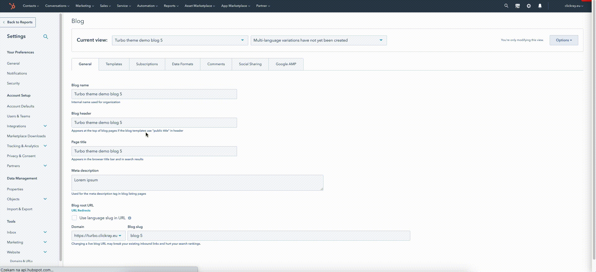
First things first, let’s create the TURBO Blog for you. On the main navigation menu of your HubSpot account, click on the
Here, you will see the blog settings page. On the very top, you’ve got a “Current view” dropdown menu. If you click on it and choose “Create a new blog”, a window will appear.
Here, you can write the Blog title, select the language of your blog, choose the URL and add a meta description. Next, you choose one template for your blog posts, and then select a template for the blog listing page from the TURBO Theme. TA-DA! You just created a new blog!
HubSpot Knowledge Base
Learn more about creating a blog here.
The next step is to edit the blog settings. Once you create a new blog, you’re back to the Blog settings page. To the right of the “Current view” dropdown menu, you will see another dropdown, through which you can edit the multi-language variations for your blog.
PS. Certain modules of the TURBO Theme, including the BLOG modules have special label fields for translation purposes (e.g., “Comments”, “Tags”, “Written at” etc.) so you can easily adjust the language of your content on pages.
HubSpot Knowledge Base
Learn more about creating a multi-language blog here.
All the way to the right you have an “Options” button, which lets you view or delete blog (among other things).
Below, you’ve got a row of seven distinct tabs, with the according functions:
General - Edit the general blog settings, e.g., Blog name, Meta description, or the Blog root URL.
Templates - Edit the templates for Blog Post and the Blog Listing pages.*
Subscriptions - here, you can associate and manage the blog subscriber notification emails.**
Date formats - edit the date formats and language in accordance with the geographical location of your readers.
Comments - turn on / off commenting and edit its options.
Social sharing - customize the social network functionalities (auto-publish and sharing options).
Google AMP - turn on / off the Google AMP formatting and edit its options.
HubSpot Knowledge Base
Learn more about editing blog settings here.
*In the number of posts per listing page you will need to input an absurdly high number (e.g., 9999). HubSpot’s default number of blog post listings is around 10 but because the TURBO Theme has a dynamic pagination (including a load more button), the number of posts visible on the listing page needs to include all of the listings. The number of posts listed on a page can be controlled later, from within the module editor. In other words, the more numbers the merrier in this field.
**Email templates are not available in the TURBO Theme, in accordance with HubSpot Asset Marketplace’s regulations. However, ClickRay offers additional services, in which we can build custom email templates for you to match the look and feel of your website.
To manage blog comments, tags, and authors, head over to the Blog listing page on your HubSpot account by choosing the “Marketing” tab on the main navigation menu, and then “Website” and “Blog”.
On the left sidebar menu, you will see four options: All blog posts, Comments, Tags, and Authors. Make sure that you choose the appropriate blog from the Blog dropdown list on the top.
In the Comments section, you can Approve, Mark as spam, Reject or Delete comments on your blog.
HubSpot Knowledge Base
Learn more about moderating blog comments here.
In the Tags section, you can add a new tag or manage the already existing tags.
HubSpot Knowledge Base
Learn more about creating and managing blog tags here.
In the Authors section, you can add a new or manage the blog authors. Here, you can add a bio and social links appearing in the Author box on your post pages.
HubSpot Knowledge Base
Learn more about creating and managing blog authors here.
Creating a blog post page is similar to creating a website page. In your HubSpot account, use the navigation bar to click on the “Marketing” and then hover to “Website” and click on the “Blog”. You will be redirected to a list of all the blog pages in your account.
To create a blog post, click on the “Create” button on the upper right corner and choose “Blog Post” from the drop-down menu. Simply choose the blog (or rather blog templates you would like to base your post on) and the post language type, and hit “Create a blog post”.
The blog navigation menu is the same as in the website page editor as it contains the following tabs: Content; Settings; Optimize; and Publishing Options.
Under the “Settings” tab, you can type in the blog post title that appears in the browser title bar and in search results, as well as choose the blog post language, define your own slug, select the blog post author and tags, write a meta description, and a featured image that will appear on your social posts and your listing page.
To learn more about editing the authors and tags, see Managing Blog Details above.
ClickRay’s Tip
Writing the external page title as well as the meta description is extremely important for SEO purposes as they help drive search engine traffic to your page. Based on our own practices, we suggest including the key words (pertaining to the page’s topic as well as your own business) in the title and in the meta description. There are many external tools to use for previewing how the page title will look like on the search engine results page, for example Moz’s Title Tag Preview. We also recommend inputting the key words and phrases at the beginning of your page so the engines trace it faster and more efficiently.
Underneath the meta description, you also have an option to associate the blog post with a custom campaign.
ClickRay’s Tip
The “Campaigns” tool is very useful for managing your marketing content (e.g., sending marketing emails) but also for analyzing the performance of your marketing efforts. Once you associate specific elements (e.g, pages, blog posts, emails) with your campaign, you will be able to track how users behave with your content as well as report on the overall effectiveness of your content.
HubSpot Knowledge Base
Learn more about creating campaigns here.
When you click on the Optimization tab, you see your entire blog post content back again. On the left side, there’s a split screen window, which lists all the native HubSpot suggestions on optimizing your page in accordance with the highest performance standards.
On the top of the window, you will see a “Topics” drop-down menu. This refers to an SEO strategy, helping search engines understand what your page is about.
HubSpot Knowledge Base
Learn more about creating custom topics here.
Under this tab, you have a choice to publish the blog post right at this moment or schedule it for later. You also have an option to unpublish a page on a given date and time, and automatically redirect visitors to another page when this one will be unavailable.
Since you have already added a Blog Listing Page to your blog feed, here we will show you how to edit it.
Using the main navigation menu of your HubSpot account, click on the
In the Blog Listing Page box, click on the white-orange button “Edit page”. This will bring you to a page editor of your listing page. In this template, you can have two modules: T- Hero Banner with Floating Image and T- BLOG Posts Listing. Head over to the Module Library of the TURBO Documentation to learn more about the specific modules.
The TURBO Theme features seven (7) different system pages that are generated automatically through specific triggers. Below, we show you how each system page looks as well as what they mean.
HubSpot Knowledge Base
Learn more about system pages here.
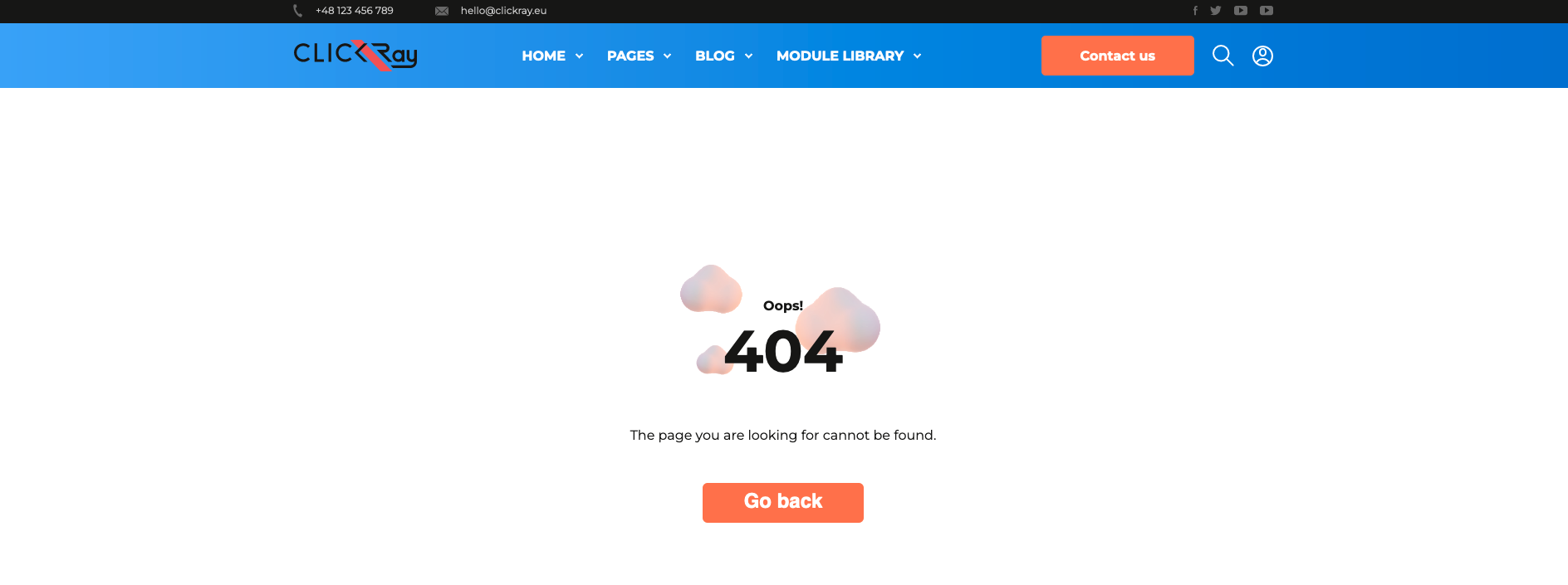
The TURBO Theme features seven (7) different system pages that are generated automatically through specific triggers. Below, we show you how each system page looks as well as what they mean.
HubSpot Knowledge Base
Learn more about system pages here.
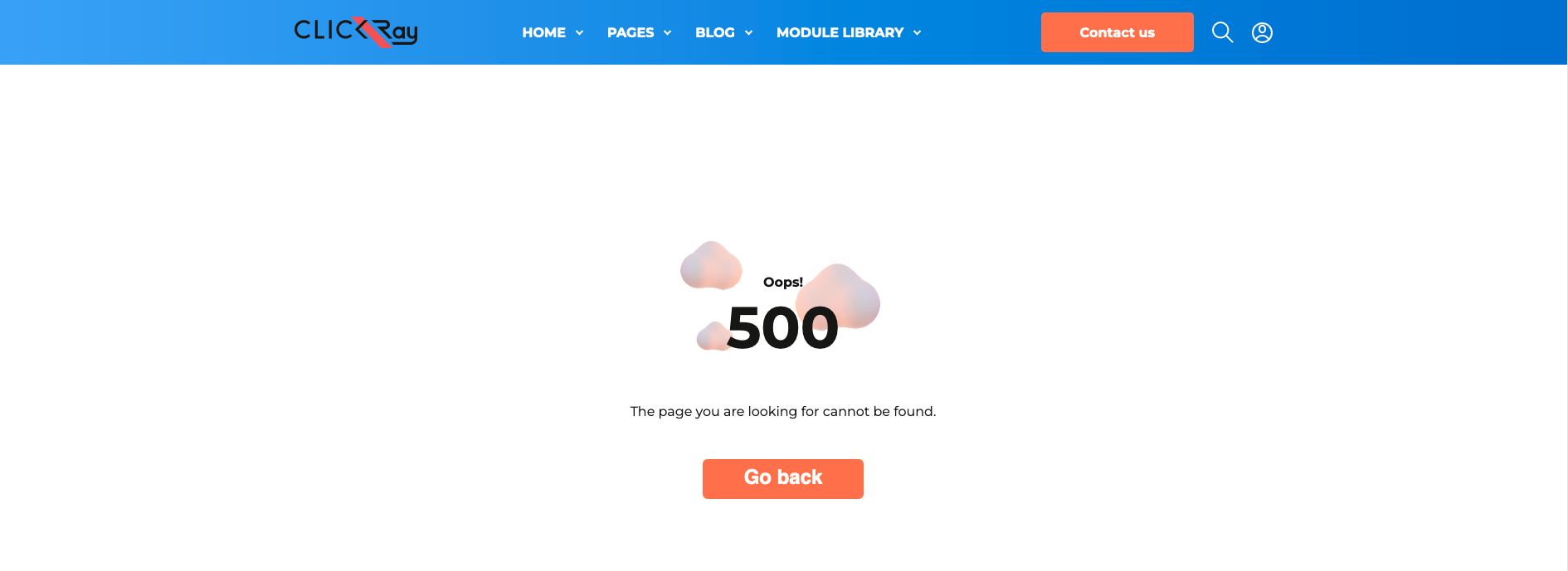
500 Error page is shown when there’s an internal server error (generally used for all unexpected errors). Contains a “Contact us” button.
Password Prompt page is shown for any content that you have locked with a password. You can password protect any website or landing page.
HubSpot Knowledge Base
Learn more about how to password protect a page here.
ClickRay’s Tip
This is a great functionality if you have (or want to have) a Membership Area on your website. Although the themes available on the Asset Marketplace do not provide the Membership Area functionality, HubSot has a built-in Memberships feature available for CMS Hub Enterprise (membership registration) and Service Hub Professional and Enterprise packages (for knowledge base articles) that you can add to your Theme upon purchasing.
If you are interested in creating and customizing a curated Membership Area on your HubSpot website, get in touch with us! We are happy to set that up for you.
Subscription page is a subscription preferences page where an email recipient can manage the email types they are subscribed to and unsubscribe from all emails.
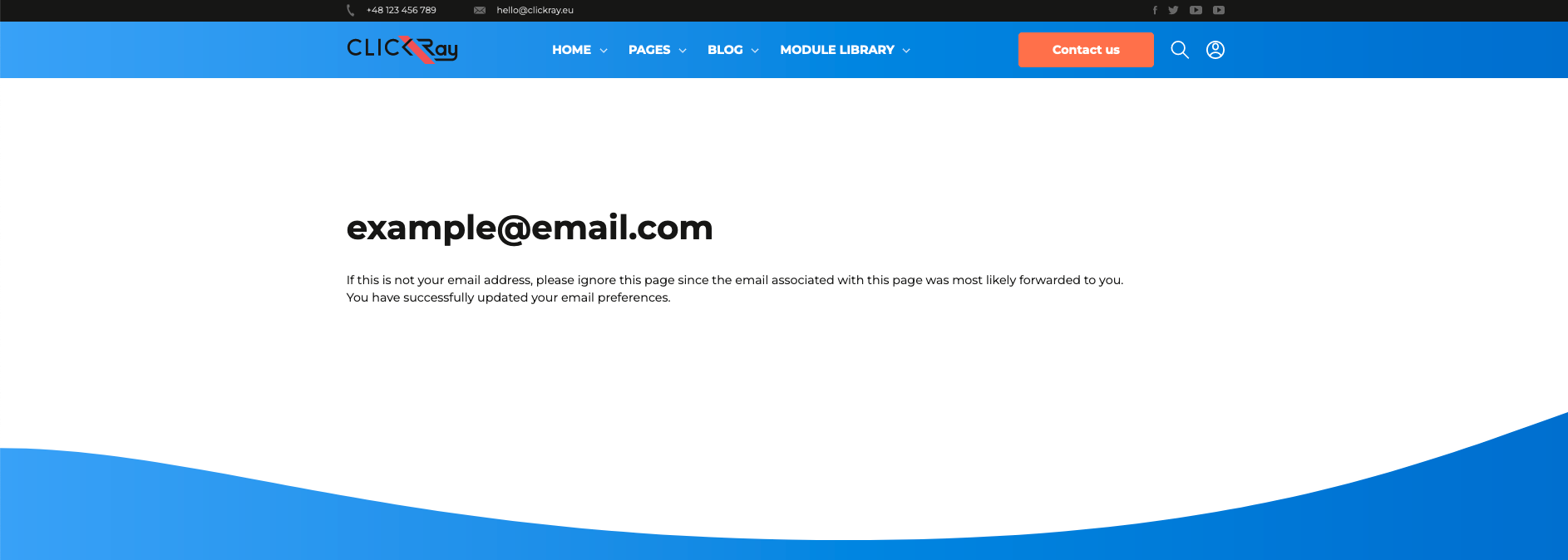
Subscriptions Update is a confirmation page that appears when an email recipient updates their subscription preferences.
Backup Unsubscribe page appears for email recipients who are trying to unsubscribe, if HubSpot is unable to determine their email address.
Search Results page displays search results when visitors use the search bar function in the main navigation menu.
See the T- Header in the Global Module under the Module Library section of the TURBO Documentation for more information about the search bar functionality.
By default, this theme is optimized for SEO and accessibility, as according to HubSpot’s recommendations. Yet in this section, which acts as an addition to the TURBO Documentation, we will give you some tips on how to improve the speed and overall performance of your website, which is at the core of the TURBO mission statement. The TURBO Theme was designed by ClickRay to supercharge your website and boost your marketing performance. We’ve got your back in every move you make.
HubSpot Academy
Take a short course on how to improve website performance, linked here.
Before you begin to optimize your website to the highest SEO standards, make sure to check your current website performance.
You can analyze your entire website in two ways.
First, do it manually on your website. Type in the URL of your website in the search bar of the browser you are using. Then, right-click on your page and select “Inspect”. A “Dev Tools” sidebar will appear on the right of your page. On the upper block navigation bar, click on the arrows icon pointing to the right to expand the menu and navigate to the “Lighthouse” tab. Select the categories you want to test (Performance; Progressive Web App; Best Practices; Accessibility; SEO) and the device on which these categories will be tested (Mobile or Desktop). Once completed, click on the “Generate Report” button. There you go! You will see a report with key metrics and suggestions on how to improve your website.
Another way is to use HubSpot’s native tool, “Website Grader”, available at the link here. Just type in your URL and email address. A new page will appear with a detailed report and recommendations on how to improve the areas you are currently not excelling in.
You can also analyze the performance of a given page.
When you are editing a page in HubSpot CMS (whether website, landing, or blog), navigate to the “Optimization” tab in the page editor navigation bar. A sidebar menu will appear on the left side of the page, listing all the native HubSpot suggestions on optimizing this specific page in accordance with the highest performance standards.
On the top of the window, you will see a “Topics” drop-down menu. This refers to an SEO strategy, helping search engines understand what your page is about.
HubSpot Knowledge Base
Learn more about creating custom topics here.
We understand how hard it is to distinguish yourself from your competitors. Many can have a beautiful website with perfectly placed conversion points to increase engagement on your website. However, having a beautiful website with captivating visuals is not enough these days - your website needs to be optimized so that the user can easily and swiftly navigate through it. Having pages that load fast is a must to keep your visitors on your website. Think of it as “time is money”. When the page speed is super slow, your visitors are more likely to retreat to a different website that offers them the same products or services but at a much faster rate.
ClickRay’s Tip
In this blog post, we wrote about the key factors that influence speed. Read through it to learn what you can do to improve your page speed.
Are you looking to improve your organic traffic rates? The TURBO Theme includes Schema Markup, a code in your website that helps search engines return better results for users. In HubSpot words, “Essentially, it gives vital information to search engines to include in your listing that can improve visibility online, as well as click-through rates.”
HubSpot Knowledge Base
Learn more about schema markup here.


