

We are thrilled to present you the Mercuric Modular. Elegant, innovative, and of course, ready at your disposal.
ClickRay created an entirely new approach, where each module can be easily dragged and dropped to any section of the template. This HubSpot-made theme for sure will attract people’s attention and convince them to spend precious time on your company website.
Thanks for choosing ClickRay!
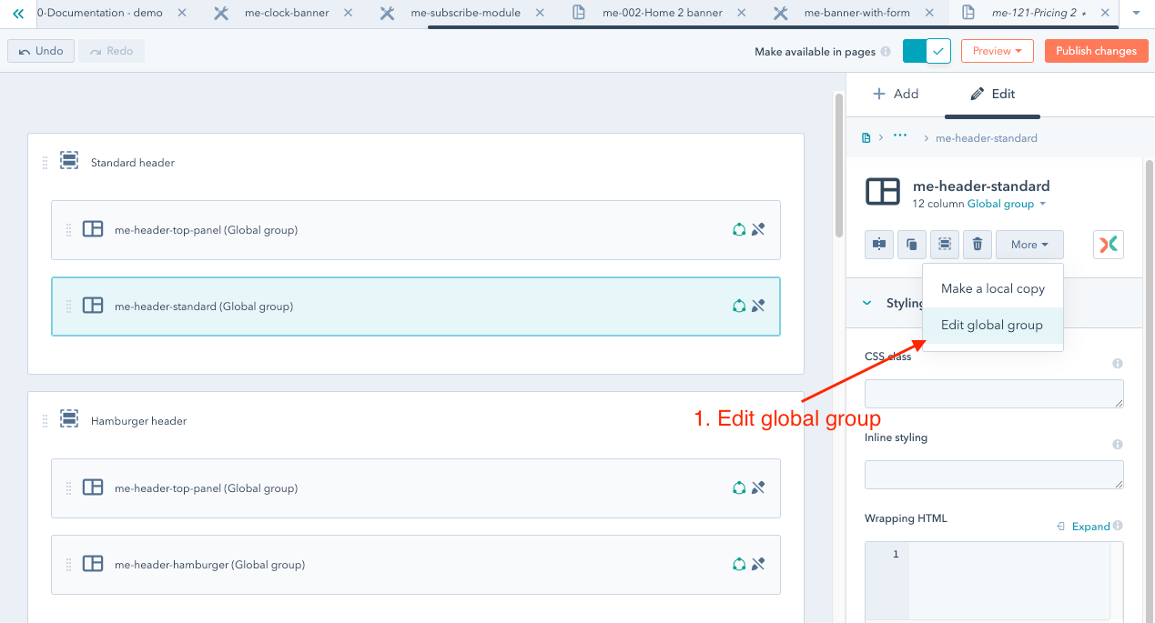
Global Groups are the key element of every professional HubSpot template.
They allow you to share the entire section of a global group between any number of templates.
In Mercuric Modular, Headers and Footers are built with the use of global groups.
You can find all global groups in the Mercuric Modular/global content/global groups folder.
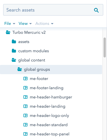
Full list of Mercuric Modular global groups:
To learn more about global groups in HubSpot, see the official documentation.
Mercuric Modular has 4 main types of headers:
Standard (me-header-standard) - live preview
Hamburger (me-header-hamburger) - live preview
Landing (me-header-landing) - live preview
Logo only (me-header-logo-only) - live preview
All templates have all 4 main types of headers built-in. The tutorial about changing the type of navigation in the template is available here.
Additionally, for each of the listed above headers, there is a top panel (also built as a global group) with fast links (telephone number, email) and social buttons - "me-header-top-panel" - live preview.
A description of how to activate the global group with the top panel is here.
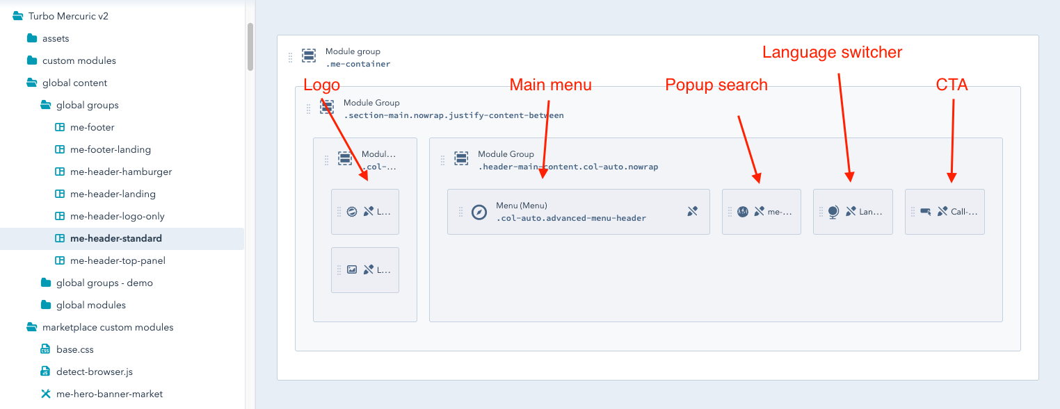
Global group me-header-standard - live preview.
It consists of the following modules: Logo, Main Menu - standard navigation in desktop version and the hamburger type for mobiles, Search Pop-up, Language Switcher, and Call-to-Action.
Due to the limited space for the Main Menu, it is not recommended for very extensive pages. The recommended number of items in the first level of the menu is from 4 to 5.
If the website contains more pages, better to consider using the Hamburger type of the header.
Do you want to learn more about changing the navigation in the template? Have a look here.
Global group me-header-hamburger - live preview.
In the collapsed state this navigation contains Logo and the Hamburger button.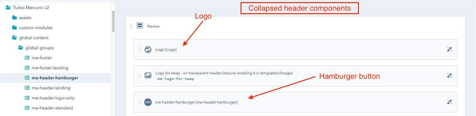
In the expanded state it also includes Logo, Main Menu, Language Switcher, Search, Socials (follow us).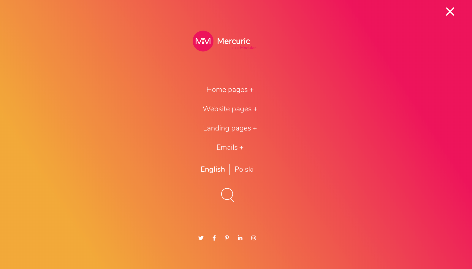
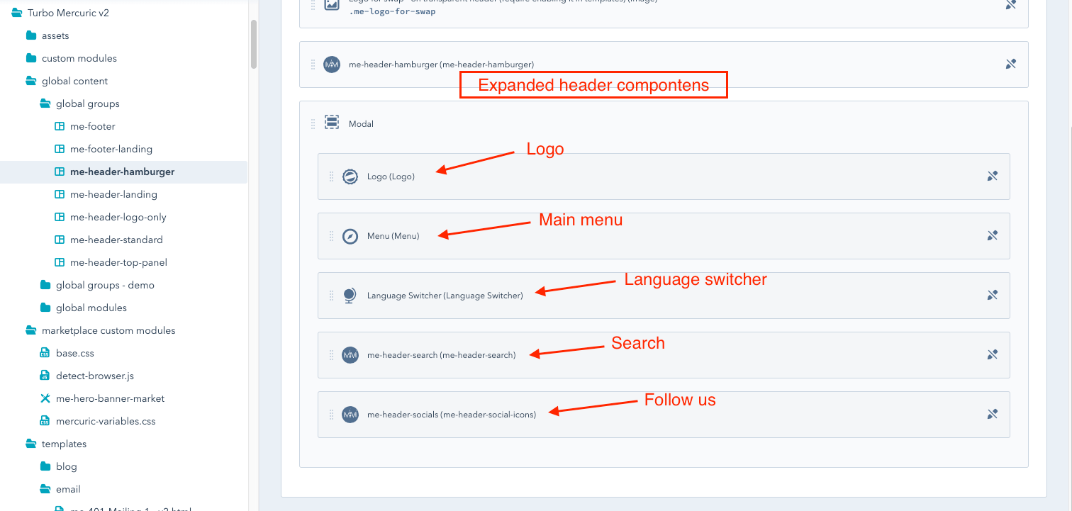
You may find information about how to change your navigation in the template or on the website here.
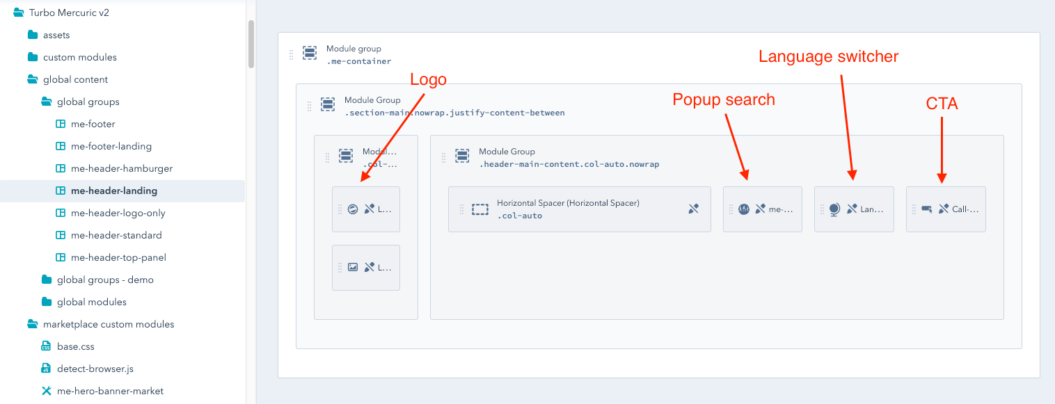
Global Group me-header-landing - live preview.
All the elements, except the Main Menu, are the same as in the standard navigation (me-header-standard): Logo, Pop-up Search, Language Switcher, Call-to-Action.
Find out here how to quickly change the navigation in the template.
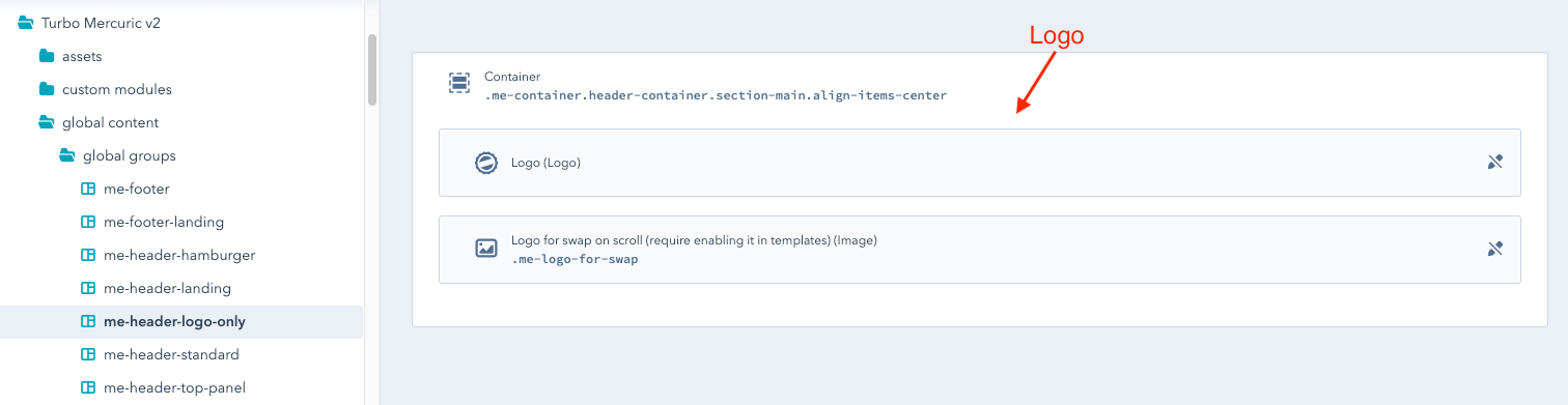
Global group me-logo-only-header - live preview.
Logo Only Header is the simplest type of Mercuric Modular headers and contains only a module with the Logo on it.
It is available in two variants differing in the layout of the logo. In the first option, the logo will appear on the left side of the page and in the second - in the middle.
How to change the navigation type in the template and on the web pages, including centering the logo? Find out here.
Global group me-header-top-panel - live preview.
This global group consists of 2 elements "fast links" on the left side and "follow us" on the right side. They can be activated for each of the 4 types of navigation.
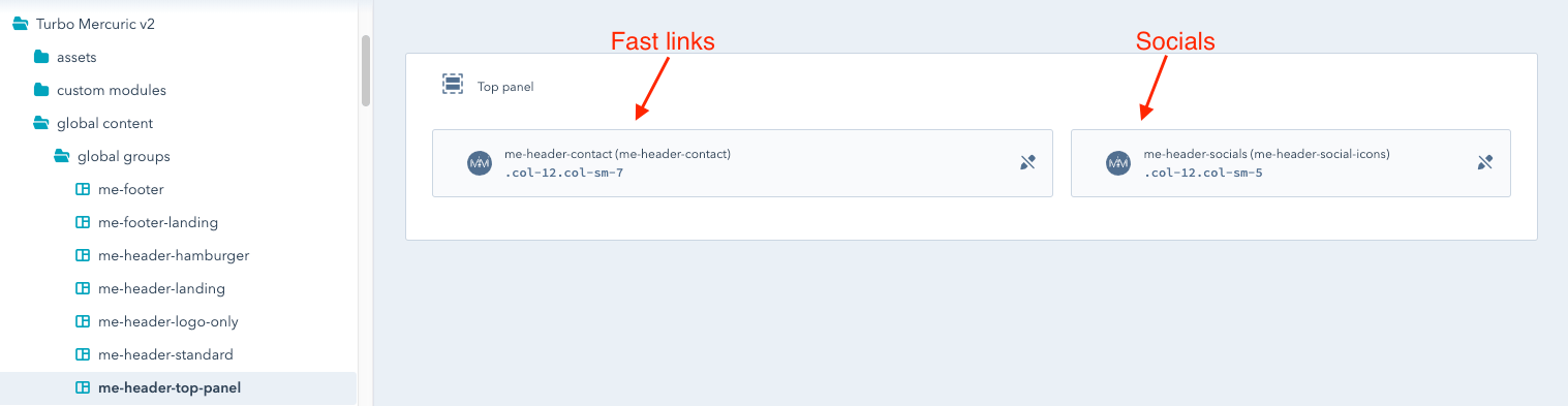
Both modules from the global group me-top-panels may be switched off independently using the "show module" field.
Learn more about how to activate a global group with the top panel in the "Show Top Panel" tutorial.
Mercuric Modular offers 2 types of footers:
Both footers have the "seesaw" effect, which means that they emerge from under the website body when the page is scrolled to the bottom.
The "Seesaw" effect will not work if the page height is not sufficient - it must be slightly higher than the screen height. On short websites, the footer will be static.
Global modules, like global groups, are used to share the same resources between multiple templates.
There are only two global modules in Mercuric Modular:
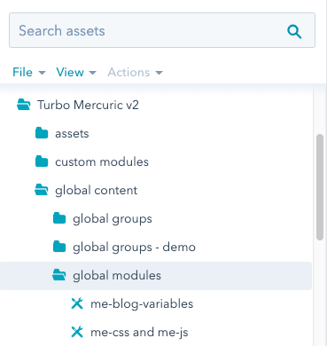
Both global modules are in the folder: Mercuric Modular/global content/global modules.
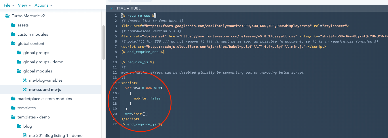
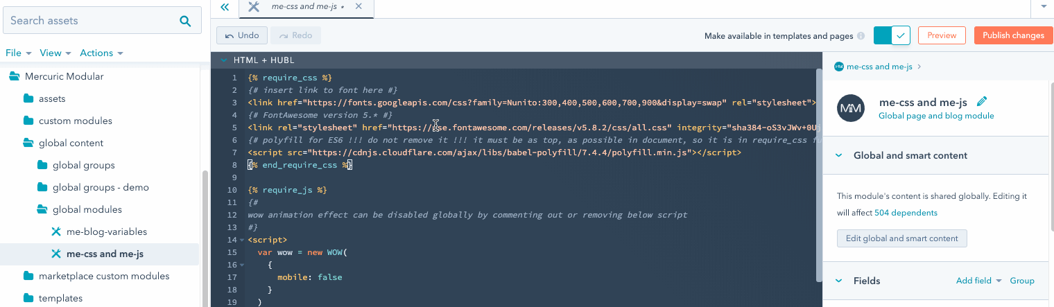
In the global modules me-css and me-js, all internal and external links to CSS and JS files are stored.
This module is used in all Mercuric Modular templates except the mailing templates. It is absolutely necessary for the proper functioning of the template. Removing it from any template will cause fatal errors in the display of the page.
In the HTML + HUBL window, you may find links to the Font Family and a link to the FontAwesome icons. If you seek more information about changing the font, have a look here.
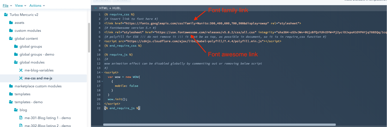
Below, there is a code responsible for the "wow" animation in all templates. Want to learn more about "wow" animation? Click here.
On the right side in the section "Linked files", there are CSS and JS files directly uploaded to the Design Manager.
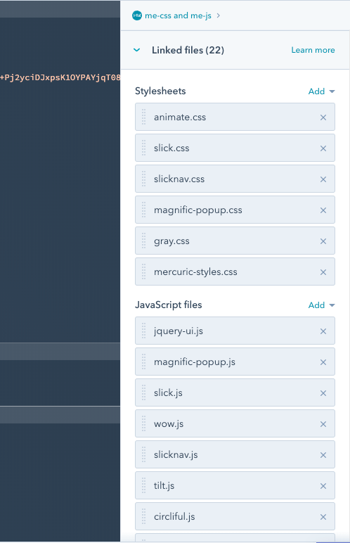
Deleting any of these files will cause Turbo Mercuric templates to malfunction.
All CSS files, including the main style sheet mercuric-styles.css, are in the Mercuric Modular/assets/mercuric_css folder.
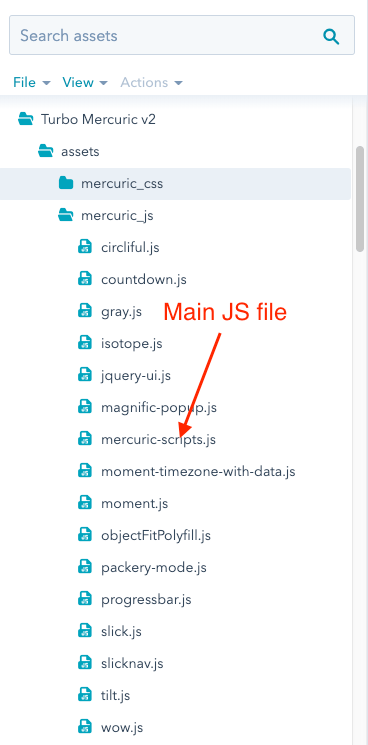
JS libraries, including the main script file mercuric-scripts.js, are in the Mercuric Modular/assets/mercuric_js folder.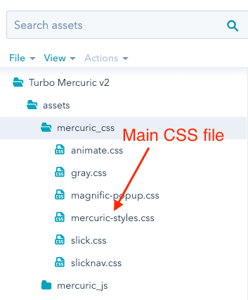
Mercuric Modular is made up of 100 templates.
All templates are located in the Mercuric Modular/templates folder and are categorized in the following subfolders:
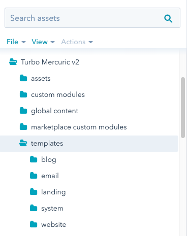
The Mercuric Modular blog templates are in the Mercuric Modular/templates/blog folder.
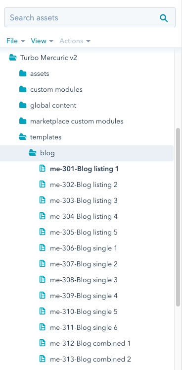
In total there are 13 blog templates:
Blogs templates from me-301 to me-305 contain only the listing view. In order to work properly, they need another template like a single post template, i.e. one from me-306 to me-313 group. Click here to learn how to create a blog page from the separate listing and single post templates.
Blogs templates with numbers me-312 and me-313 are complete blog’s pages consisting of a listing view and a single post template.
They can be also used as a single post view for templates with listing only (me-301 - me-305) and conversely (me-306 - me-311).
Mercuric Modular email templates are in the Mercuric Modular/templates/email folder.
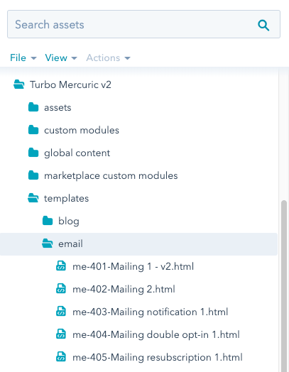
In total there are 5 email templates:
All the above templates are crested as pure HTML + Hubl code. This makes it easier to customize them for different email clients so that they display the same everywhere and without errors.
All Mercuric Modular email templates are responsive.
Mercuric Modular landing templates are in the Mercuric Modular/templates/landings folder.
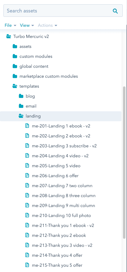
In total there are 15 landing templates. Those with numbers from me-201 to me-210 work best as Landing pages and those from me-2011 to me-2015 as Thank You pages.
List of all landing templates:
All System templates are in the Mercuric Modular/templates/system folder.
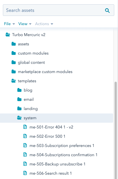
Mercuric Modular pack consists of 6 system templates.
A complete list:
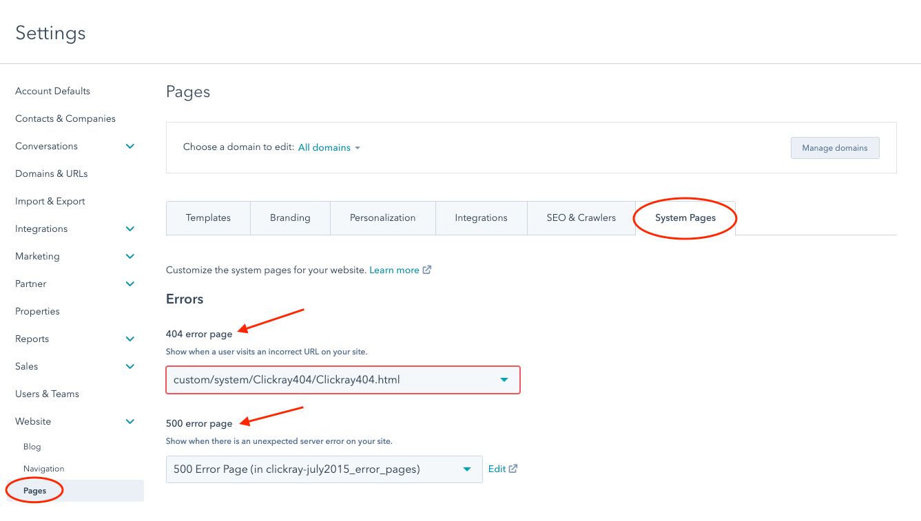
me-501-Error 404 1 - v2 and me-502-Error 404 1 - v2
me-501-Error 404 1 - v2 and me-502-Error 404 1 - v2 are templates responsible for displaying errors on the page. 404 when the page is not available at the requested URL address and 500 when a server error occurred.
Like all System pages, you can create them by selecting the appropriate templates in your account settings: Settings -> Website -> Pages -> System Pages tab.
me-503-Subscription preferences 1, me-504-Subscriptions confirmation 1 and me-505-Backup unsubscribe 1
These templates are needed to allow your contacts to change their email preferences. They are set up similarly to the Error pages: Settings -> Marketing -> Email -> Subscriptions tab.
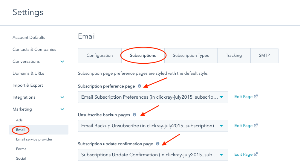
More information about Error and Subscription system templates you will find here.
me-506-Search result 1
It is a special System template to display search results on your website. It is set up in the same place as the Error pages: Settings -> Website -> Pages -> System Pages tab.
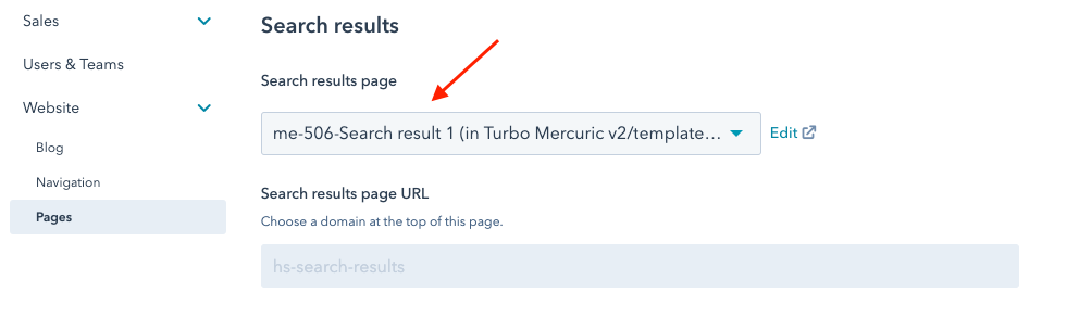
Click here to learn about the Search Results page.
Mercuric Modular Website templates are in the Mercuric Modular/templates/website folder.
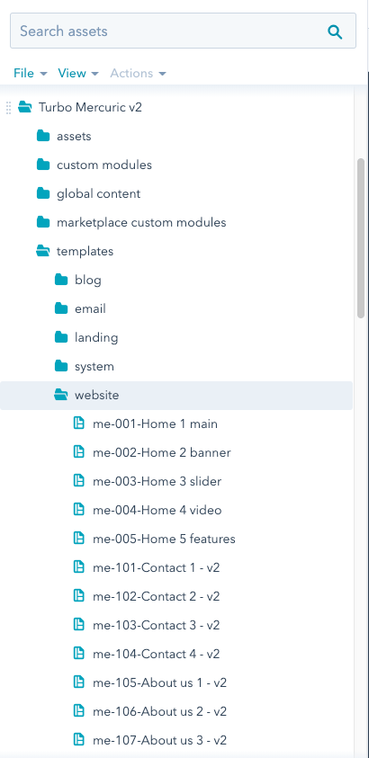
The most numerous group of templates, which includes as many as 61 templates.
Full list of website templates:
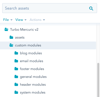
All Mercuric Modular Custom modules are located in the Mercuric Modular/custom modules folder and are categorized in subfolders according to their scope of application:
Total number of modules - 137
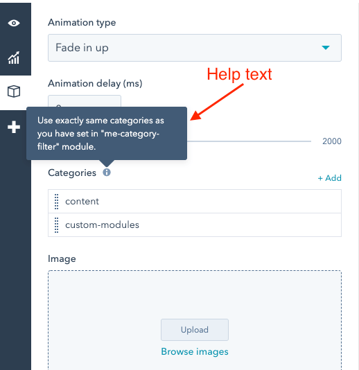
Most of the modules are easy and intuitive to use. More advanced modules have fields with "Help text", describing their rules of operation or guidelines/requirements. Always read instructions to ensure that the used modules are set properly.
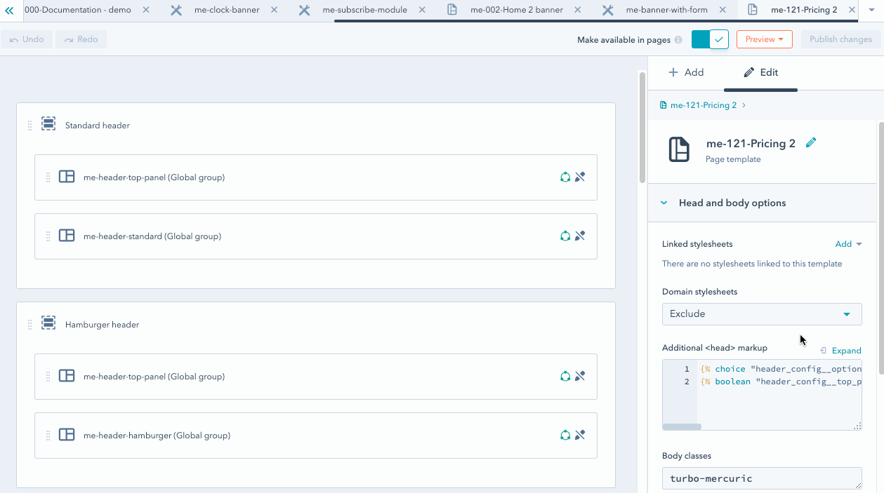
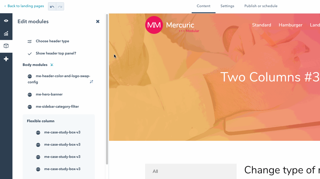
The type of navigation can be set individually in each template or independently for individual pages built on the same template.
In order to change the navigation type in the template globally for all current (in which the navigation type was not overwritten from the "Content Editor" level) and future pages, built on it, you need to:
In order to change the type of the header for a particular page, you should:

The additional panel above the navigation can be set individually for each template or independently for individual pages built on the same template.
If you want to activate the top panel in the template globally for all current (in which the navigation type was not overwritten from the "Content editor" level) and future pages, built on it, you need to:
To display an additional panel above the navigation only for the specific page, you should:
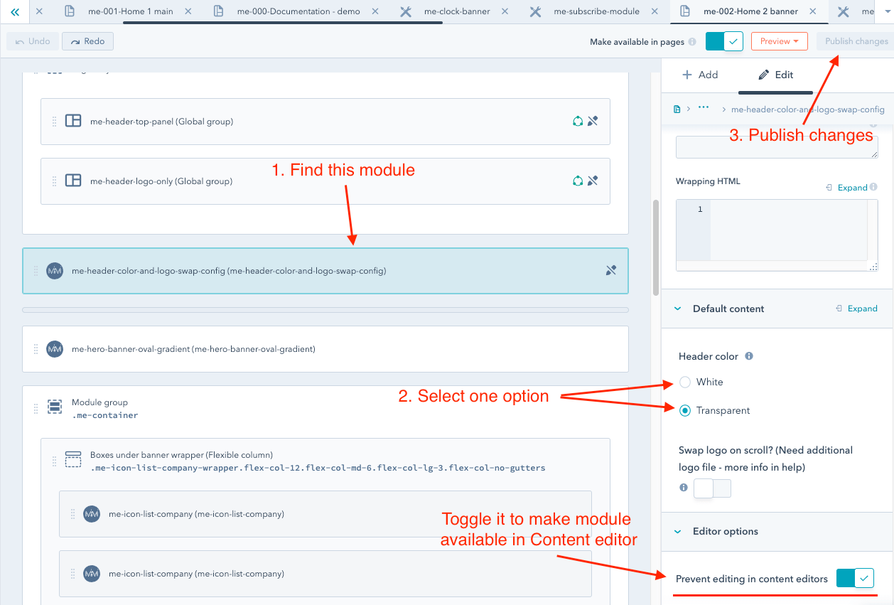
There are 2 navigation color options available:
To change the color of the navigation background, you should:
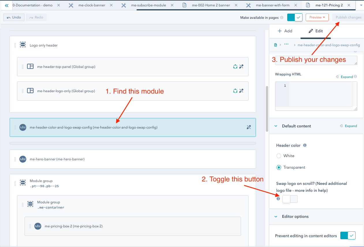
If you need to set the background color of the navigation only for a particular page, you need to unlock the editing of this module. You may do this, by changing the value of the "Prevent editing in content editors" switcher to "False". Then the module edition will also be available from the "Content editor" level.
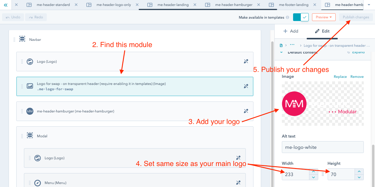
To set the logo, which changes color while scrolling the page (just like in our demo), you just need to:
Then:
Our Mercuric Modular theme uses the "grid system" based on Bootstrap 4.
Unlike the native HubSpot’s grid, which is based on old Bootstrap 2 and is focused on desktop devices ("desktop first"), our grid provides many more possibilities such as more responsive breakpoints and the flexbox technology. What’s more, it is highly focused on mobile devices ("mobile-first").
Using our grid is not difficult, however basic knowledge of HTML and CSS is recommended.
Of course, you don’t have to worry about anything to create a template based on Mercuric Modular - the drag and drop HubSpot’s system is fully supported by us and the structure the user build in the Design Manager (i.e. the layout of columns) will be exactly reflected on the published website.
When building a template without our grid, the page will change its layout of columns only for screens whose width is lower than 768 px.
With our grid classes you may freely change the width of columns for the following screen widths:
Moreover, the flexbox technology provides control over the behavior of the columns.
You can specify whether the columns in a row should be centered vertically or horizontally. You can even change the order of the columns for specific breakpoints.
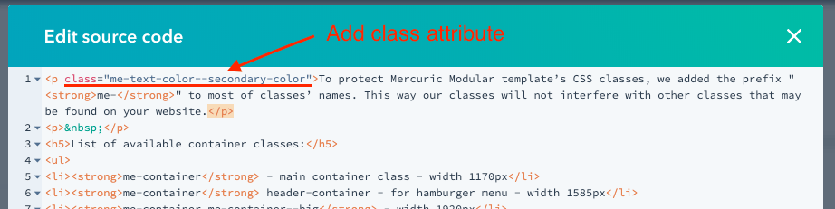
To protect the Mercuric Modular template’s CSS classes, we added the prefix "me-" to most of the classes’ names. This way our classes will not interfere with other classes that may be found on your website.
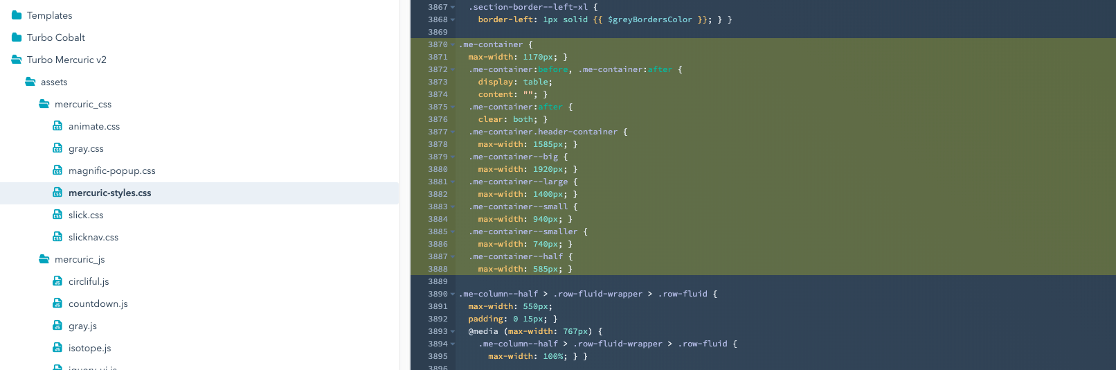
List of available container classes:
CSS styles for Mercuric Modular’s containers are available in the main CSS file "mercuric-styles.css" in the "__globals.scss" section.
Feel free to modify the containers’ widths or add new ones so that the whole will best suit your needs.
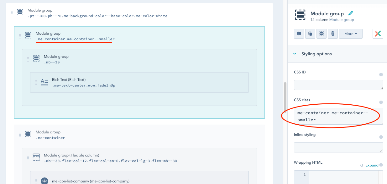
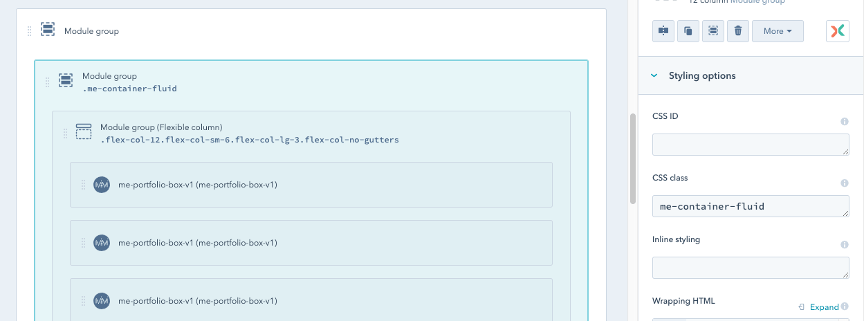
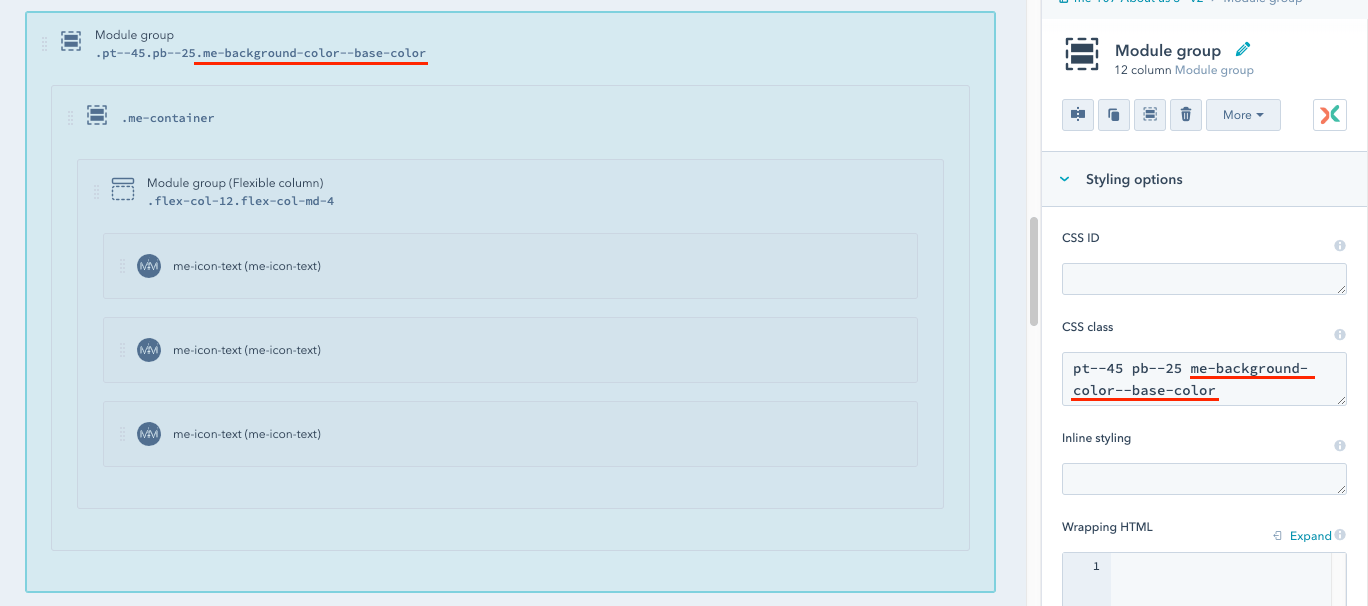
In order to use the container class in practice, it should be added to the "CSS class" field of the module group.
If you want to set one of the modified container classes, remember to always add the main class "me-container", and then after space, the class which brings new width.
The exception is "me-container-fluid". This class should be without the antecedent "me-container" class because its task is to extend the columns over the entire width of the screen.
Following the latest trends and best web-development practices, the Mercuric Modular’s grid is coded according to the "mobile-first" conception.
To make it easier to use, we used the same class names as in the original Bootstrap 4.
You don’t need to use them, because the layout of the columns you set on the Design Manager will be retained. Additional columns’ classes are used to improve the page’s responsiveness.
Example of application of additional classes:
In the example above, only col-sm- and col-xl- are missing. However, the rules of conduct are the same.
For example, col-sm-8 will set the column width to 8/12th of a container for screens above 576px and col-xl-10 to 10/12th of a container for screens above 1200px.
HubSpot’s Flexible Columns provide freedom in creating websites. Read more about them here.
However, they have a significant disadvantage - modules in such a group are always stretched over the full width of the container.
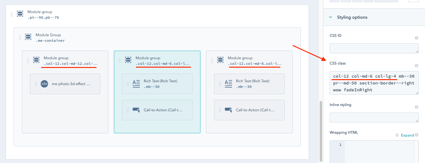
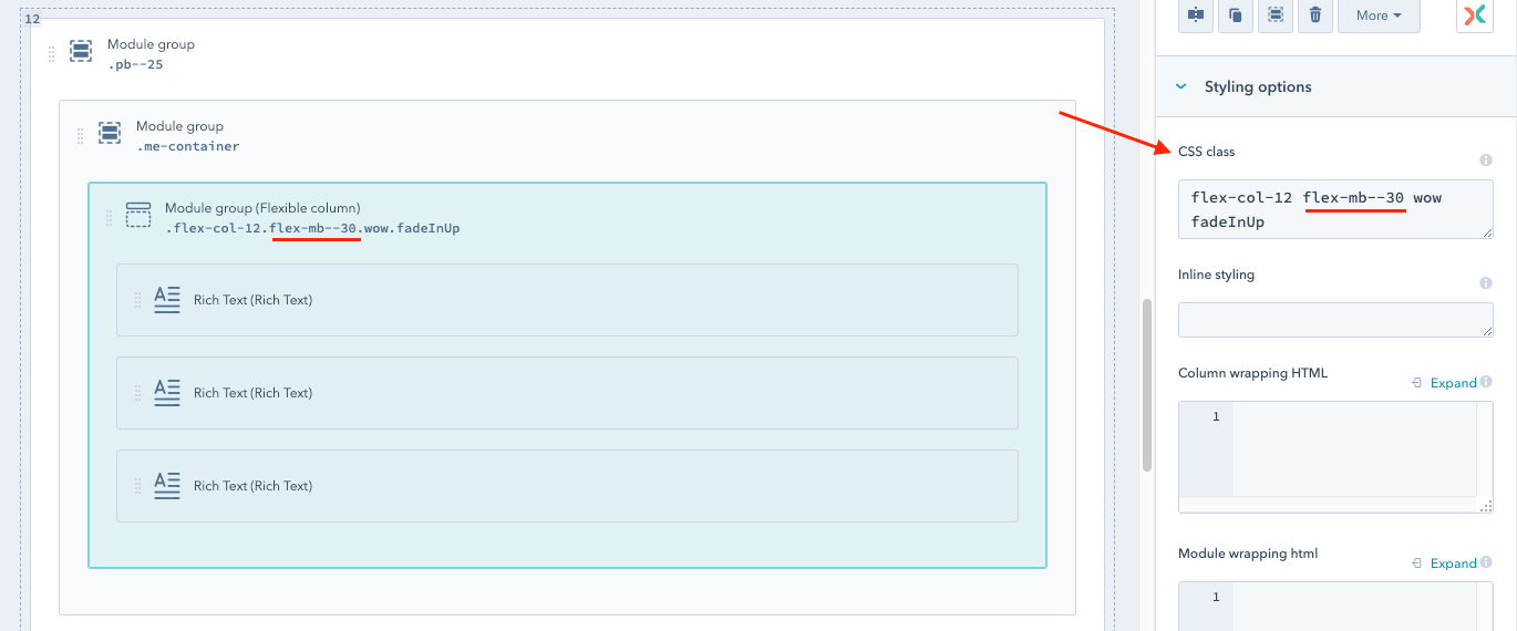
To solve this problem we’ve prepared special classes thanks to which you can freely change the width of the columns in the Flexible Column group.
They are very similar to the usual Bootstrap 4 classes, which are described in the previous section Mercuric Modular Grid columns. The only difference is the additional "flex-" prefix.
In view of the HubSpot limitations, the set of classes is added directly to the Flexible Columns group, because individual modules in such a group do not have the "CSS class" field.
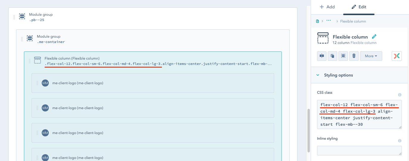
The flex-col- styles will be applied to all modules in the same group. Analyzing the screenshot above that will be:
The usage of the flexbox technology is the unquestionable advantage of our grid.
Among other things, the flexbox technology gives the possibility to change the order of columns in a container. This is specially useful when, for example, in a two-column layout, with a large screen width (desktop), an image is in the right column, and the text in the left, and in the mobile version the picture is to be placed above the text, not below it, as it results from the natural behavior of the HTML structure.
To make the column with the image change its layout when resizing to a mobile version, you need to add 2 classes: order-first and order-md-0 to the "CSS class" field.
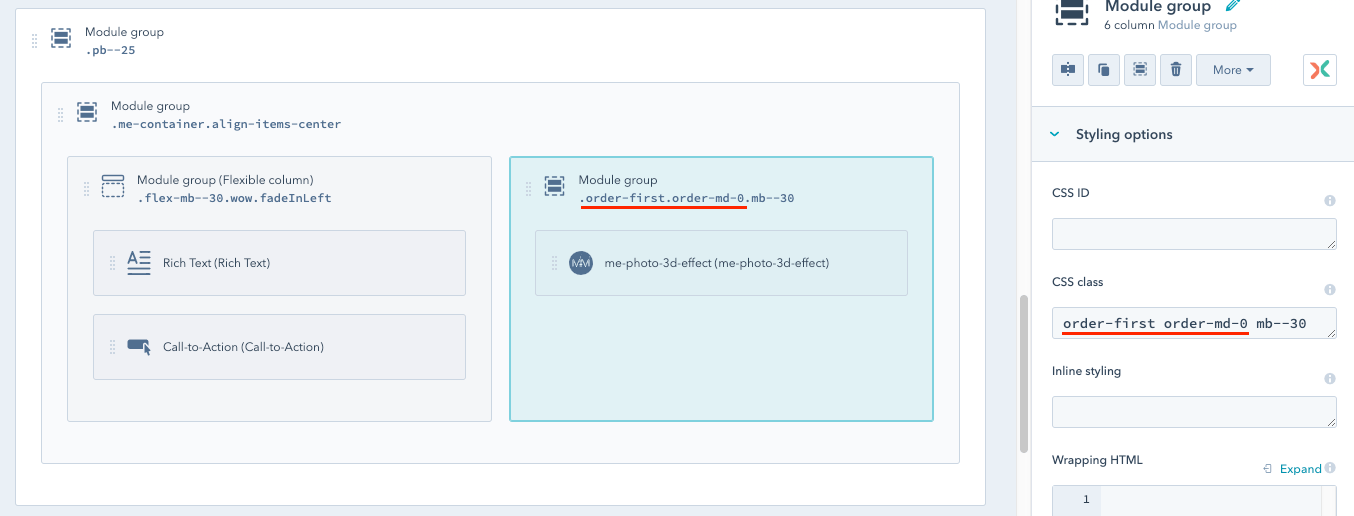
Because our grid uses the "mobile-first" conception, classes:
Learn more about "order" classes in the official Bootstrap 4 documentation.
Due to the flexbox technology, it is possible to freely control the alignment of the columns in the container, both vertically and horizontally.
For this purpose, we also used the classes from Bootstap 4. You will find a detailed description of all available classes here.
In order to apply them in practice, the alignment class should be added to the group located directly above the columns. Most often it is a group with the me-container class.
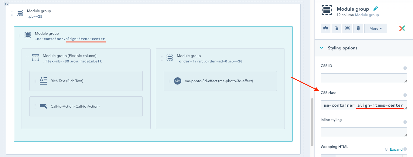
If you want to align all modules inside a Flexible Column, just add the desired class to the Flexible Column.
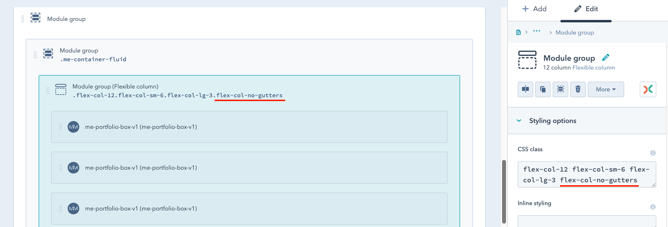
As in Bootstrap 4, the "no-gutters" class added to the "CSS class" field of the group will remove the spaces between all columns in the group.
In the Mercuric Modular theme, it is often used in the version for Flexible Column: "flex-col-no-gutters".
Added directly to Flexible Column will remove the spaces between all modules in the Flexible Column.
To make it easier to customize themes, Mercuric Modular comes with a number of predefined CSS classes designed to allow you to make minor changes from the Design Manager level, without unnecessary interfering with the CSS files. Just add any class to the "CSS class" field to get the desired effect.
In the following sections, more about the defined CSS classes is presented.
Basic knowledge of HubSpot Design Manager is recommended.
If you do not feel too confident with this tool, it is worthwhile to use their official documentation and tutorials. The best place to start learning is here: Get started with the Design Manager.
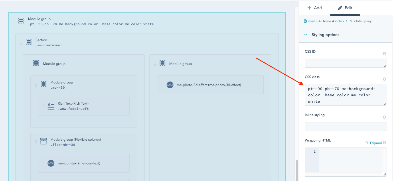
In the Mercuric Modular, you may easily change the spacing between sections and modules. For this purpose, we have prepared classes, which can be added in the "CSS class" field to the whole group or individual modules/columns in the Design Manager.
All classes that are intended to change spacings are written according to the same scheme.
The first part is the space type and the second is the value, e.g. mt--40 means margin-top(--)40px.
Additionally, responsive classes are available, e.g. mt—sm-40 sets "margin-top" value to 40px for devices with a screen width above 576px.
Available types:
Available values: 0-100, step 5.
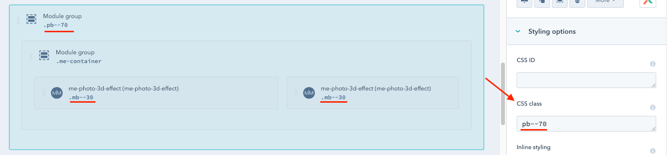
If you want to add a space for all modules in the Flexible Column, you may use the special class for margin-bottom (all others are not available in the Flexible Column version).
It is analogous to the previously mentioned classes. The only difference is the prefix "flex-" at its beginning, e.g. flex-mb—25.
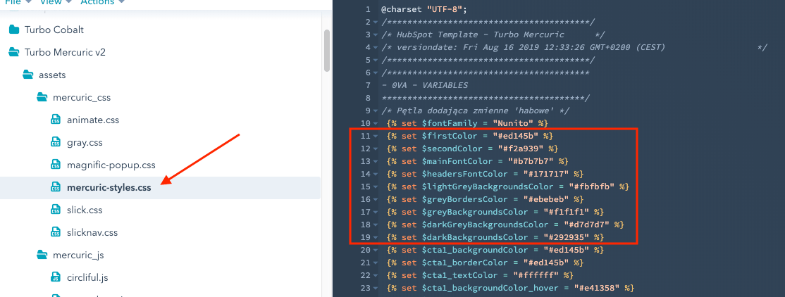
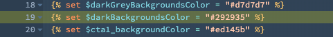
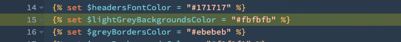
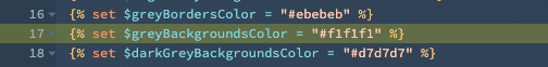
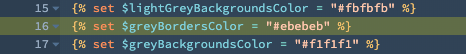
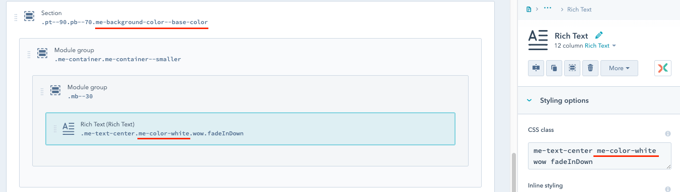
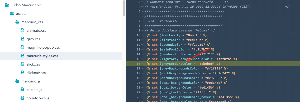
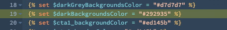
The colors assigned to the class are defined in the main CSS file (mercuric-styles.css) in its first lines as variables.
A class with background color should be applied to the top parent group of columns. This will change the background within the whole group.
Available classes:
Text color on the changed background
If you change the background color to dark or one where the default font color is not clearly visible, consider changing the font color to white.
Some Mercuric modules have a white text color checkbox. Others change the font color automatically.
However, in the case of native HubSpot modules, e.g. Rich Text, it is not possible. For this purpose, we have added the CSS class "me-color-white". Entering it in the module "CSS class" field or any parent group will change the font color in all modules in the group to white.
You can read more about font colors in Typography.
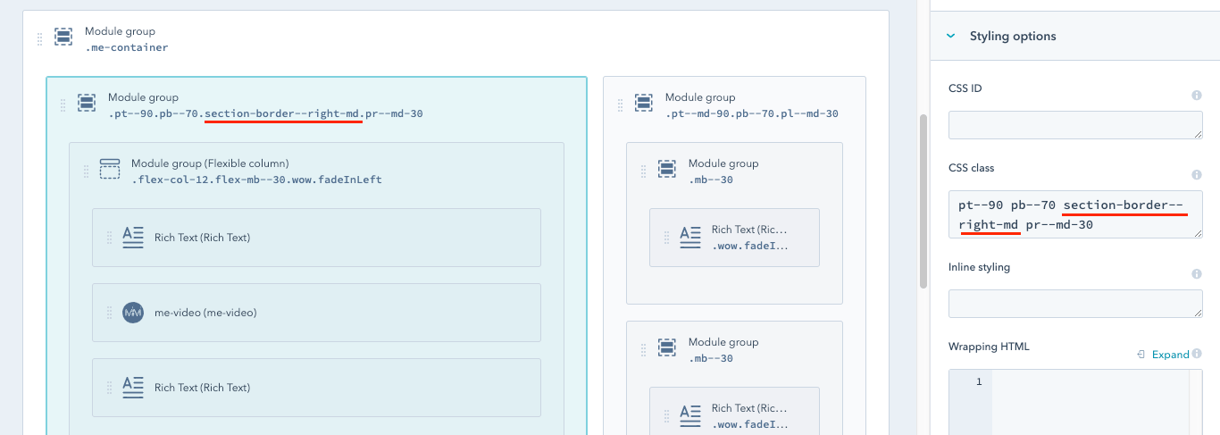
If you want to clearly separate the columns, it is recommended to use the class showing the lateral edge line.
The color of the line depends on the color of the variable named $greyBordersColor from the main CSS file.
To give the element an edge, enter one of the available, intuitive classes in the "CSS class" field:
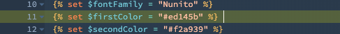
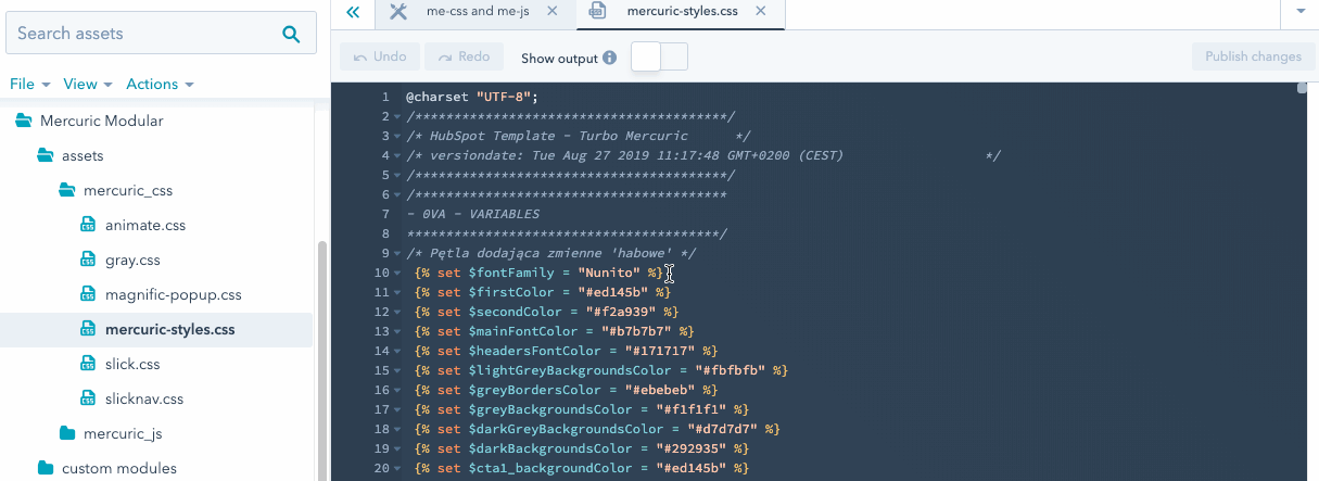
There is one main font family in the Mercuric Modular. The default is Nunito (font-weights: 300, 400, 500, 600, 700, 900) from Google Fonts.
The link to the font family is in the global module me-css and me-js (Mercuric Modular/global content/global modules).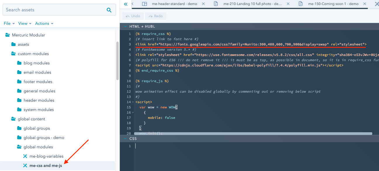
The CSS variable responsible for the font throughout Mercuric Modular is in the main style sheet (mercuric-styles.css, folder Mercuric Modular/assets/mercuric_css) under the name "$fontFamily".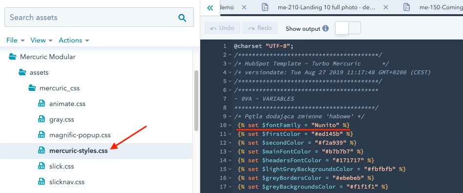
To change the font family, you should:
1. Add a link to font family in the global module me-css and me-js, preferably by replacing the link with the default font. It is important to place the link in the "require_css" block.
If you want to use Google Fonts, it is best to choose one that has all the font-weight that are present in Mercuric, namely: 300, 400, 500, 600, 700 i 900.
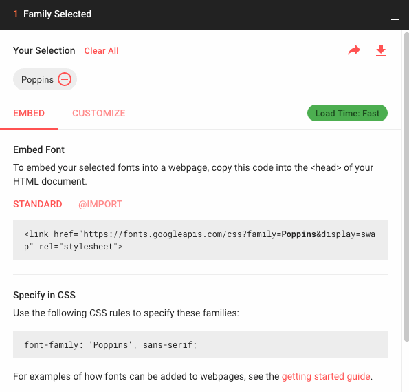
2. Replace the value of the "$fontFamily" variable in the main CSS mercuric-styles.css and publish the changes.
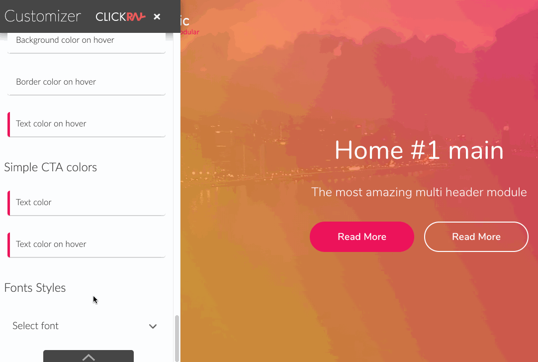
To change the font family you may also use our customizer.
The customizer will automatically generate a link to the selected font family as part of the CSS code for the mercuric-styles.css file. In this case, it is not necessary to change the font link in the me-css and m-js. However, it is a good practice to remove the old link from me-css and me-js, once it is no longer in use.
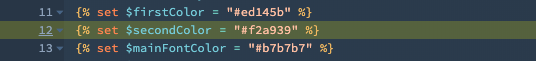
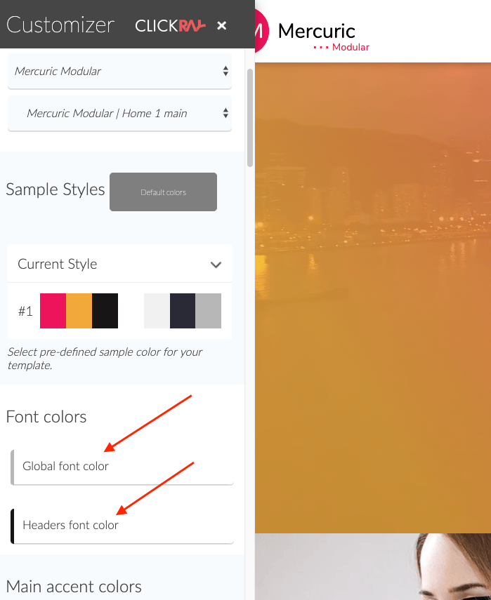
Mercuric Modular has 2 basic font colors:
Both colors are declared as variables in the main CSS file mercuric-styles.css (Mercuric Modular/assets/mercuric_css folder).
To see which elements will change after setting a different color, use our customizer. It also makes it easier to implement the changes by generating CSS code for the change in the main style sheet - just follow the instructions in the customizer.
White text color.
If you change the background color to dark or one where the default font color is not clearly visible, consider changing the font color to white.
Some Mercuric modules have a white text color switcher. Others change the font color automatically.
However, in the case of native HubSpot modules, e.g. Rich Text, it is not possible. For this purpose, we have added the CSS class "me-color-white". Entering it in the module "CSS class" field or any parent group will change the font color in all modules in the group to white.
.webp?width=1351&name=me-color-white%20(1).webp)
.webp?width=1267&name=me-color-white-preview%20(1).webp)
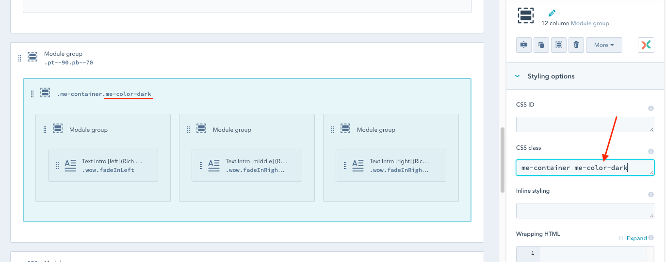
Dark text color.
A similar class to "me-color-white" is "me-color-dark”.
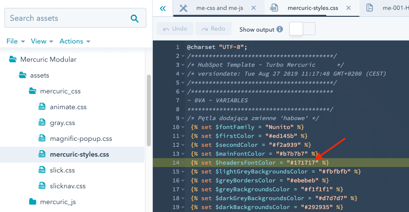
The color that is assigned to it is the color of the $headersFontColor variable from the main CSS file mercuric-styles.css.
The rule and scope of its operation are the same as the "me-color-white" - the color change will include all modules within the group with "me-color-dark” class.
Other font colors.
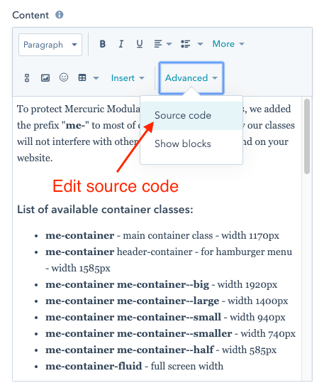
In addition to the "me-color-white" and "me-color-dark” classes, which are applied by entering in the "CSS class” field in Design Manage, Mercuric Modular also has classes that change the font color, which are assigned directly to HTML tags (e.g. <p>) in the "class” attribute.
A great place to use them is the HubSpot Rich Text field in the "Edit source code” mode, where the HTML tags may be modified easily, including adding a "class” attribute, such as <p class="me-text-color--secondary-color">.
The following classes are available:
.png?width=487&name=first-color-variable%20(1).png)
.png?width=536&name=second-color-variable%20(1).png)
Each Custom Module from Mercuric Modular has a "Dropdown" field or switcher where the animation may be changed/deactivated.
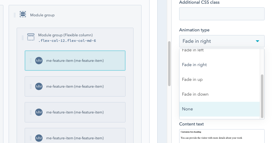
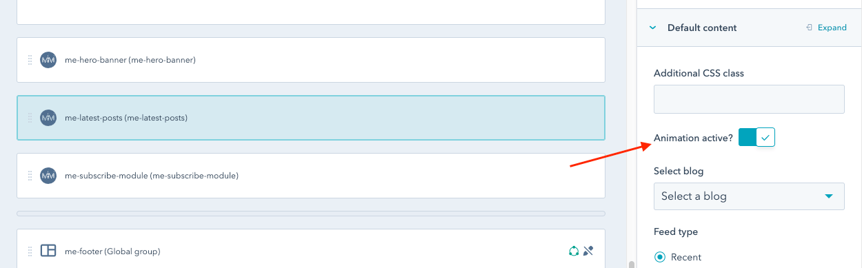
In Mercuric Modular there are also native HubSpot modules, e.g. Rich Text, where the animation type is defined directly by adding a class with animation to the "CSS class” field of a module or a group of modules.
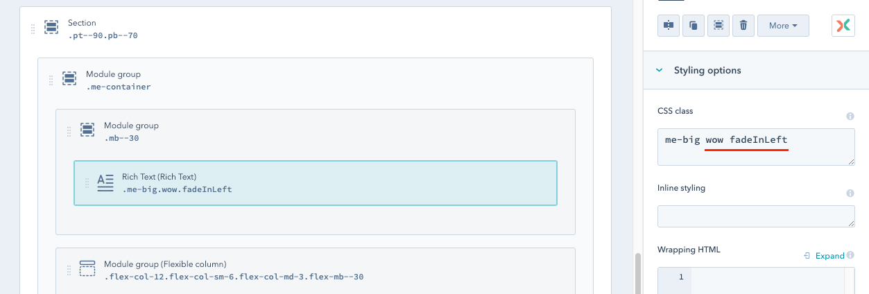
All you have to do is to remove the fragment from "wow fadeIn…”, to deactivate the animation.
You can also freely change your animations by entering one of the available Animate.css classes.
The following effects are used in Mercuric:
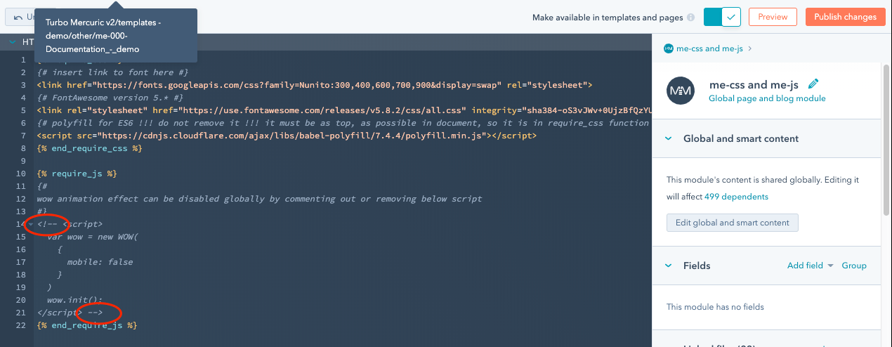
In Mercuric Modular it is possible to remove the animation effect globally.
Just find the global group called "me-css and me-js”, which is at the bottom of each template and click on "Edit global group content".
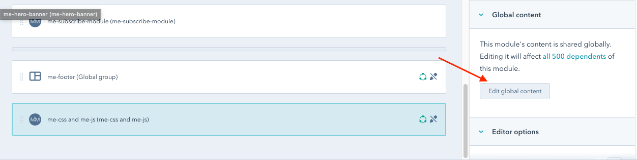
Then remove or comment out the code in the <script> tag and publish the changes.
Mercuric Modular is fully compatible with HubSpot’s Drag & drop technology dedicated to creating templates.
Simply drag the selected module into the area of the template and it will appear on your website.
This way, you may build a template from modules available on Mercuric, as well as from native HubSpot modules (Rich Text, Image, Form, etc.).
If you want to use Mercuric modules, pay attention to the folder in which the module is located. Some modules are designed only to work within the framework of Blog, Website or Mailing templates.
Modules from the "general modules" folder will work in Website and Blog templates.
In the folder "blog modules" there are dedicated Blog templates modules, but some of them are also compatible with Website templates.
In "email modules" there are modules only for Email templates. This is the only group of modules that are placed in the Email template using "HubL module syntax", not Drag & Drop.
The folder "system modules" contains the modules used in System templates. They are not limited to System templates only, so you can put them in Website or Blog templates. However, this functionality may not be complete in this case.
The "header modules" and "footer modules" folders contain modules in global groups; me-header* and me-footer. Placing them in templates is not recommended.
Creating Templates
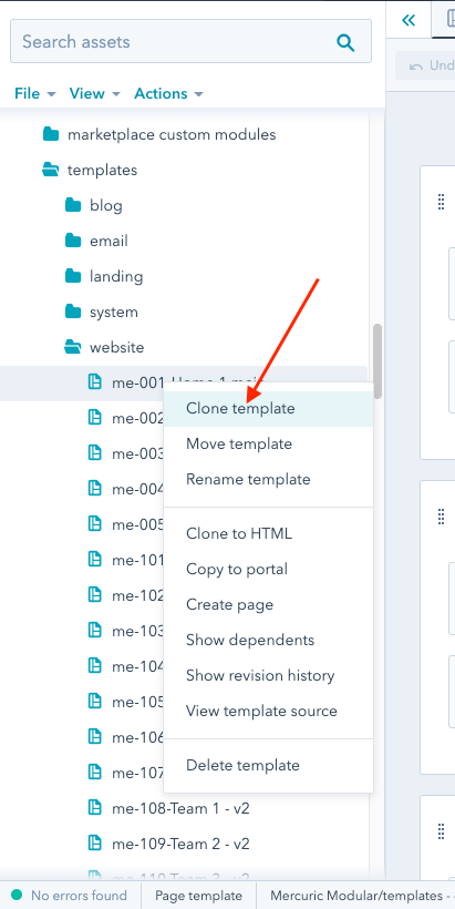
In order to create a new Mercuric Modular template, it is best to use one of the already existing templates. To do this, select the template you are interested in and right-click on the template. Then select the "Clone template" option.
In this way, the new template will immediately contain all the necessary elements (global groups, modules, assets and other) for the proper functioning of the Mercuric Modular.
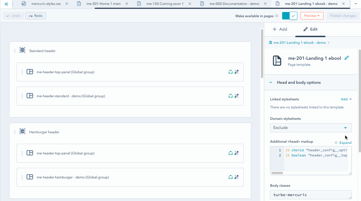
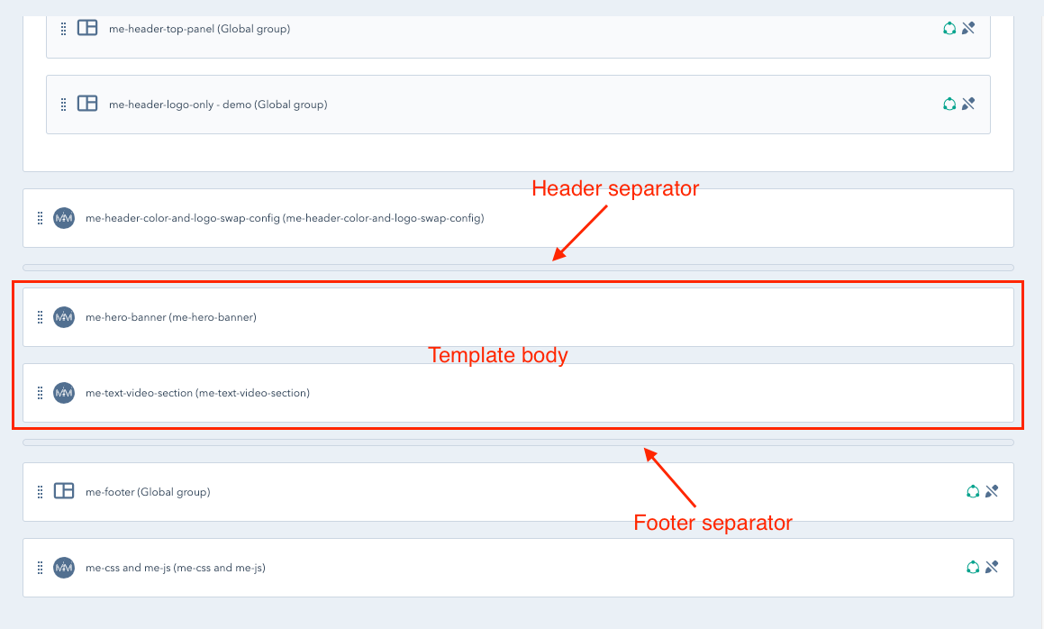
The template consists of 3 main parts - Header, Body and Footer.
Header and Footer are divided by separators. The elements contained in them should not be modified or removed. At your disposal is a central part of the template - Body - in which you can build sections from Mercuric and HubSpot modules.
The easiest way to build a section is to restore a group with modules from a different template that interests you.
You may do it manually, step by step, by playing back the group structure, or you can use HubX extension by neambo to clone modules and groups between templates.
If you decide to build sections manually, a lot of useful information on how to use the Design Manager can be found in the official HubSpot documentation.
Information about the grid (columns arrangement) in Mercuric Modular, along with instructions on how to use it, can be found here.
Also, check out the classes we have prepared to help you design and modify Mercuric Modular templates. Detailed descriptions and instructions are available here.
If you are still not sure how to use Drag & Drop in Mercuric Modular or need help with creating or modifying your templates, please do not hesitate to contact us.

